System utilities receive facelift in recent Tiger builds
 Kasper Jade
As Apple strives to complete the development of Mac OS X 10.4 Tiger for a potential launch in early 2005, several system utilities are being revamped and rejuvenated.
The consistency of the Mac OS X look and feel remains at bay in Tiger as Apple appears torn between its two user interface themes. A new version of the company's Audio MIDI Setup has shed its discrepant combination of Aqua and brushed aluminum in favor of all Aqua motif. Meanwhile, a revised version of Keychain Access has seen quite the opposite revision and is now adorned completely in aluminum. The application sports a single window, which features keychain and category selectors on the left, and items and info on the right.

— >
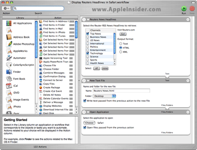
The interface to Apple's new Automator application—a personal automation assistant that lets users streamline challenging repetitive manual tasks without writing code—also continues to evolve. Recent builds of the application sport an action menu, reshuffled interface, and a more complete listing of categories and actions. The application now adheres to its "Automator" name, leaving behind the "Pipeline" code name and application icon.
— >
As mentioned previously, Apple has also overhauled its Printer Setup Utility, refreshing its interface and adding interaction with the company's online store. Although miffed over a disclosure of relevant details, the company continues to refine Apple Store integration in Tiger and reportedly plans to add similar functionality to at least one more component of the OS before its release, sources close to the company said.
Inside Apple's Cupertino, Calif.-based campus, Tiger has approached and likely surpassed build 8A270. Sources close to the Tiger development team warned that several application interfaces remain a work in progress and will likely change considerably over the next few months. Additionally, tipsters hint that forthcoming builds of the OS will throw a third application interface theme into the mix— a look similar to the one found in Spotlight search result windows.


 William Gallagher
 Andrew Orr
 Sponsored Content
 Malcolm Owen

 Mike Wuerthele

