Inside Mac OS X 10.7 Lion: Developer Preview 3 dials down animated tabs
 AppleInsider Staff
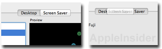
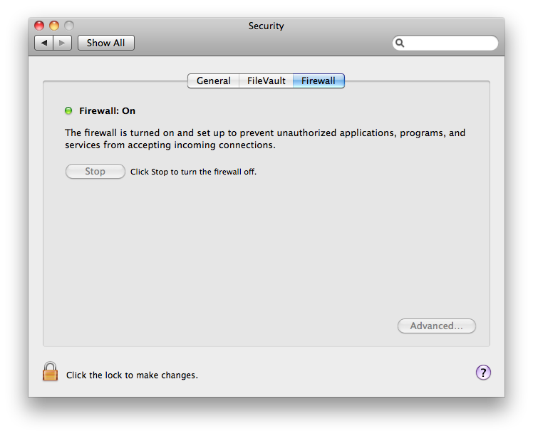
Apple is retaining Lion's toned down new version of its Aqua design language, which strips much of the bright blue highlighting and bubbly interface controls such as buttons and window navigation arrows, the omission of which tend to make Mac OS X look more cohesively related to iOS.
However, Lion's new sliding pane tabs, which originally appeared to make the control function like a physically raised button that slid into place on a click (as depicted below) have been revised in Lion DP3 to work, but not look, more like the existing controls in Snow Leopard.
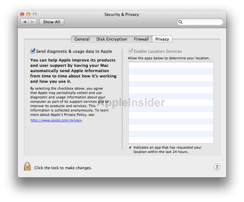
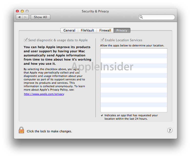
Rather than adopting a bright blue highlight, the selected tab section is now drawn as if it were depressed inward, with a dark background and high contrast, white lettering. The Security & Privacy pane below shows the difference between the current Aqua look, the original Lion appearance, and the revised new design in Lion DP3.
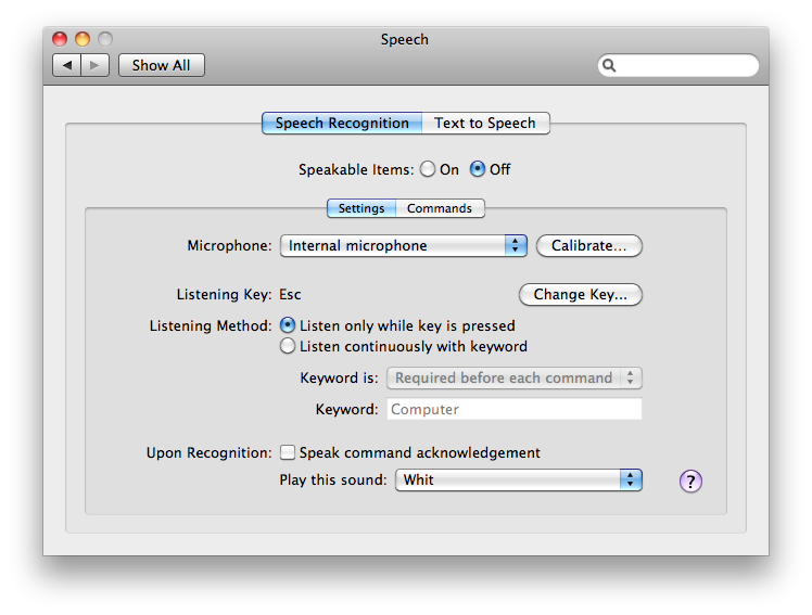
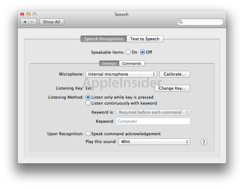
The overall look of the new tab controls when they appear in nestled panes is portrayed below, comparing the Speech pane in Snow Leopard with the revised appearance of Lion DP3. The graphics also depict the loss of colored highlighting throughout the interface, and flatter, round radio button controls as opposed to the "candy drop" bubbles introduced by Aqua.


 Marko Zivkovic
 Amber Neely
 Christine McKee
 Malcolm Owen
 Mike Wuerthele and Malcolm Owen

 William Gallagher