Hands on with Dark Mode in MacOS Mojave
 Andrew O'Hara
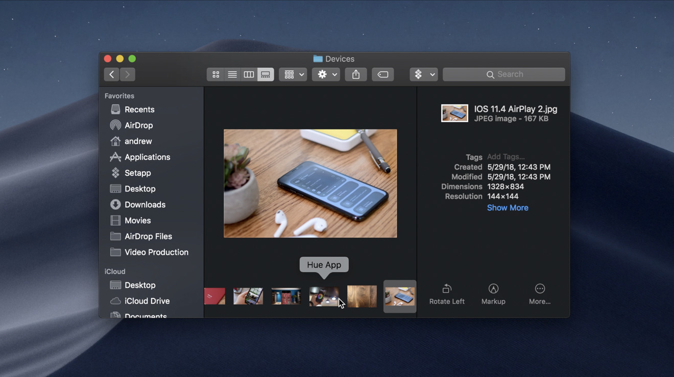
At least one long-awaited feature has made its way to the Mac at WWDC this year — Dark Mode. AppleInsider goes hands-on with the new system-wide UI in macOS Mojave.
In macOS Sierra, Apple allowed users to alternate between a light and dark menu bar along the tops of their displays. This didn't go far enough to appease users, who still longed for a complete dark mode across all apps, menus, and UI elements.
That is exactly what we got with macOS Mojave.
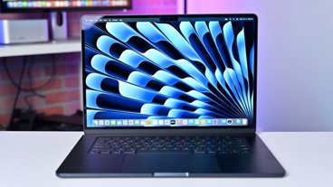
It all starts in the preferences app where under General there lives the option to toggle between light and dark appearance. Same location where the menu bar appearance could be changed.
A really nice effect is the new default wallpaper included in Mojave. As light and dark mode is changed, the wallpaper will adjust to being day or night.
While the menu bar along the top has largely remained unchanged, everything else is new. We see this with the new dock along the bottom that has a new appearance. To the right of the new "recent" section rests a new dark trash can icon.
All system apps have been optimized for the new dusky UI — even the highlighting is changed up. All of the new apps, including Home, News, Voice Memos, and Stocks look particularly good here.
Some of Apple's apps have not been updated yet like the iWork suite, most likely because of their App Store distribution. Pages, Keynote, and Numbers are all glaringly bright on the new darker interface. These will undoubtedly be updated once Mojave is released.
Third-party apps will be able to adapt to the UI as well once it is released, with just a bit of additional work. Right now, some apps can look a bit off because of it. As an example, when highlighting text in Slack, it uses a dark highlighting that makes the text largely illegible while selected. Other apps, like Affinity Photo, already fit right in.
Dark Mode in macOS Mojave is a huge step in the right direction and feature sorely needed. It looks great and will fill out even better as developers add support when it is released this fall. Unfortunately, Dark Mode still evades iOS, which is left only with Smart Invert as the only thing even close.


 Malcolm Owen
 Christine McKee

 Amber Neely

 William Gallagher