Inside Mac OS X 10.7: Apple to strip most Aqua gloss
The most obvious Aqua gloss stripped from Mac OS X Lion involves scroll bars, which are replaced with iOS-like, grey segments that disappear when not in use. The Finder and Mail also drop the use of bubbly, colorful toolbar and source-list icons, indicating a general preference for simpler, monochromatic icons similar to those used in iPad apps.
Also missing are the Aqua pill buttons in the upper right corner of windows in the Finder and certain other apps, which currently display or hide the window's toolbar. These have been replaced by the Full Screen control used in apps that support that mode.
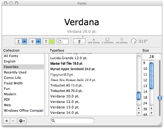
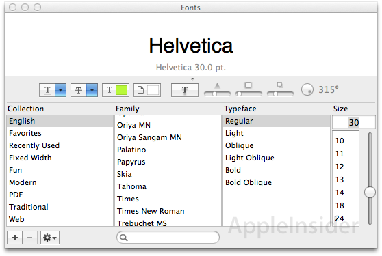
Across the interface, while Aqua highlighting still exists, much of the "blue gel" has been dialed down. For example, the standard Font panel uses a plain slider control rather than a blue bubble.
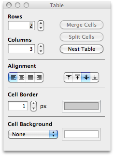
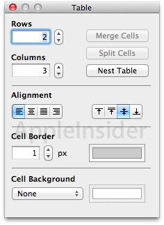
A variety of rounded buttons are now replaced with more squared off rectangles, and popup menus now lack a blue button selection indicator, as the Cell Background control in the Table panel from TextEdit indicates.
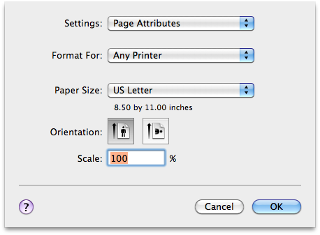
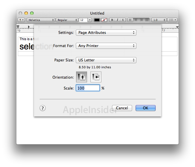
The standard print sheet also demonstrates the more square and conservative use of Aqua highlights used throughout the interface (with the help button now lacking a purple fill).
The screen shots below also show another new feature of Lion: screen shots of a drop down sheet now include the window they are connected to, rather than just capturing the sheet itself.
 AppleInsider Staff




 William Gallagher and Mike Wuerthele
 Christine McKee
 William Gallagher

 Malcolm Owen
 Marko Zivkovic


 Wesley Hilliard