Mac OS X 10.7 Lion to add Office file viewing, new text and signature annotation
 AppleInsider Staff
Mac OS X's Preview app originated as a way to view graphics and PDF documents without needing to install third party Reader software from Adobe. Apple has continuously made minor improvements to the app, and Lion's updates reflects the overall goals of the new operating system.
For example, Preview is now a Full Screen app, and it also drops its nonstandard "bubble" toolbar icons reminiscent of Mail.app to adopt the new squared-off, monochromatic iPad-like buttons of other Lion apps (including the new Mail).
Expanded Previews
A key new feature of Preview is the ability to open and preview Microsoft Office documents, sparing users from having to obtain and install Office or iWork just to play a slideshow or work with spreadsheet. In Lion, Preview is now the default app for presentation and spreadsheet documents until you install something else. Word documents continue to default to open in TextEdit.
The new support for Office documents appears to connected to Quick Look, which already previews Office documents from the Finder. In Preview, documents that can be viewed in Quick Look can be opened in a fixed window, or even Full Screen for quick reference via Mission Control, something the temporary Quick Look window can't do.
Documents opened in Quick Look now sport a button that launches Preview and opens the document for more permanent perusal, changing the app from being just an Adobe Reader substitute into a full fledged, general purpose document viewer.
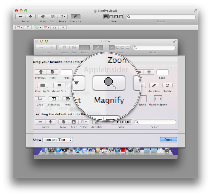
A new Magnifier tool in Preview works similar the loupe in Aperture, blowing up an area of graphic files for closer examination.
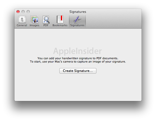
Enhanced PDF annotations
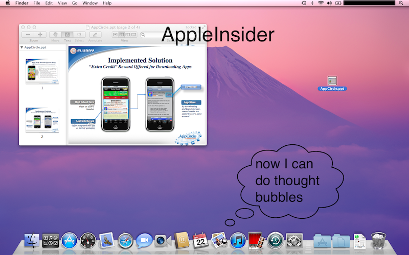
Creating annotations on PDF documents is also significantly expanded in Lion's Preview, with annotation tools now presented in a more sensible (and iPad-like) location below the toolbar, rather than at the bottom of the window. In addition to simple text, colored lines, arrows and rectangles or circle outlines, Preview now supports filled shapes, outlined text, and cartoon-like speech or thought bubbles.
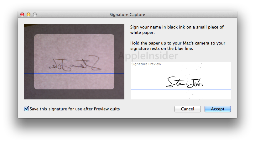
Another new annotation feature is the ability to capture and add a handwritten signature. From preferences, Preview allows users to hold up a handwritten signature that is captured by the system's camera to yield a line art signature that can be digitally added to PDF documents.


 Andrew Orr
 Sponsored Content
 Malcolm Owen

 William Gallagher
 Mike Wuerthele
 Christine McKee