Windows 8 design to radically depart from Mac OS X Lion
A new blog entry by Steven Sinofsky, Microsoft's president of its Windows Division, indicates that one key element of Windows 8 will take the new release in a very different direction than Apple's outline for Mac OS X.
Sinofsky detailed his thinking behind changes planned for Windows Explorer, which is roughly analogous to Mac OS X's Finder.
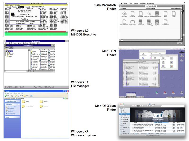
A history of Windows file browsing
The Windows file system manager originally appeared as "MS DOS Executive," which exposed DOS commands in a graphical environment with little similarity to the icon-centric Mac desktop.
As Windows began to grow in popularity, Microsoft created an embellished graphical representation of the file system with File Manager. Then, as web browsing became popular, Microsoft brought a browser-like interface to the file system, renaming File Manager as Windows Explorer, complete with a URL-like address bar and prominent back button.
Microsoft has incrementally incorporated Mac-like interface elements in Windows Explorer, with icon-centric file browsing that links documents to their preferred application. Particularly since the release of Mac OS X, Microsoft has incorporated a similar user environment focus that presents the user's documents, pictures, music and videos rather than just a raw window into the root file system.
Windows 8 Ribbonized
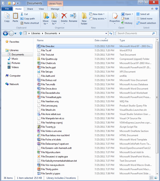
However, Microsoft's biggest changes in Windows 8 will be an Office-like Ribbon that presents all the major functions in a tall, window-wide control bar. This marks a radical change in thinking compared to Apple's increasingly minimalistic interface in the Finder, which limits the default buttons to a grouping of view options, a new sorting feature in Mac OS X Lion, a Quick View button, an Action button, and a search field.
Microsoft's Windows 8 Explorer presents 19 visible buttons in five categories, and that's just the Home tab. The Ribbon also supplies four other tabs, which function similar to the Mac's main Menu Bar. Sinofsky explains, "The Home tab is the heart of our new, much more streamlined Explorer experience. The commands that make up 84% of what customers do in Explorer are now all available on this one tab."
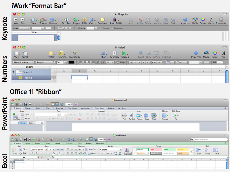
Microsoft's Office Ribbon design is so different from the Mac environment that the company had to create a hybrid version of Office for Mac to adapt portions of the Ribbon concept into a window that Mac users could relate to. Apple's own design for iWork similarly takes a very different design path to present a limited number of default toolbar buttons. along with a strip of contextual controls (contrasted below).
Outside of the graphical interface, Microsoft's design goals for Windows 8 also mark a new era of computing centered around mobile devices such as tablets. Existing Windows 7 apps won't run on future ARM-based tablets, but a new secondary environment of web-based apps will, something Microsoft hopes will enable Windows to remain relevant even as the conventional PC market has plateaued and begun to shrink globally.
Apple sandboxes the file system
Apple's design direction for Mac OS X has opted to incorporate a variety of design elements originally created for iPad, including a simplified, window-less Full Screen mode for apps; limited and simplified control buttons in toolbars; an increasing use of touchpad gestures; and a new security model that encapsulates apps and their documents in a private sandbox.
Apple's iOS originally appeared on the iPhone without any "file browser," and even the latest version works hard to avoid any exposure of the underlying file system, despite supporting document-centric apps like iWork. Apps on iOS simply can not present a global view of the underlying filesystem, because all they can see is their own sandbox.
Apple's iCloud similarly reduces the exposure of file system, replacing MobileMe's iDisk with a new Documents and Data feature that secures an app's files and data from access by malware while making the user's files (and any changes) easier to manage across various devices.
Future versions of Mac OS X will likely continue along the same path, focusing upon self contained apps that create files, rather than a wide open file system (and the security issues related with having any piece of user-level software capable of accessing or wiping out any files in the local user folder).
Apple has demonstrated a mechanism for Mac OS X and iCloud that will allow apps to access other files, but only with the explicit permission of the user, adding a new level of per-app security that goes beyond the last decade's user-level security permissions.
 Daniel Eran Dilger




 Malcolm Owen
 William Gallagher and Mike Wuerthele
 Christine McKee
 William Gallagher

 Marko Zivkovic


