Apple rolls out updated iOS 6 beta App Store with 'Chomp' inspired layout
The new App Store made available to developers running the upcoming iOS 6 sports a redesigned look based on app cards or tiles rather than the list view seen in iOS 5. Apple appears to be implementing some of the features acquired from its recent purchase of app search engine Chomp, which had a similar tile interface.
It should be noted that Apple appears to be actively tweaking the software, and any features described at the time of this writing may not necessarily be active when the product is introduced to the public later this fall.
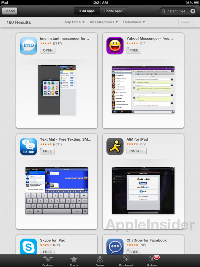
Versions of the app for both the iPad and iPhone received minor visual enhancements like UI color changes and relocated buttons, the most significant upgrade comes in the store's search utility. With the iPad, searches now bring up a number of large tiles that allow for an app's name, rating and screenshot to be displayed. The current iOS 5's App Store only displays an app's icon, rating, and a few lines of text including the app name, which is truncated if it surpasses 25 characters.
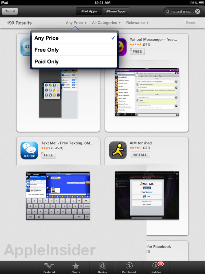
Certain buttons and drop-down menus have been relocated as the new layout doesn't show iPad and iPhone apps on the same page, instead moving the "Device" selector to the top UI bar. Below the "iPad Apps" and "iPhone Apps" toggle buttons are "Price," "Category" and relocated "Relevance/Release Date" filters.
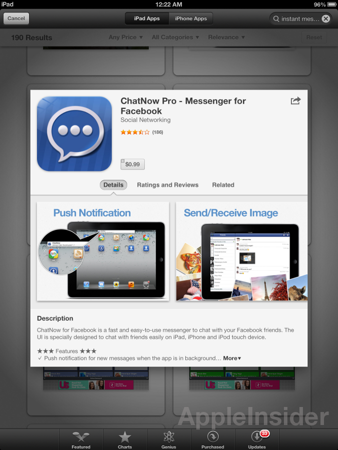
When an app is selected, a pop-up appears over the app tiles instead of switching to a new page as in iOS 5. The window features a more intuitive and compact design that, unlike the current full-page layout, combines Details, Ratings and Related app information with user-selectable buttons.
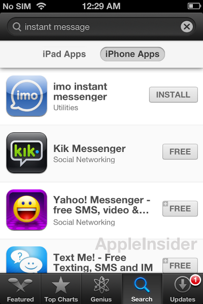
As for the iPhone, the App Store's layout has also been revamped, with the Categories button moved from the bottom bar to be integrated into search results. Perhaps most notable is the ability to search for both iPad and iPhone apps, however the function remains unclear as apps coded for Apple's tablet are incompatible with handsets.
The iPhone's App Store design appeared to be in flux, however, as the software was returning tiled search results earlier in the day only to be replaced by the regular scrollable list at the time of this writing.
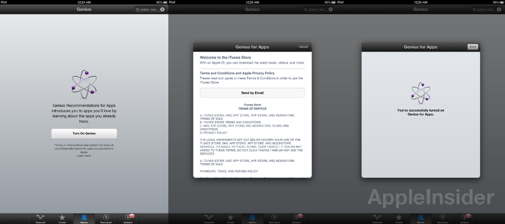
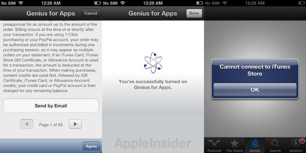
Finally, the Genius search option is back for iOS 6 beta users, however the service isn't yet fully functional. Currently users are relegated to agreeing to Apple's terms and conditions before being sent back to the "Turn On Genius" landing page.
Overall, the look and feel of the new App Store is more of an evolution rather than a revolution, and the new tile system is sure to spark controversy among users accustomed to the traditional list layout. However, the changes are substantial enough to give the store a more put-together appearance worthy of a new OS launch.
Apple is widely expected to debut iOS 6 alongside a much-rumored next-generation iPhone at a special event on Sept. 12, to be followed by a U.S. rollout on Sept. 21.
 AppleInsider Staff






 William Gallagher
 Andrew Orr

 Sponsored Content

 Malcolm Owen



 Mike Wuerthele