Apple turns on App Store Genius recommendations for developers
 Mikey Campbell
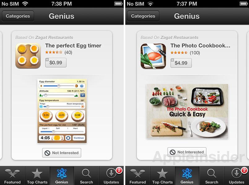
Apple rolled out a revamped App Store for iOS 6 beta on Friday, though at the time it appeared to be a work in progress as Genius recommendations weren't yet activated and the "Chomp-inspired" layout seen on the iPad version had yet to make its way to the iPhone.
The company has apparently made some changes over the weekend, as Genius is now live and iPhones running iOS 6 beta are consistently seeing the tiled user interface styled after Apple-acquired app search engine Chomp. Previously, the iPhone's App Store would switch between the traditional list view and the new tile-based system.
With Genius for apps, users can browse through apps based on previous purchasing history just as in iOS 5, however the new implementation adds a "Not Interested" button to refine results. It is not yet clear how the new feature will work because it is inactive, however the method could be similar to the current "Swipe to Delete" option.
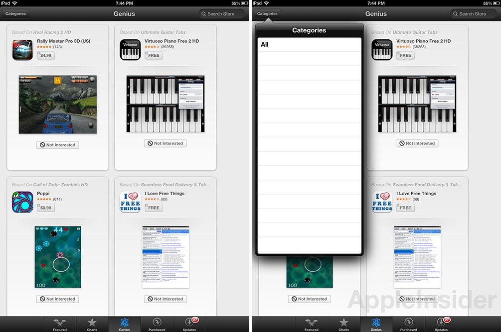
Genius takes the place of "Categories" at the bottom of the App Store's UI, a metric that is now included as a sorting method for recommendation results. For now, the only category available is "All," though it looks as though more comprehensive functionality will be provided when the app launches this fall.
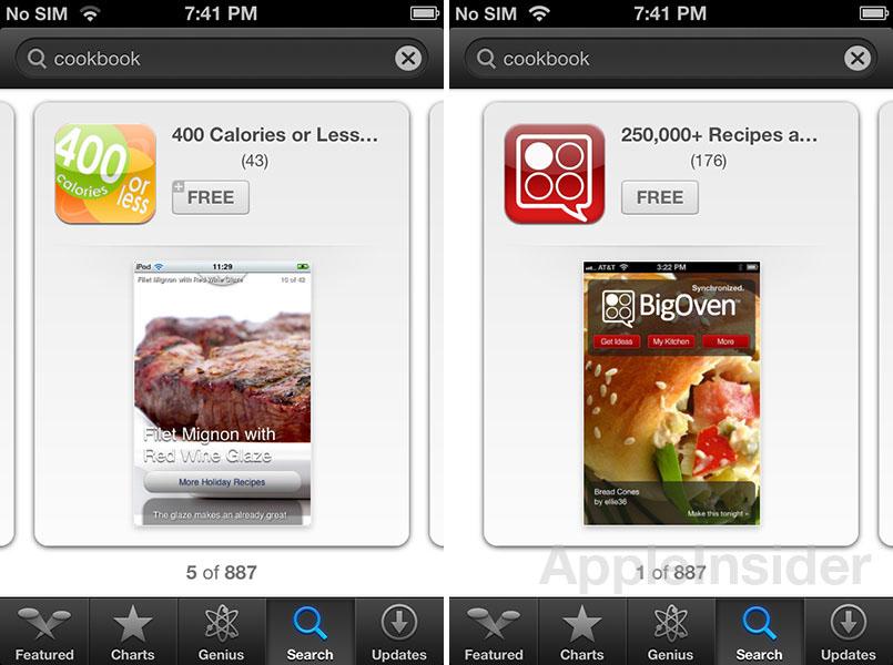
The Chomp-style tile layout first seen last week on the iPad version of the App Store is also being used on the iPhone, with the large, nearly full-screen tiles offering bigger icons and app images. It doesn't appear that any new information is offered with the interface besides the addition of a screenshot, bringing into question the system's functionality compared to iOS 5's list view. The feature is implemented across the entire app, as seen below in the store's "Search" function.
Apple is widely expected to debut the next-generation iPhone running iOS 6 at a Sept 12 special event with U.S. shipments to follow on Sept. 21.


 William Gallagher
 Wesley Hilliard
 Andrew Orr

 Amber Neely