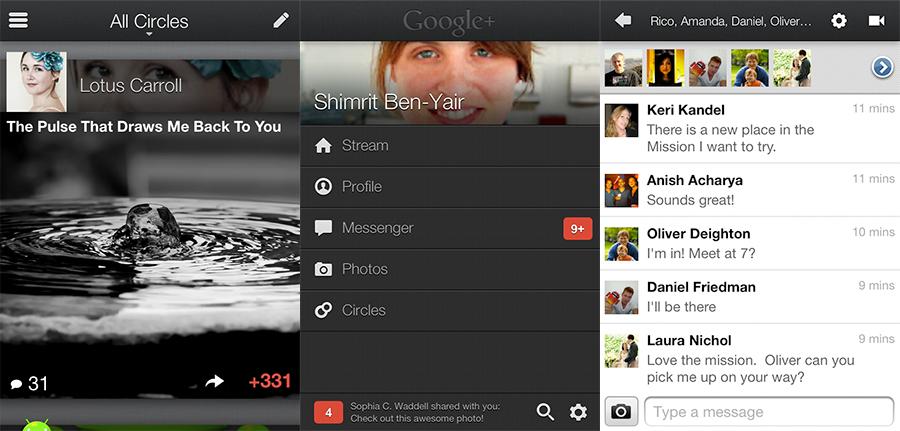
Google updated its Google+ social networking app for iOS on Wednesday, combining significant design changes under the hood with a more integrated user interface experience.
The Mountain View-based company's playful naming scheme continues with Google+ version 2.0.0.5888 and while the service's main features like Circles, photo galleries and Messenger remain unchanged, the overall UI has been noticeably reworked.
The revamped iOS app reflects a design inspired by the recently-renovated Google+ web destination, which the company says is a step in the direction of a "simpler, more beautiful Google." There, as with the new app, layout is defined by soft lines and curves, clean text and an emphasis on media.
Perhaps the most prominent feature of the iPhone-only program is its depiction of photos in the smooth-scrolling post stream. As a user moves past one entry, the next "falls down" in a dissolve-in animation at the bottom of the screen while pictures from the current post, called "full-bleed photos" by Google, occupy most of the display's real estate.
Copious use of gradients and other visual tricks comprise the main stream page while more basic tap-and-swipe lists are arranged in categories to take care of data organization. Rounding out the app are backend improvements and smaller UI tweaks like button placement and fonts.

Google+ for iOS post stream (left), contents page (middle), and Messenger (right). | Source: Google
Interestingly, Google rolled out the iOS version of Google+ before launching the app on its own mobile OS, though the company's Senior Vice President of Engineering Vic Gundotra said that the "Android update is coming in a few weeks (with a few extra surprises)." The iPad is still left without a native version and there was no announcement made as to whether a universal iOS app is being developed.


