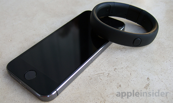
Nike's second-generation FuelBand makes progress toward a more complete activity monitor, including support for Bluetooth LE, an improved accelerometer, increased durability and a new iOS app.

This is the third in a multi-part review series featuring fitness monitors and activity trackers. Over the coming weeks, AppleInsider will offer pros and cons for a number of upcoming devices, as well as those currently available.
Design
On the outside, the FuelBand SE is nearly identical to its predecessor. The rigid bracelet form factor carries over, as does the rubberized outer shell and one-button user interface.
The only visible changes from the original FuelBand are flourishes of color found on circuit board and battery access panels, which can't be seen when worn, and highlights on the buckle mechanism. Nike offers the SE in four colors: a neon green dubbed "Volt," Pink Foil, Total Crimson and black. The company recently announced a limited edition run of "METALUXE" colors that replace the clasp and screws for colored metal versions, the first of which will be rose gold.

Nike's FuelBand is what we would consider a medium-sized activity monitor; not the thickest we've seen, but not as unobtrusive as competing products like Jawbone's Up line or Misfit's Shine. Weight is not a factor, but the band sticks out from the wrist enough to catch the occasional bump or scrape.
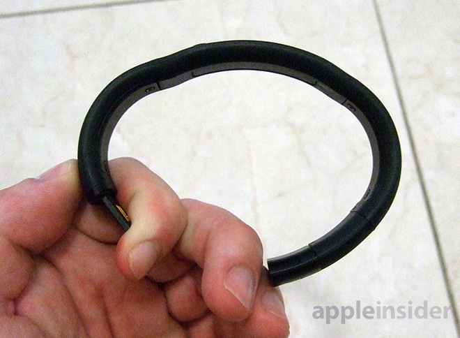
Like the first-gen unit, the SE is mostly rigid to protect sensitive electronics like the matrix of LEDs hidden beneath the rubberized face. The internal circuit board has two flex points for taking the device on and off, while a thermoplastic elastomer/polypropylene shell shields the device from minor abrasions and keeps it water resistant.
Unlike the Shine, which we reviewed last week, the FuelBand SE is not waterproof. Nike claims the device has been made more water resistant compared to the original FuelBand, but notes it is not waterproof, so no swimming or water sports.
Because the FuelBand is rigid, Nike makes the unit in three different sizes, each of which come with two spacer links that connect to the clasp for further refinement. Nike's size chart is somewhat confusing, but the company suggests users buy a smaller band if they are between sizes. Adding the provided spacers changes the FuelBand's oval shape somewhat, though not to the point of being uncomfortable. In testing, we used the smaller insert, which shifted the display slightly toward the side of our wrist, forcing us to turn the unit manually when checking Fuel levels.
Charging is accomplished via a male USB plug integrated at one end of the clasp. The contacts are marginally protected when worn, though the housing is not watertight.
In use
One of the SE's main draws is its display, which consists of 100 white LEDs and a row of 20 multi-colored LEDs. The array is bright and vibrant, with an integrated ambient light sensor that automatically adjusts for fluctuations in lighting. We found the display to read well, even in bright sunlight, though some indicators were difficult to distinguish when running due to their small size.
When the lone tactile button is depressed, Nike's FuelBand defaults to a Fuel earned view. A short animation scrolls the word "Fuel," then displays the corresponding number above a row of colored LEDs meant to represent a fuel gauge. Depending on how much Fuel has been accrued, the LEDs will light up from red to yellow to green.
Like its predecessor, the SE "gamifies" working out by assigning "Nike Fuel" based on a user's movement. The metric might as well be arbitrary, however, as it's difficult to determine exactly what exercises are needed to gain Fuel. Unfortunately, the only solid numbers available for review are steps taken and estimated calories burned.
In our step count testing, we found the SE's accuracy to be on par with competing products, with seemingly identical calories burned algorithms calculated by height, weight and age. Interestingly, a side-by-side comparison with the first-generation FuelBand yielded slightly different rates of Fuel accumulation. There are a number of possible answers as to why the two devices are out of sync, one being the SE's supposedly more advanced accelerometer.
As for activity tracking, the SE builds upon its predecessor by adding tags, dubbed "sessions," which can more effectively monitor and log various sports. Pressing and holding the button for three seconds will activate the feature, while users can go into the app and retroactively assign a sport and intensity to the session.With the FuelBand SE, Nike introduced "sessions" tagging for specific sports, which measures intensity by calculating Fuel per minute.
Each tagged session monitors the intensity of a given workout in Fuel accumulated, earned Fuel per minute and elapsed session time. These metrics are also displayed automatically at the end of every session and are stored in the app. Overall, we found tagging to be quite useful, especially when viewed as a graph on our iPhone that breaks down each session in easy-to-read numbers.
Nike claims the new SE features sleep tracking capabilities, something the original FuelBand lacked, but in reality the system merely counts sleep time and Fuel as a session. Without metrics like deep sleep versus light sleep, it would be more appropriate to call the function a sleep timer.
The latest FuelBand also has an alert called "win the hour," which reminds users to move for five minutes each hour, a feature similar to one found with the Jawbone UP, but is a bit different in practice.
Each hour the FuelBand activates its large LED array with a message that scrolls across the display three times, in our case "GO MIKEY." An animation then lights up the 20 Fuel LEDs as well as 20 white LEDs before displaying the current Fuel level. The first red LED on the fuel gauge blinks repeatedly until movement is detected or the alert is canceled with a button press.
While a good idea in theory, the hourly reminder may go unnoticed as Nike's device does not have a vibration motor. For our purposes (sitting and typing while at work), the alert is sufficient as we are in constant sight of our wrists, but the LED-only alert could be hard to notice for people not tied to a computer. In such cases, the iPhone can be set to vibrate, or the option can be turned off to save battery life.
We found the SE's rigid structure to be slightly uncomfortable, especially when typing. The band doesn't feel as form-fitting as comparable devices. Overall, the FuelBand feels like an uncomfortably fat bracelet that gets in the way of daily work activities. For a device that is supposed to be worn at all times, the design could be more forgiving.
Cycling through the SE's functions is a one-way process activated by the tactile button. The system is responsive and we found only a slight hint of lag when moving through the menu hierarchy. With the new device, Nike has instituted a quick clock view that lets users check the time with a double-press.
The Bluetooth functionality worked as promised, syncing automatically without user intervention. There were a few times when the app couldn't connect to the FuelBand, and the app randomly logged us out without warning more than once, but overall connectivity was above average. With the new Bluetooth module, battery life was lacking with a charge needed every three days or so, depending on usage.
The app
When Nike launched the FuelBand SE, it released a revamped app to take advantage of the new built-in features. The title is polished and easy to navigate, with touch gestures used throughout for an organic experience.
Because the SE comes with support for Bluetooth 4.0, the device can keep app stats up to date in near real time without substantially hurting battery life. Syncing is also done in the background, meaning no more forced syncs with the app.
From the main "Today" screen, users can view a graphical readout of activity levels throughout the day, which are presented as earned Fuel. The line graph also displays session tags, which can be linked to their respective sports from the activity menu. A large gauge tells users how much Fuel they earned, as well as how much is left to meet their predetermined goal.
At the bottom of the Today screen is a drawer of swipe-able stats that show progress compared against previous days' averages, as well as against other users of the same age. Nike's "Capture the Moment" social media integration can also be accessed here. The app has hooks in Facebook and Twitter, as well as the Nike+ network, for sharing of stats, reached goals and challenges.
Moving to the Activity screen, more graphs show Fuel per day, week, month and year, complete with averages and comparisons against historical user data. For example, the app breaks down Fuel by Late Night, Morning, Afternoon and Evening time periods. Scrolling down shows the number of sessions for a given time period, data from the sleep logger and more.
Sessions get their own page, which can be used to tag activities, edit times and intensities and view past data for a quick progress check.
As part of its "gamification" of exercise, Nike doles out awards for reaching certain milestones, like hitting a Fuel goal 30 days in a row. These digital rewards are shown off in the Trophies page, which also shows achievements and goals yet to be unlocked.
Conclusion
The Nike+ FuelBand SE is one of the more mature activity monitors on the market and it shows. Accuracy is good and the unique Fuel accruement system is a motivator for those looking to get more active.
The display, while sporting an identical layout to the first-gen model, is one of the best on the market, with bright LEDs easily readable in sunlight.
While the accelerometer is accurate, we would have liked to see additional sensors packed in for altitude readings. Software enhancements like a true sleep tracker would also be welcome improvements. For more advanced users, simply recording steps and sessions is likely not enough to warrant the $150 price tag.
We appreciated the changes that were made, however, an example being "win the hour" reminder alerts and the major iOS app revamp.
In the end, though, these tweaks were mostly software related. The only major hardware improvement over Nike's original FuelBand is the inclusion of a Bluetooth LE module for automated, power-efficient syncing.
It should also be noted that the first-gen FuelBand recently received a firmware update containing many of the SE's functions, including support for tagging sessions, double-tap time checking and advanced tracking algorithms.
For many who already own the first iteration, the FuelBand SE is not worth the upgrade. On the other hand, people already invested in the Nike+ ecosystem who don't have the original, or those interested in a solid performing all-around monitor, should give the SE a look.
Outside of Nike, the Nike+ FuelBand SE is currently an Apple Store exclusive and can be purchased for $150.
Score: 3 out of 5
Pros:
- Intuitive user interface
- Convenience of Bluetooth LE connectivity
- Bright display
Cons:
- Basically same model as last year
- Rigid design may take getting used to
- Mediocre battery life