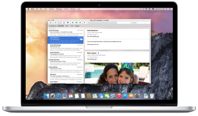
Apple on Monday posted to YouTube a promotional video showing off the graphical changes OS X 10.10 Yosemite will deliver when the operating system launches this fall.

Titled "The New Look of OS X Yosemite," the short minute-long clip highlights a few major changes made to Apple's upcoming OS, including flatter iconography, retooled system text and transparencies. Apple CEO Tim Cook first presented the clip at the Worldwide Developers Conference keynote last week.
The clip starts out with Yosemite's new "traffic light" window buttons, which are now devoid of skeuomorphic shading. Aside from the graphics tweak, the familiar green button previously assigned to enlarge Finder windows is now a toggle for full-screen viewing.
From the video's annotations:
We reconsidered every element of the Mac interface, large and small. The result is something that feels fresh, but still inherently familiar. Completely new, yet completely Mac.
Yosemite's new dock is also featured, with a run-through of icon changes made to Apple's standard apps like Safari, Mail, Calendar, Notes and more. A few select apps are shown off in detail, including Mail, Messages and Calendar, each featuring extensive use of transparencies that Apple says adds depth to the desktop OS.
AppleInsider is taking an in-depth look at Yosemite, as well as the upcoming iOS 8, in a first look series highlighting the operating systems' most anticipated features.
