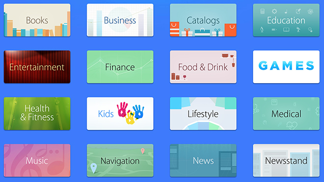
Apple on Thursday announced a new App Store feature called "Browse by Category" that allows users to navigate to different curated app collections without the need for drop-down menus.

The new feature is basically an alternative user interface to the usual drop-down category menus seen in the current Mac and iOS App Stores. Now, instead of selecting from a text list, users can choose categories by clicking or touching an icon.
As seen above, the new method is perhaps aimed more toward touchscreen device users than Mac owners, with large easy to select category graphics displayed in a grid layout. Browsing the Mac App Store via the usual drop-down method is more efficient as the traditional list view was designed for larger screens and mouse control.
The "Browse by Category" option is now a featured card on both the Mac and iOS App Stores alongside other curated collections like App Store exclusives and individual showcased apps. By effectively breaking off the Categories menu, which is still available in drop-down form near the search bar, Apple is possibly looking to boost app discovery.
The company has been pushing for more intuitive and interconnected App Store navigation for some time, though the last major change came in 2012 with the integration of Chomp-style app cards.


