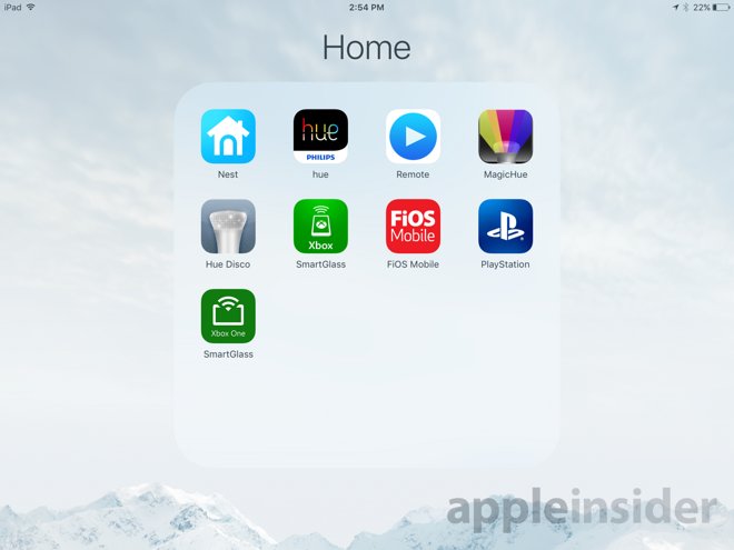
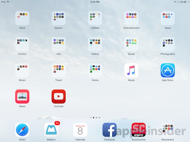
In another move intended to take advantage of greater screen real estate on the iPad, folders iniOS 9 are now a larger four-by-four design, accommodating 16 apps per page.

Upon installing iOS 9, users will find that all folders on their home screen are now automatically displayed in a four-by-four square. Previously, folders were shown three-by-three on the iPad and iPhone alike.
The new, larger design accommodates 16 applications per app page on the iPad, compared to just 9 on the iPhone.
The change represents yet another iPad-specific design tweak implemented by Apple, intended to utilize the larger 7.9- and 9.7-inch screens found on the iPad lineup. In previous years, annual improvements to the iOS platform were largely the same on both iPad and iPhone.

Many of the other iPad-specific changes found in iOS 9 focus on productivity, including a new slide-over feature that will allow users to quickly multitask on Apple's tablet. iPad Air 2 users will also gain full-fledged split-screen support, allowing two apps to be shown at once simultaneously.
iOS 9 also includes a new iPad-only Picture in Picture mode that allows users to continue watching video with any task. With Picture in Picture, a clip can be shrunk down to three different sizes, and placed into one of four corners on the screen, overlaid over another task. The video can also be temporarily pushed off the screen to allow the user to focus on the task at hand.
Finally, the iPad also gains a number of keyboard-specific enhancements in iOS 9, including new hardware keyboard shortcuts that will give the device more Mac-like functionality. There's also a new cursor-controlling gesture keyboard available on both iPhone and iPad in the operating system update, as well as iPad-specific quick access to cut, copy, paste and more on the iPad in certain apps.