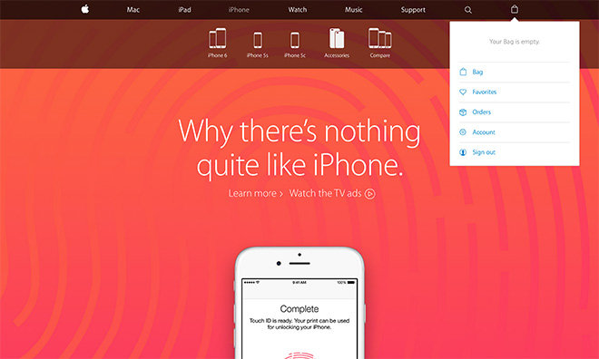
Apple on Thursday made a huge change to the way it handles online shopping by integrating the Online Apple Store with its main Apple.com website, merging the two Web presences into a unified view, adding a persistent shopping bag link and performing slight design tweaks to product pages.

As seen in the screenshot above, Apple's online store is now completely integrated with the company's official website. Major product lines still show up with the usual "Buy Now" buttons, but clicking on those assets adds items to a virtual shopping bag instead of redirecting to "store.apple.com." This makes shopping on Apple's website even easier than before, as customers no longer have to hop back and forth between Apple.com and a separate Online Apple Store.
Individual product landing pages have also been revamped, with sub menus up top directing to device and model information, available accessories and model comparison pages. Each device page's link hierarchy points to older Web assets like the Explore menu, the main difference being seamless integration with Apple's online purchasing system.
While purchase pages for Apple's major product lines like iPhone, iPad and Mac also remain largely unchanged from designs seen on the erstwhile Online Apple Store, accessories are displayed in grid form with links to separate buy now pages. In both cases, the old buy button has been replaced by an "Add to Bag" graphic.
Clicking on the new shopping bag icon located to the extreme right of the navigation bar invokes a drop-down menu with links to user's "bag," favorite items, orders, account information and an option to log out. The icon replaces Apple's "Store" link that sat in the same position for years.
Search has also been revamped with quick links and query handling for four main categories: Explore, Accessories, Support and Apple Stores.


