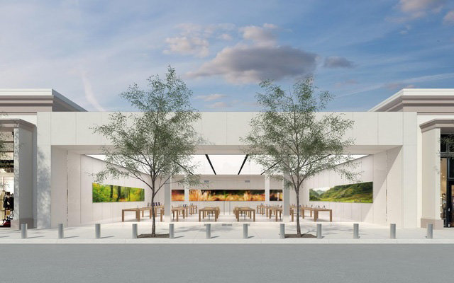
Apple representatives gave local government officials in Tennessee a glimpse at the future of the Apple Store during a recent planning meeting, showing off a design that continues the architectural trends begun with Manhattan's Upper West Side store.

Source: The Commercial Appeal
The new store features floor-to-ceiling glass panels and a roof that appears to be intended, at least in part, to allow natural light to filter in from above. It also includes a lighter natural granite facade and a simplified interior layout designed to show off the product tables from the street.
Apple's presentation to local government officials was first discovered by AppleInsider reader Michael. The quality of the image is the best we could capture from Apple's proposal.
Apple's Upper West Side store in Manhattan was the company's first to move to the more natural look, and the design has since been adapted for other outlets. The recently-remodeled Palo Alto location is one example.
Apple has not abandoned its traditional stainless steel-and-glass look entirely, though. Two high-profile new locations in greater China --Â Canton Road in Hong Kong and MixC in Hangzhou --Â carry a refined version of the more well-known styling, suggesting that Apple may be prepared to move forward with more than one design language.
In the event that Apple does segment its store designs in some manner, they will not be completely disjointed as the two styles do share common elements. The predominantly steel shops sport natural stone interior walls, for example, while the other locations continue to utilize stainless steel as an accent.
Update: Local publication The Commercial Appeal has acquired a higher resolution image of Apple's proposed store.


