If you're fine with Apple's free Calendar app, then BusyCal 3.1.5 is interesting just for its long history, but if you need more powerful features, the app is a strong contender for best-in-class.

The more you use BusyCal, the more you can so very clearly see the sheer depth of experience that its makers have.
Before Apple's Calendar app, before its predecessor iCal, and long before OS X, there was Now Up-To-Date and Now Contact. They were a reason to buy a PowerBook in the '90s.

They were transformative in how well they brought a calendar and an address book to the Mac. Given the dearth of To Do software at the time, they were even powerful with tasks and reminders.
Flash forward a couple of decades and through company buyouts or management changes and the old Now Software firm is long gone. However, the original makers of these two apps are now running a company called BusyMac and they have two apps: BusyCal and BusyContacts. While we're only looking at calendar software here, the integration between these two is as exceptional as it was between the two Now products.
The integration could be better between two platforms, though: BusyCal on Mac and iOS can't recognise when you've responded to an alarm on one. So if your iPhone has given you a notification of an event, the next time you get back to your Mac, BusyCal for macOS Sierra will have the same alert up on screen.

Every other calendar app that's currently available is built around Apple's engine, the part of macOS Sierra that handles dates and calendars. Even the most powerful ones use that and it's a great thing because it means you can try Fantastical today, BusyCal tomorrow, Pocket Informant next week and just swap between them. There's no importing and exporting of calendar information, no chance of you losing an appointment.
The makers of BusyCal didn't need Apple to show them how to make a calendar, though, so while it does use the same central system as the rest, it's still got some of its own calendar engine. This business of alarms not syncing across platforms when you've tapped a button is an unfortunate consequence of the third party engine. What's a fortunate consequence, though, is how those alarms work when you get them.
BusyCal's alarms are simply more feature rich: you can more easily snooze an alarm for any amount of time you choose, for instance. It's like BusyCal's alarms are more aware that you're, well, busy, so it reminds you of things, but will do as it's told if you want to delay something.
The app is also more conscious that we don't all work in offices all day. If your job is outside or in any way relies on weather conditions, then BusyCal is easily the best choice: it will display weather information for every day ahead that it can.
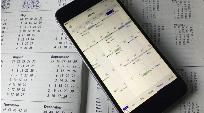
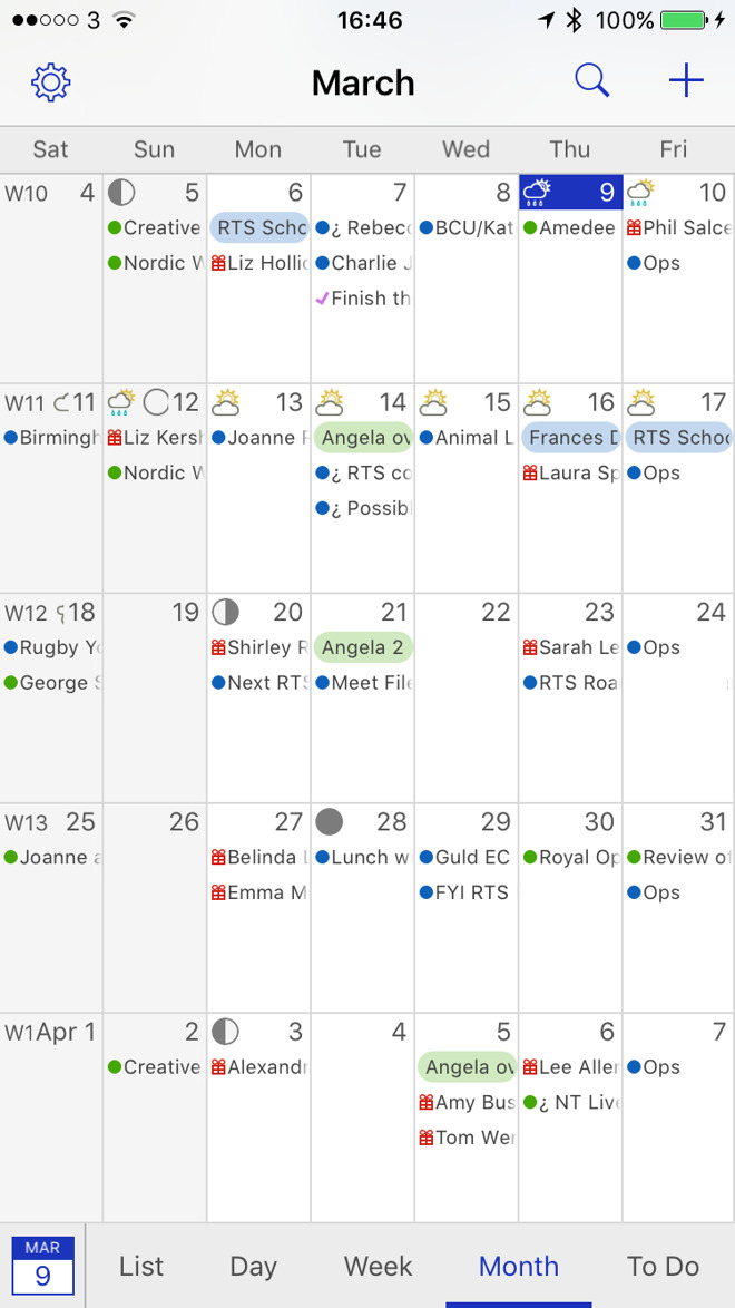
We believe that it's BusyCal that introduced and implemented the idea of breaking away from the traditional kind of calendar you might put on your wall. Instead of showing you a month at a time, it shows you about four weeks - but starting from the current week. If you ever do want to see something before this week, you can scroll, but you never will. You always want to know about today and what's next, so this isn't just good, it's the way things should be.
All calendars should be like this and actually both of BusyCal's different versions should too. At the moment, this feature is just on the iOS app, not on the Mac. That can't be for any technical reason, though, as Fantastical is the other way around: it does this on the Mac but not iOS.
Both Fantastical and BusyCal have one feature that on its own is worth switching from Apple's. It's the ability on the Mac to call up the calendar and start writing in an appointment from wherever you are. So that when the phone rings, you answer while tapping a couple of keys and there you are in your calendar.
Both calendar products do this via a menu bar app, but once again you can see the result of a long development - it's just that this time it's visible in Fantastical. Where Fantastical's menu bar app is really a full-featured calendar because that was what Fantastical began as, BusyCal's one is more bare bones. You can't change which calendars you see right within the BusyCall menubar app, for instance.
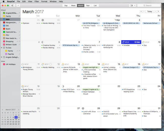
However, BusyCal arguably has the handier display of your month. Instead of dots marking days that have events on, BusyCal has a bar which widens according to the number of scheduled appointments. In general that difference is just a matter of taste except when you have all-day events: Fantastical will still show only one dot where BusyCal will show a complete bar across the day.
It's one point where the visual design of BusyCal works well. Overall, though, the one disappointing result of BusyCal's long history is that in some ways it still looks like Now Up-To-Date from the 1990s.
That only gets worse if you do elect to have weather information and BusyCal pops icons into each day of the month view. It gets even worse if you're still using your calendar for reminders.
The month view on BusyCal on Mac and iOS can get quite overwhelmed with detail and it's just not displayed with the same design skill as in rival Fantastical. Of course design is not how something looks, it's also very much how something works. There BusyCal actually makes some strides because it has a clear list view of events which shows days that are free as well as those that have events.
On iOS it's also got a bottom row of buttons for switching quickly between the Day, Week and Month view where something like the otherwise very good Calendars 5 needs more tapping. There's no tapping needed in Fantastical but you have to learn where to swipe when you want to change views in that.
So it's not that BusyCal looks bad or is hard to use, it's more that it doesn't look so good that you enjoy using it all day. Mind you, the app is built to make entering events as quick as it can and to make looking up existing appointments or searching for free time as swift as possible.
The company BusyMac hasn't produced an Apple Watch version of BusyCal that might mean you use the main app less often. However, it has produced these extra-detailed alarms so that you can see what's coming up without having to go into the app.
Consequently the look and feel could be better but you're never going to be in the app for long enough at a time to be that concerned.
BusyCal 3.1.5 requires OS X 10.11 or higher and costs $49.99 if you buy it on its own. You can get it from the Mac App Store, but you're better off buying it direct from the developer as that will get you update deals in the future and a discount deal on BusyContacts right now. BusyCal and BusyContacts for Mac are each $49.99 but you can buy them together in a bundle, just like the old Now Up-To-Date and Contact, for $79.98.
There's no bundle on iOS because unfortunately there is no iPhone or iPad version of BusyContacts as yet. Instead there is solely BusyCal 3.1.2, which requires iOS 9.0 or higher and costs $4.99 on the App Store.