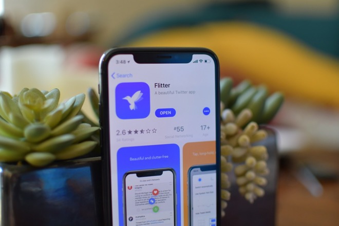
Flitter is a new minimalist Twitter client for iPhone that offers an alternative to Twitter's standalone app, but does it bring enough to the table to unseat leading third-party titles Twitterrific and Tweetbot

Twitter has been making changes lately, notably retiring some API features that could leave many third-party clients losing some major features. Twitter later backed down and pushed back the planned deprecation to a later date. In midst of this, we are still seeing entirely new Twitter apps coming to the App Store, the latest being Flitter.
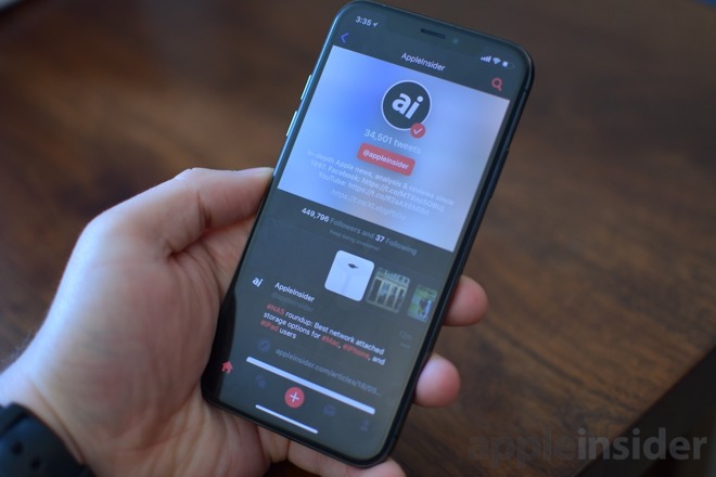
Upon first launching Flitter, our immediate thought was that this could easily be the Twitter client by Apple, if the company decided to create one. It has a clean, minimalistic design with a simple tab bar on the bottom, a trending arrow on the top left, and a search icon on the top right. Other than that, your timeline fills the remainder of the screen, including full support for the iPhone X.
Trending topics, an always handy reference, will by default show popular topics around the globe. A simple dropdown near the top allows you to narrow browsing down to more specific locations, such as trending items in the U.S., or major cities. Using a dropdown seems like an odd choice here, as it can take a long time to scroll through the whole list, especially since it is in no discernible order.

Using the timeline is a bit more cumbersome than other Twitter clients. We love the gesture-based UI seen in Tweetbot that allows you to swipe on a tweet to like, reply, or get more options. Flitter requires you to tap a small ellipses to get to any of those actions. Not a deal breaker, but it's less user friendly.
One of the biggest hangups to Flitter is lack of support for Tweet Marker, meaning it doesn't keep track of where you leave off in your feed. Every time the app is opened, it returns to the newest tweets. We love the way Tweetbot handles this mechanism, especially with iCloud sync to their Mac counterpart.
As far as what the timeline gets right, Flitter handles threaded tweets very well. The specific tweet you are viewing is pushed down, revealing the beginning of the thread above it, allowing you to read top-to-bottom.
If you tap on a Tweet, you get taken to a new page just for that tweet, filled with different actions such as reply, like, retweet and share. Tapping on the profile picture takes you to the profile for the user, another of our favorite designs. Each profile gets a nice clean layout, with the profile picture and banner behind it. There profile description, handle, stats and a media gallery all above their feed of tweets.
Another awesome and unique feature for the timeline is the ability to pinch to screenshot. Anytime you are in the app, just pinch. It will take a screenshot, optionally save it to the camera roll, and populate a tweet with it attached.
Along the bottom is the tab bar with several options: home, mentions, new tweet, messages, and profile. All of these are what you'd expect them to be. Under profile is also where the settings icon lives.
Something we haven't seen before, though, deals with the new tweet button. It is located right in the middle of the navigation bar, just tap and hold on the icon, and it can be moved about the screen. It can be relocated to any of the four corners or a central position at the top and bottom of the screen.
When it comes to actually creating a tweet, there is nothing too exciting. A full-screen editor appears, allowing you to type, dictate, add emoji, @ and # shortcuts, as well as access drafts. For those who like emoticons, you are in luck. Flitter gives you access to a huge list of emoticons right within the app. If you aren't sure what emoticons are, those are characters made out of different symbols and punctuation. Like these: \_()_/ (^^)
Digging into settings, there are a number of helpful options. Options for choosing the app icon you most prefer, locking the app with Face ID or adding multiple accounts. Settings is also where you can select the theme you'd like. They include light, Flitter Dark, and Absolute Dark. Absolute Dark is going to be great for iPhone X users with that OLED display. Instead of picking them yourself, Flitter is able to automatically switch themes based on the time of day.
While playing around with Flitter for the past week or so, we did notice a bit of lag. This includes within the app itself (especially with auto-theme switching on) as well as waiting for new tweets to populate.
Developer Shihab Mehboob promises that much more is coming down the pipeline for Flitter, but right now it feels too under-featured to compete with the likes of Twitterrific and Tweetbot. Both of those other clients not only have excellent iOS applications but Mac applications as well.
Flitter desperately needs Tweet Marker, Apple Watch and iPad support, among other crucial features. It is otherwise expertly designed and even has a few niceties we haven't seen before.
Flitter is available now on the App Store for $1.99.