We've just got redesigned iPads but Twitter wants more. Specifically, iPad owners' wish lists now include a 15-inch model. You can see why, you can wonder how, but AppleInsider talks about the unexpected issues beyond just making a bigger screen.

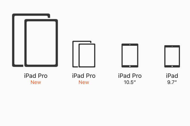
Mockup of an Apple Store larger iPad icon
App developer Stephen Troughton-Smith has followed up last month's correct prediction of new tap detection on the Apple Pencil with more of a hope for a larger iPad Pro. He claims no inside knowledge, he claims no reason to suspect Apple is doing this, but he does claim that it would take the company little effort to make a 15-inch model based on how iOS 12 works now.
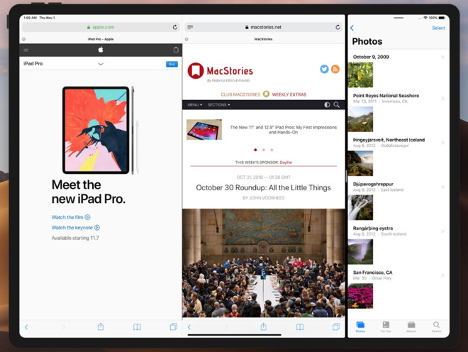
"It turns out that a near-15-inch screen is big enough for Safari on the iPad to be happy with two tabs side-by-side as well as another app," he wrote on Twitter. "It's very clear that you could go to near 15 inches without having to redesign iOS."

Mockup of a 15-inch iPad Pro by Stephen Troughton-Smith
"Software-wise," he continues in the same thread, "everything basically just works already. As a product, I think this ticks all the 'should we do this?' boxes and moves into 'when should we do this?' instead."
Hold on...
That mocked-up image is showing a combination of two tabs in Safari on an iPad plus and a third app in Split View. That app is Photos and it's shown in its iPhone format. When you drag a second app up from the dock, you can choose to have it take up one half or one quarter of the iPad's screen.
If you choose to have the apps share half the screen each then the device attempts to show you them both in their full-size or at least full-ratio. Whereas if you drag an app up and make it a quarter space, the iPad instead displays it as if it were an iPhone app.

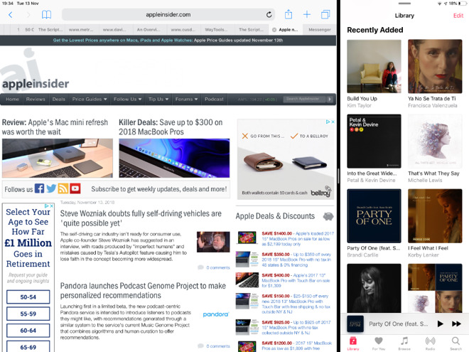
How iPad currently treats a second on-screen app
The app is longer on screen, it stretches further down, but the width is as if on an iPhone.
What Troughton-Smith argues is that with a larger screen you could have one app be in this iPhone-width and Safari taking up the rest of the display. He argues that if you do this, you can further use Safari's tabs to have two full web pages side by side.
Today you can have two Safari tabs open side by side or you can have another app in half- or quarter-split screen. You can't have both.
If you open up two tabs simultaneously in Safari then today they each automatically take up half of the screen. If you then drag another app up from the dock then Safari snaps back to showing one tab.
Interestingly, if you then later dismiss the second app and Safari automatically returns to its full-screen width, then it also automatically restores the two tabs.
Clearly better
No question, then: if a larger iPad would let you have two Safari tabs and an iPhone-sized other app open at the same time, that's got to be better. Especially as you could presumably still have a third app that you open up with Slide Over.
Only, there's just enough wishful thinking here to make it sound plausible before you start wondering about why Apple wouldn't be better making a 18-inch model like Dell did about half a decade ago, or a 27-inch one.
Bigger is definitely better in terms both of being able to work with more information on the screen. Yet, having two tabs open in Safari is hardly the same as having, say, Word, Excel and Safari open.
Two tabs is nice, but likely is not a revolutionary productivity boon. Especially not as although Troughton-Smith talks about Safari being happy showing two tabs side by side and doesn't consider that they aren't full tabs. Both in his mockup and on a real iPad Pro when you choose to open two Safari tabs, you see that the browser has changed what gets shown.
Here's Apple's own site as shown full screen on an iPad Pro 12.9-inch model and next to it is the same same screen as it currently appears when you split a tab. So that you can see the difference more clearly, we've removed the second of the two tabs.
Comparison of clarity and menus: Apple.com full screen on an iPad (left), squeezed into a second tab (right)
The iPad's full-screen version of the site feels as close to being the same as one on a desktop Mac as possible. Whereas the two tabs version switches to the iPhone's navigation bar.
Nobody can realistically predict how Apple would implement split view and tabs on a larger iPad, but Troughton-Smith is arguing that he'd be happy with cut-down tabs in order to get this extra iPhone-sized app. If you're wishing for the ability to work more on your iPad, this seems half-hearted.
Just in case
There is a reason for taking a shot in the dark and saying Apple should make a 15-inch one and not, for instance, wishing for an 18-inch display like on the Dell XPS 18 we talked about before. And it's down to the size of the case.
The old iPad Pro 12.9-inch display was housed in a case that was itself 14.57 inches on the diagonal. If Apple had kept the old case size and increased the screen, the current large iPad Pro could indeed have had a larger display, but just not 15 inches.
Troughton-Smith argues that you could now get a 14.5-inch display into that and he's probably right. A true 15-inch iPad screen, measured diagonally, would also have to have more pixels in order for this to be of any use at all. When the old iPad Pro 9.7-inch model was replaced by the new 10.5-inch one, the screen real estate changed with it. What had been 1,536 x 2,048 pixels became 2,224 x 1,668.
The screen size chart that iOS developers work to
Then, alongside this, there is the fact that all iPads ever made have a screen ratio of 4:3. That's the same as an old-style television picture and compares to 16:9 which is the best for viewing films and newer TV shows.
Apple sticks with 4:3 because it prefers that for apps and web-browsing. The company would most likely to stick with that for a larger iPad too.
Speaking of apps
If all a 15-inch model got us was a two-tab Safari and an iPhone-width second app, it would not be worth it to us -- or to developers.
Apple has famously been easier to design apps for because, in part, iOS doesn't have quite the array of different screen sizes and ratios of Android. Adding a larger iPad would require developers to redesign their apps to fit.
Many or most have just done this to accommodate the iPhone XS Max so it's not like it's a new or a difficult job, but it is another thing for developers to do. Eventually they may stop making apps fit nicely at all, or Apple will come up with some kind of fancy resolution-independent Metal routines.
Only
We would also like a larger iPad. We wouldn't go around mocking up screenshots, but we'd buy one if Apple went larger. We instantly felt the advantage when the original 12.9-inch iPad Pro came out and we could have two apps side by side.
More than size and convenience, it's also made the iPad even more immersive than before. When you're working, say, OmniFocus on a 12.9-inch iPad Pro display, you end up with both your hands on it and it feels like you're kneading bread. You're directly manipulating your work instead of just pointing at it.
Only, you know that this kind of experience comes from the fact that Apple spent a lot of time considering the size of the iPad Pro and it is either doing so now with a larger size, or already has and dismissed it out of hand. It wouldn't come from a Tim Cook shower thought of just slapping on a screen that's vaguely between 14.5, nearly 15, and 15 inches wide because Apple can.
Keep up with AppleInsider by downloading the AppleInsider app for iOS, and follow us on YouTube, Twitter @appleinsider and Facebook for live, late-breaking coverage. You can also check out our official Instagram account for exclusive photos.