As expected, the second beta of iOS 13 and iPadOS contains a number of new features and changes. Here are over 40 that we've pinpointed so far.

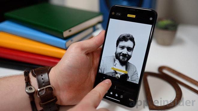
The new High-Key Light Mono Portrait Mode effect in iOS 13 beta 2
The biggest changes
See all the changes for yourself in our hands-on video.
In the second beta, there were a number of higher-profile changes that users will appreciate. For example, the camera app gained two big new features. There is a new Portrait Mode option -- High-Key Light Mono. This effect separates the subject from the background, turns it black and white, and white out the background. Similar to Stage Light Mono, but opposite. The second change is a new slider that allows the Portrait Mode effect strength to be adjusted.
3D Touch also has returned in the second beta. In the original, it seemed all devices -- even those with 3D Touch -- were relying on a long press rather than 3D Touch to fully function. In beta 2, it is quicker and seems to be true 3D Touch once more on compatible devices. Additionally, there is a shorter haptic effect and a very soft click noise when 3D Touch is invoked.

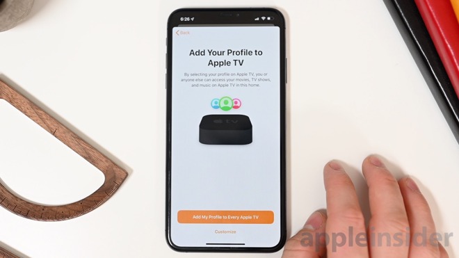
Onboarding profiels in Home app
The Home app received a bunch of minor changes as well as new onboarding screens that explain the new features coming to Apple TV and HomePod such as multi-user support. Many other apps got new welcome screens or tweaks to existing welcome screens.
CarPlay's new Now Playing screen
CarPlay now has the estimated time of arrival displayed on the Dashboard which can also now be accessed by swiping to the side. The Now Playing UI also has been updated to what Apple previewed which shows the album artwork more prominently to the right.
One feature that was in the first beta that wasn't available yet is a new feature to sync the audio with the Apple TV. This is a utility on the Apple TV that uses your iOS device to sync measure the audio and check the delay of your Apple TV audio and correct it. When selected in tvOS 13 beta 2, a card appears on an iOS 13 iPhone or iPad to start the process.
Four new Memoji Stickers in iOS 13 beta 2 include shush, thinking, crossed fingers, and peace sign
Also of note is four new Memoji Stickers with new poses such as crossed fingers and shush.
All the changes
Here is our list of all the changes found in the second beta of iOS 13.
- Calendar search animation comes straight down instead of from the side
- New Memoji Stickers for shushing, thinking, fingers crossed, and peace
- Portrait Mode strength slider
- While editing photos in the Photos app and you select crop, it no longer shows "Reset" until you make a change.
- The rest button that does appear in the Photos app no longer has an icon or a yellow background
- New High-Key Light Mono portrait mode
- New welcome page for Maps introing the new features
- SMB works in beta 2
- APFS formatted drives work now
- New splash screens in the Home app for Apple TV and HomePod
- In HomePod settings within Home app, Updated Listening History toggle is now a menu with "Follow User" and "Never" as options
- Wi-Fi address is back under HomePod settings
- For lights in the Home app, "Status and Notifications" just becomes "Status" because notifications don't make sense
- Scenes and accessories have darker background shade in Home app automation and other panels
- When adding media to Automation, it will show the current state as a label on the menu option "Audio."
- You can also test the audio animations again
- When adding an accessory, text was tweaked from "Don't Have a Code or Can't Scan?" to "I Don't Have a Code or Cannot Scan"
- That button also has a new orange background
- You can now once more "select all" when viewing all inboxes in beta 2
- Voice Control now has an icon when enabled. It automatically dims when the phone does not have your attention
- There is a new sound that chimes whenever you use Tapback in Messages
- New "new note" icon in Notes
- Tapping the ellipsis in Notes now says "Select Notes..." instead of "Select" and also has a cancel button
- When creating a list in Notes, it can automatically move checked items to the bottom of the list
- Reminders' welcome screen has been tweaked. "Type, Talk, or Tap" now reads "Quick Creation" and "Siri also suggests reminders found in Messages" to that category.
- In Reminders, new options when editing a reminder list. Instead of Edit, Add People, List Detail, and Show Completed it has List Appearance, Select Reminders..., Add People, and Show Completed in those orders. List Appearance is the new name for List Detail and Select Reminders... is new instead of Edit.
- Subscriptions show under your Apple ID in Settings
- Send Replies Without Confirmation is now an option when sending a message with Siri
- Can toggle parallax effect in Wallpaper settings
- "Delete Undos Slide" is a new toggle in Settings when using new key board
- New "Show Link Previews" toggle within Safari settings
- Updated CarPlay "Now Playing" UI that was missing in beta 1 with more focus on album art
- ETA now shows on dashboard in CarPlay
- You can swipe left to access Dashboard in CarPlay
- When sharing a webpage in the Safari Share Sheet there is a new option for saving as a PDF or a Web Archive (also automatic)
- 3D Touch now seems to work again
- 3D Touch now has a small noise to go along with it
- Wireless audio sync for Apple TV under Settings > VIdeo and Audio
- New Voicemail icons
- In Music, "Unlove This" becomes just "Unlove"
- New multi tasking Home icon on iPad
Find any other changes? Reach out to us on Twitter @AppleInsider or @Andrew_OSU.
