In an interview following the launch of the iPad Pro, Apple Chief Design Officer Jony Ive discussed his thinking behind the new model's refreshed appearance and features, and when he believes a product can appear magical to consumers.

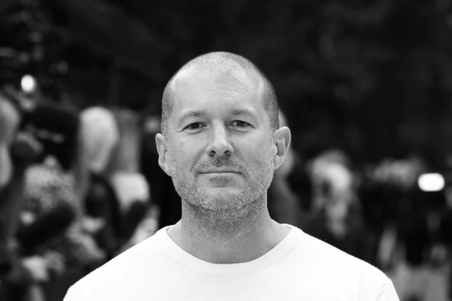
Jony Ive in 2017
Speaking after the introduction of Apple's iPad Pro refresh, Ive explains the new model has one of the elements he has wanted for a long time, namely the ability to orient it any way the user wants. The removal of the Touch ID-equipped Home button and the introduction of Face ID that works in both portrait and landscape freed up the design to make it usable in all directions.
"The first iPad had a very clear orientation which was portrait," Ive advised to the Independent. "It had the ability to be used in landscape, I think very well, but it was pretty clear how the product was designed. And I think with the first iPad you had the sense that it was a product made up of distinct and somewhat separate components."
The new model, Ive notes, doesn't have an orientation, with the plain appearance and speakers surrounding it confirming to users they can use it however they want.

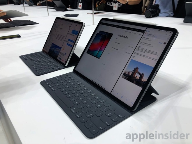
11-inch iPad Pro (left) and 12.9-inch iPad Pro (right)
The curved screen is also highlighted for being different to traditional displays that are "absolutely rectilinear" and have square corners. "What I've always found disappointing is the way that the display is a distinct and discrete component with square corners, assembled into a design that seldom has a square corner," advised Ive.
The radius of the curve for the corner of the display is "concentric with and sympathetic to" the enclosure's own corner. "You feel it's authentic," declares Ive, "and you have the sense that it's not an assembly of the whole bag of different components: it's a single, clear product."
A curved edge found on other iPad models has been changed to a straight edge because "the product had reached the point where the fabulous engineering teams have been able to make it so very thin that it meant we could have a very simple straightforward edge detail," according to Ive. "We couldn't have done that before when the products weren't as thin as this."
On being asked how he designs products that could be described as "magical" by users, Ive admits to loathing the thought of being predictable, but that it is a combination of multiple factors, including the development of new technology over multiple years.
"I think what puts a product in the place where it's described as magical is often about those attributes which are less easy to describe. You can't quite put your finger on what it is," Ive suggests.
Apple Pencil 2
The new Pencil design and the way it snaps to the side is offered as an example of the "magical feeling" he tried to describe. "It's unexpected, we don't quite understand how it's working, and even more incomprehensible is the fact that it's also charging. You can see how that's aligned with this idea that you can just pick the product up and use it without thought."
"Actually, you're using it with tremendous thought," Ive alludes, "but it's based on what you want to be doing rather than wondering if you're holding the tablet the right way up."
In October, Ive spoke in another interview about his work on the Apple Watch, declaring he is "truly proud" of the wearable device. For the latest model, Ive suggested there "will be a more marked tipping point in understanding and adoption" for the timepiece.
Ive has also insisted he will be with Apple for quite some time to come, expressing "the energy and vitality and sense of opportunity" at working for the iPhone producer as "extraordinary and it's very exciting."