Apple's focus on skeumorphism changed a decade ago in iOS 7. Here's why Apple started and stopped using it, how it evolved, and why it's still important to interface design.

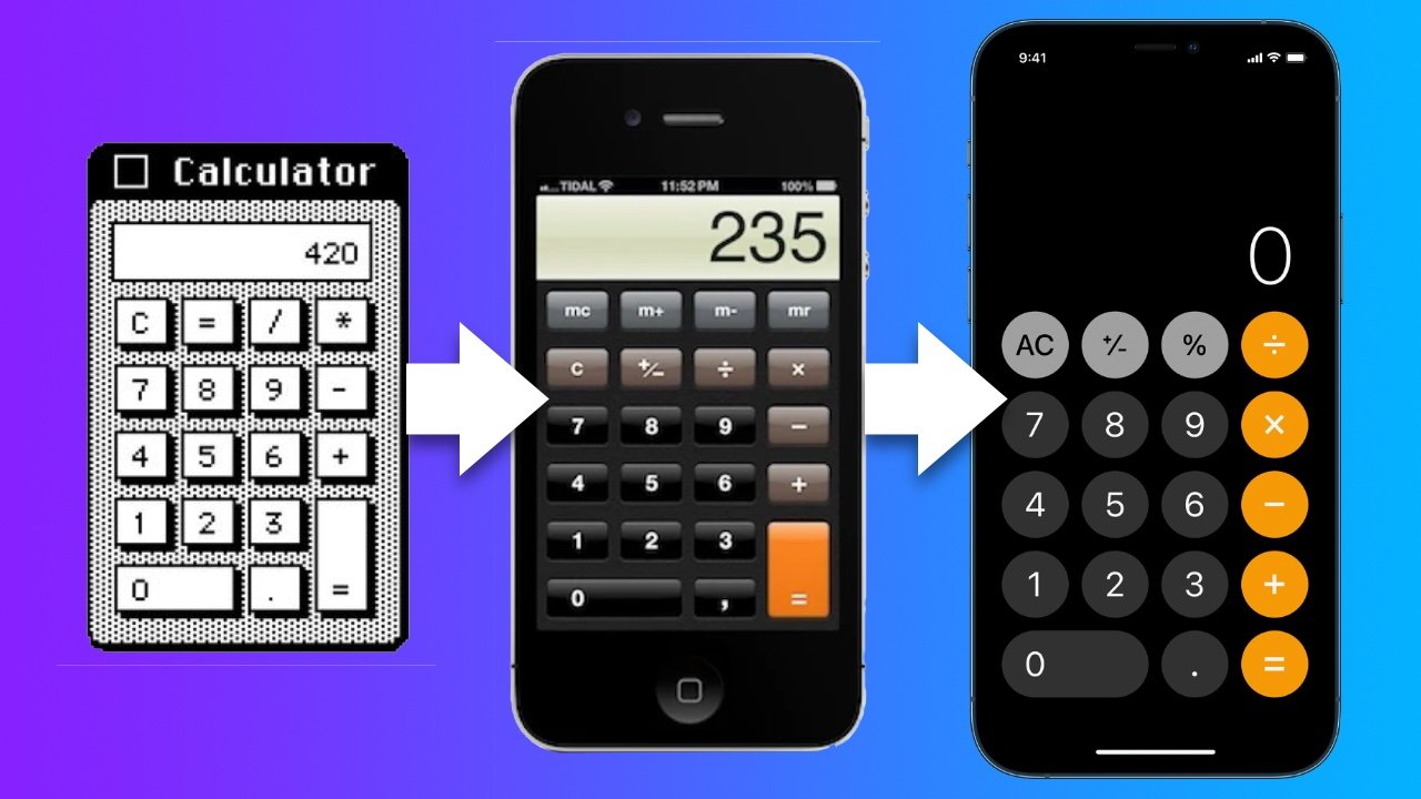
Apple's calculator has had a long history with skeuomorphism.
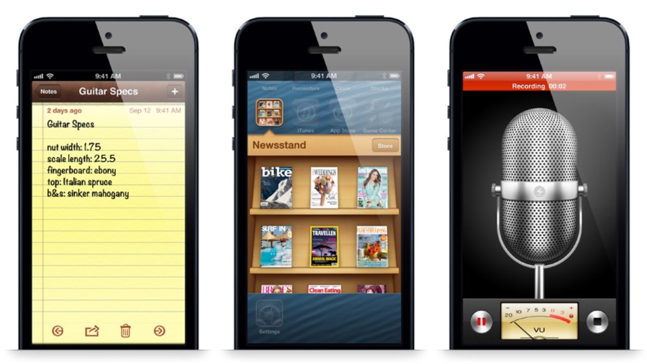
You might have heard the term "skeuomorphism" to describe Apple's iconic design style. About 10 years ago Apple's use of skeuomorphism was at its peak with iOS 6: the yellow, lined notepad paper in the Notes app, the bookshelf-like interface of the Newsstand app, the metallic look of the Voice Memos app microphone, and other life-like materials.

iOS 6 was the peak of Apple's realistic, skeuomorphic interfaces
At this time these and many other Apple-designed apps shared this style of design. As far back as the 1800s, "skeumorphism" has been used to describe a specific approach to design.
What is Skeuomorphism?
Skeuomorphism is used when a designer carries over elements from an original object into a new one. The purpose of retaining such elements can be purely aesthetic. Or it can provide the user familiarity and understanding of how the new object works -- assuming the user has previous experience with the original object.
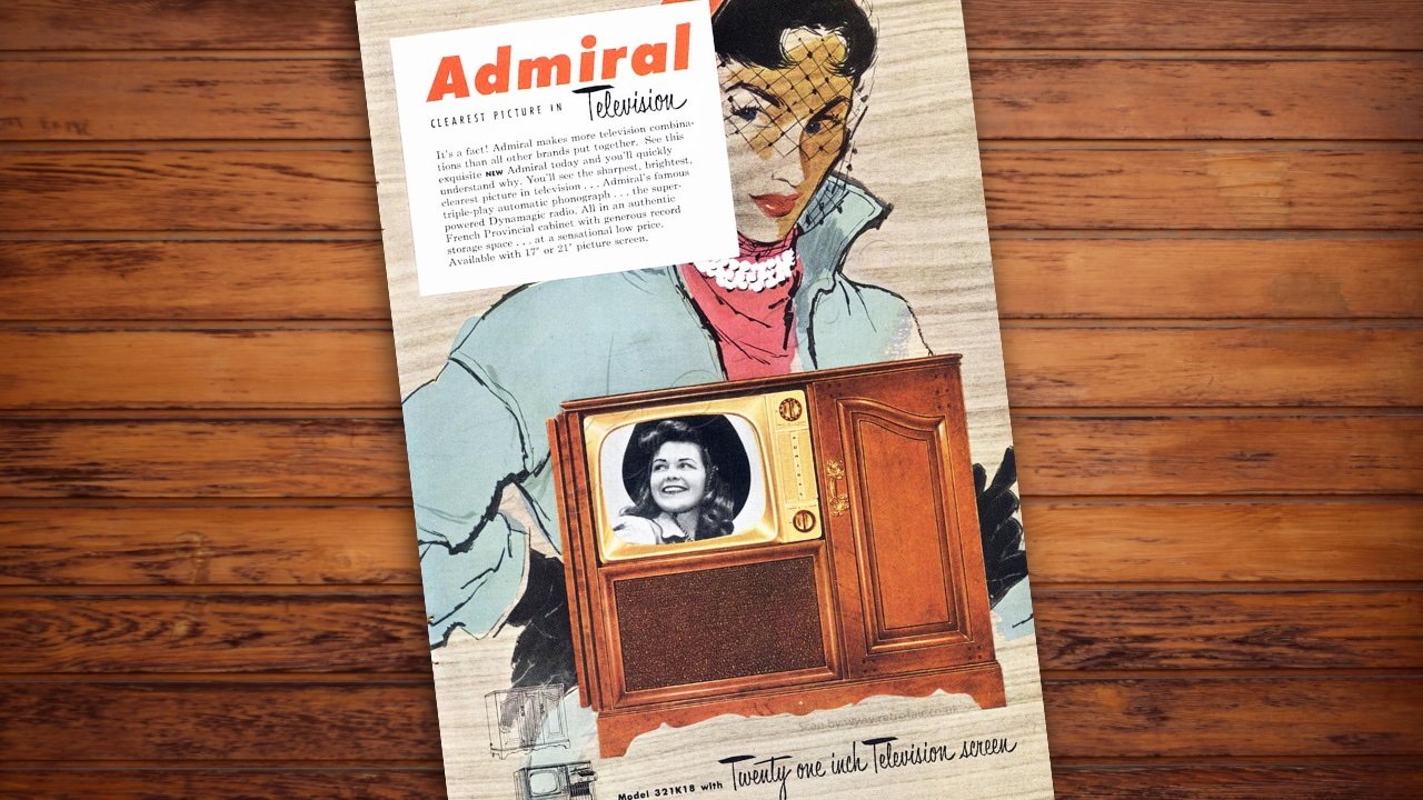
After doing it first with radio, television makers designed the sets with the same materials and look of furniture for decades. This helped consumers see the television fitting into a living room setting.

In the early days of TV, designing them to look like furniture was a skeuomorphism.
Another early example was the transition from horse-drawn carriages to cars. For people to understand the leap from one to the other the skeuomorphism began in the language used. It was better understood to refer to these 4-wheel contraptions as "horseless carriages".
Because of it, early cars were made to look like carriages. One designer even attached a dummy horse head to the car's front.
Graphical user interfaces mimic the real word
When the computer screen came along and we got to see what we were working on in real-time, the average consumer was not keen on the text-based interface or command line input. When Steve Jobs visited Xerox's R&D department in 1979, he was blown away by the basic graphical user-interface Xerox had been testing.
Jobs quickly saw the potential and Apple began building its own which would become the interface for the 1984 Macintosh.
The Macintosh showed clear and deliberate metaphors for the physical world. One of the fundamental metaphors still in use today is the desktop. A work area that can have files and objects laying on top of it-- the desktop was easily understood.
The trash can, folders, printers, and other icons were easily understood as well. The most basic skeuomorph was the button. The buttons on the Macintosh calculator appeared raised from the background suggesting the depth of a physical button.
The calculators' display was positioned above the buttons and contrasted with the background. The user instantly knew how to use it.
The 1984 Macintosh was one of the first graphical user interfaces.
This approach to graphical user interfaces caught hold across the entire computer industry. It continued to evolve as drop shadows, textures, and objects were given photo-like qualities so they might appear more like their real-world counterparts.
iPhone design goes from photo-like to flat
In 2007, Apple launched iPhone. Naturally, iPhone's OS followed the skeuomorphic approach, but by this point, it probably was more of a design tradition than a tool to provide users with familiarity. By 2012, Apple had reached its skeuomorphism peak with iOS 6 and macOS Mountain Lion.
It wasn't just Apple skeuomorph-ifying everything. For years, designers everywhere had "copied Apple" and applied materials like leather and wood with embossed text on all kinds of interfaces. Designers didn't need a reason to use a metaphor as long as it looked cool.
The trend in 2012 was to use rich textures with embossed elements like this mockup from Matthias Mayr.
By 2014, this look was getting old for many users and even designers. That group included some people at Apple. Up to this point SVP of iOS, Scott Forstall had been Apple's chief skeuomorphism proponent next to the late Steve Jobs.
In 2012, Forstall was fired for a couple of major flops. Jony Ive and others took over the design of iOS who were not fans of continuing with skeuomorphism.
"When we sat down last November (to work on iOS 7), we understood that people had already become comfortable with touching glass, they didn't need physical buttons, they understood the benefits," Ive said to USA Today in 2013. "So there was an incredible liberty in not having to reference the physical world so literally. We were trying to create an environment that was less specific. It got design out of the way."
iOS 7 was born with its flat style and limited metaphors. Some textures were replaced with white while others with subtle punchy gradients. Buttons had backgrounds removed and given thin outlines. The icons were flat and lightweight. Depth was kept in some places with an occasional drop shadow.
The compass app was one of the many drastic changes in UI from iOS 6 (left) to iOS 7 (right).
Some overlaying elements in iOS 7 such as the share sheet were given a translucent background depicting frosted glass. This particular choice showed the kinds of lessons Apple learned from their history with skeuomorphism.
A drop-shadow once was the obvious approach to mimic as literal as possible the real-world depth of objects. Now, designers began to find more elegant metaphors and use unrelated physical properties like frosted glass to convey the hierarchy between layers.
Skeuomorphism is often misunderstood
Apple's deliberate approach with skeuomorphism and sudden shift to flat design in iOS 7 gave many users whiplash. Many people felt like they had to pick a side as they wondered if maybe they missed the eye candy that was the microphone of the Voice Memos app, or the torn paper at the top of the macOS Mountain Lion's Calendar app, or Apple's photo-realistic app icons.
Whatever your preference was or is, Apple made the right call to evolve its approach to interface design. Once users understand a new design, skeuomorphism begins to lose its advantage.
By 2014, users were familiar enough with iPhone and smartphone interfaces that they didn't need to rely on so many metaphors for the physical world.
Luckily, we don't have to choose between skeuomorphism or flat design because they are not exclusive to each other. A design can be flat in appearance while also applying skeuomorphic attributes.
Since iOS 7 Apple's icons have appeared flat but many still have a metaphor for real-world objects. For example, the inbox list in Mail includes icons that look like the kind of physical inboxes you'd see sitting on a 1960s office desk.
Another example of how Apple continues to use skeuomorphism is the drawing tools in the Notes app. They are photo-realistic graphics of a pen, a highlighter, a marker, an eraser, and a ruler. Tapping on one activates that tool.
Apple has struck a balance in skeuomorphism in recent years. Wallet, Notes, and Weather apps are a few examples in iOS 15.
Interfaces are ever-changing
Apple didn't invent skeuomorphism but it's hard to ignore the influence its exaggerated use of it had on the tech and design industries. Apple and many other companies continue to lead the way in how we interact with devices.
Real-world objects continue to get replaced with digital ones. Just as we saw the transition from horse-drawn carriages to horseless carriages, we are seeing a shift from human-driven cars to self-driving cars. Virtual reality is packed with real-world metaphors as that technology continues to evolve.
The principle of skeuomorphism is needed as much as it ever was. When the anticipated Apple car is released and the steering wheel is replaced with a digital one, what a throwback it would be if it was designed to look like black hand-stitched leather.