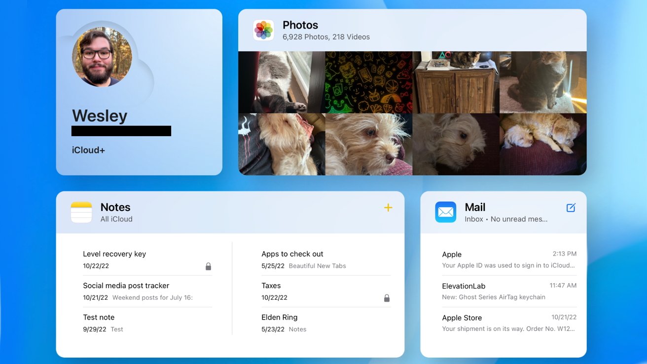
The desktop iCloud website is undergoing some changes as a beta version shows new customizable widgets and interfaces.

iCloud website beta has customizable design
Apple's desktop website for iCloud is available to anyone with a web browser, and it has gone through multiple overhauls over the years. The latest version, currently in beta, has an all-new interface with app widgets and a customizable interface.
When a user logs in to the new website for the first time, they are greeted with a set of basic widgets that show information about their iCloud profile, Apple Mail, Photos, and iCloud Drive. A large button at the bottom lets the user add, remove, or rearrange widgets based on other iCloud services like Notes or iWork.
Clicking on a widget will take the user to the respective app's web app. The page with widgets is called the iCloud Home Page and can be reached at any time from the app menu or by tapping the Apple logo in the top left corner.
The new design can be viewed from beta.Apple.com. The beta is open to anyone with an Apple ID.
