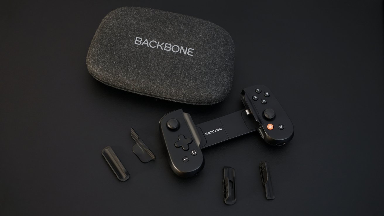
Backbone One smartly refined its iPhone controller with better ergonomics and magnetic adapters for an improved fit, but competition is fierce, making the $100 controller a more difficult sell.

Backbone One review: case friendly and ergonomic
I love Backbone One for its minimal design and portability. The Lightning version kept a place in my gaming gear until USB-C iPhones took over.
When I reviewed the first Backbone One in 2020, it was an excellent entry into a space that seemed like it had fallen off. Today, Backbone has to contend with much stronger competition from companies like Gamesir, Gamevice, and Razer.
Despite all of this increased competition, I believe Backbone One has struck a solid balance in size and feature set. The Backbone app is a smart addition and is better executed than others.
I'm happy with the second-generation Backbone One, but it may have played too safe at this price point. Here's how the features break down.
Backbone One review -- design
Of the popular options, Backbone One is certainly the smallest and most portable. Sure, some competitors have the option of collapsing the controller into a smaller square shape, but these are so bulky that it's not really space-saving.

Backbone One review: a compact gaming option with a familiar layout
Backbone One is small enough that I've found myself carrying it in my back pocket or jacket pocket without a second thought. Its size is a big strength.
Once iPhone 15 went all-in on USB-C, it was clear accessory makers would need to be quick. Backbone One and others like it already had Android versions available, but Backbone did one better and released an improved second generation in Lightning and USB-C earlier in 2024.
Unlike some manufacturers that chase radical designs and flashy lights, Backbone kept it simple. The new model is nearly identical, but edges look smoothed out and the grip is overall more comfortable.
The D-pad has been redesigned, but otherwise, the buttons feel the same as before. The inserted iPhone feels much more stable than before, thanks primarily to the new adapter system.
Like the previous model, customers can choose between a black colorway with Xbox-like A, B, X, and Y face buttons and a white colorway with PlayStation insignia. There is a new black or white carrying case as well.
Magnetic adapters for fit
One of the biggest problems with game controller grips like the Backbone One was how exact the design was. Controller makers designed the devices to exactly fit an iPhone or similar sized smartphone with very little wiggle room.
Backbone One review: small and medium cases fit fine
It was an expectation that users would need to remove any kind of case in order to use the controller. That has been somewhat alleviated.
The Gamevice Flex I reviewed put plenty of space in the grips for up to a significant case thickness and included adapters to better grip thinner cases or the phone itself. Backbone One has done similar things but on a smaller scale.
The empty controller is at its widest setting. I don't own any incredibly thick cases like an Otterbox Defender, but I can say those wouldn't fit anyway.
Of all of the cases I tested from Pitaka, Nomad, and Shiftcam, they all could fit in the Backbone One. A Spigen special edition that looks like a Bondi blue iMac G3 didn't fit, but not because of thickness, because the port couldn't reach the connector lengthwise.
Backbone One review: more stability thanks to magnetic inserts
There are two magnetic adapters included, small and large. The large adapter is the one you'd use if you go caseless with your iPhone. Not even my Nomad leather magnetic skin could fit in this precise adapter.
The small adapter is good for all small to medium-sized cases. The thickness should be minimum, almost adding nothing to the iPhone.
Having no adapter allows for many average size cases to fit. At this point, it is purely dependent on the overall thickness of the back side of the case and the rim at the USB-C port.
Especially thick and protective cases won't work with the Backbone One. Something like the Gamevice Flex can accommodate thicker cases, but not much thicker, and it means the controller itself is thicker, too.
The magnetic inserts are a clever idea. Theoretically you'll only need to deal with them one time when determining which one you might need, after that, just slip the phone in and play.
Backbone One review -- features
Feature wise, the Backbone One hasn't changed a bit. It still has the same face buttons, shoulder buttons, and app launcher.
Backbone One review: USB-C out to a Mac or iPad
The rear spring mechanism feels more sturdy, but that may be a placebo. At the least, the iPhone feels more sturdy and secure in the grips than before.
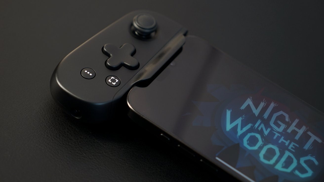
The four buttons across the bottom of the controllers are mapped based on system functions. The ellipsis button can mute the microphone in some multiplayer games or be used as a start/select button in others.
The button with an open square is a screenshot or screen recording button. Screenshots are performed by pressing and holding the button, which then saves the image to your photo library.
The screen recording function is a little odd and defaults the same as I reported in the original review. It starts recording with a press and stops recording with another press, however, users can now switch this function from the Backbone app controller settings.
Backbone One review: a dedicated app launcher button
The recording is saved to a folder in the Backbone app where the user can share the video or save it to their photo library. The highlight feature, where the video can be uploaded and shared via a link, is still present.
Remember, since the Backbone One is using the system screen recording function, any notification or other activity shown on the display will show up in the video.
On the right controller, there is a hamburger button that is used as an options or menu button across most apps. Finally, there's the orange Backbone button, which almost always launches the Backbone app.
If you are using the Playstation Remote Play app, it can act as the PS button when held down.
Having a shortcut to the Backbone app built into the controller is a bold move. It means the Backbone app needs to earn that premium location, especially one that can sometimes be accidentally pressed due to its proximity to the joystick.
Backbone app and software
The Backbone app remains central to the controller experience, though other iPhone controller makers have taken a similar approach. I'm not a big fan of turning a utility like a game launcher into a social media client, but it is clearly popular amongst some users.
Backbone One review: manage button options and recorded videos in the app
You're able to ignore the social aspects entirely and just launch a game. However, you're eliminating 80% of the app functionality by doing that.
Backbone takes a different approach than a company like PlayStation. The top menu on the PS5 is all about launching games, with submenus dedicated to social and discovery.
The top row for recently played games feels like the only part of the app I use. Every row after that is auto-playing videos, ads for other games and platforms, and social options.
Backbone One review: 'Assassin's Creed' recognizes the controller
While it may not appeal to me, it may be useful to some. Also, as I said, you can ignore everything, including the app itself, and just play games.
My issues with the app I mentioned in the first review still persist but have lessened somewhat. Apple's introduction of Focus Modes allows me to design my own Home Screen game launchers, and screen recording can automatically enable Do Not Disturb with a Shortcut.
The Backbone+ subscription enables higher-resolution screen capture and video upload with shareable links through the app, plus the game hub functions mentioned before. If you purchased the original Backbone before the service launched, you don't have to pay, but otherwise, it's an up to $49 per year service on top of the already pricey controller.
Peak portable gaming
There's a lot to love about Backbone One. It's well-designed and ergonomic despite being smaller and thinner than competitors.
Backbone One review: an optimal yet expensive iPhone controller
However, its high price and subscription service will likely push customers to lower-priced alternatives. Backbone One is worth the extra cash for now, but the next generation will need to turn up the perks to maintain the price point.
The controller is a versatile option thanks to its ability to connect to other devices over a cable. It is small enough to fit in a bag or pocket without being too bulky.
Backbone One review -- pros
- Compact and portable
- Ergonomic and familiar design
- Sized for moderate cases
- Dedicated app with game launcher...
Backbone One review -- cons
- ... but the app should be more focused on launching games than social
- Backbone+ is a paid add-on for an already expensive controller
- Very little new in a competitive space
Rating: 4 out of 5
The original Backbone One got a 4.5, and this one got a 4. That isn't to say the new model is worse, but the competition is better.
Backbone needs to consider how it can improve the controller and justify the $100 price point going forward. The Backbone+ subscription feels more like a drag on the brand than it should be, as customers likely expect those features as included, not paid add-ons.
Where to buy Backbone One
The second-generation Backbone One is available from Backbone's website for $99.99. It can also be purchased from Amazon for $99.99.