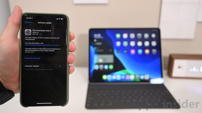
With over a month until iOS 13 makes its official debut, Apple has included many changes in the fifth beta issued to developers. Here is everything we've spotted thus far in iOS 13 and iPadOS.

iOS 13 beta 5 has more changes in store
What's new
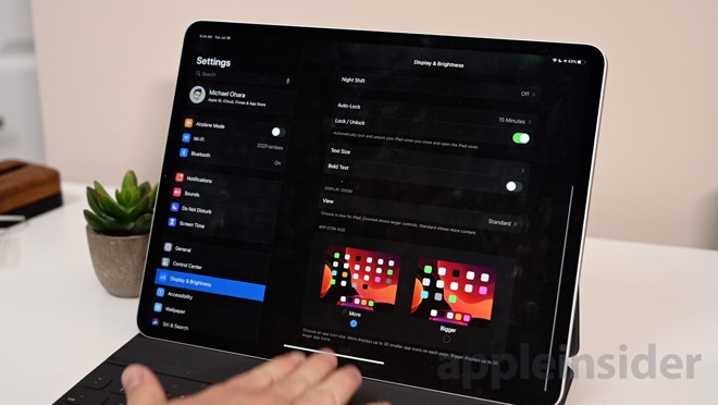
On iPad, users now have the option to adjust the density of icons on the Home screen. Icons can be larger, or more icons can be placed on the display.

Pixel density toggle in iOS 13 beta 5
iPad users can choose between 4x5 or 6x5 rows of icons with the latter being smaller to accommodate the additional apps. We think that this doesn't go far enough. The iPad -- especially 12.9-inch variant -- could handle more icons.

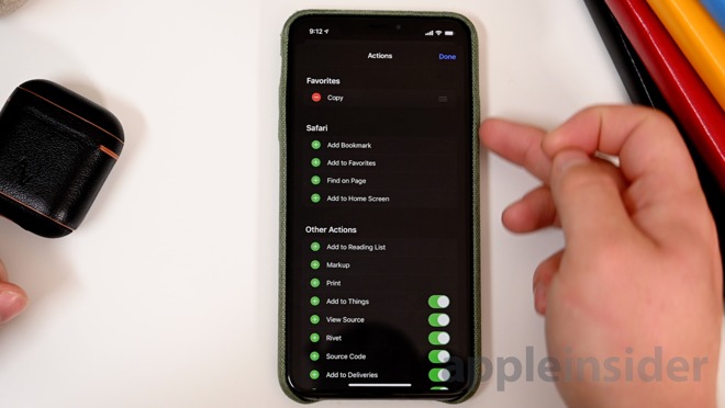
Share Sheet categories in iOS 13 beta 5
The all-important Share Sheet got reworked with iOS but was a bit cluttered. The fifth beta makes it a bit easier to parse by grouping the options and including the ability to favorite certain actions.
CarPlay continues to be refined with tweaks to the Now Playing interface as well as allowing album art to be toggled on or off from within the Settings app in the CarPlay interface.
The new welcome image for the Health app in iOS 13 beta 5
Health and Messages each have a new intro pop up that highlights the new features being added.
In the Activity app, Apple Watch users will see new awards for achieving their Move goal past the 1000 mark. When 3D Touching (or Haptic Touching) the Safari icon once more has the option to open right within a new tab.
Apple has redesigned the volume hud in iOS 13 and with beta 5, it is now more incremental and includes haptic feedback when maximizing and minimizing the volume. This only happen adjusting with a finger on the slider. The slider also appears slightly more narrow this time around.
New smokey wallpapers in the iOS 13 Home app
The Home app lost its default wallpapers with a previous update, replacing them with some new rather boring gradient wallpapers. Beta 5 includes six new colorful and smoky options and the previous ones have been removed.
There are a few other changes as well. Temporarily, the "Automation" tab has been removed from the Shortcuts app which will be re-added later. The cellular designator is slightly larger, matching the size of the cellular bars. The cursor icon, which got additional adjustments in previous betas, now can become even smaller on iPad.
Songs that don't have lyrics available don't have the option to toggle them on. Users can now peek at points of interest within Maps. Drafts within the Mail app are sorted similar to tabs in Safari. Apps that have notifications, now show on the 3D Touch peek menu.
Anything else?
These are all the changes we've found so far but the list is obviously non-exhaustive. If you've found any other changes, reach out on Twitter @Andrew_OSU.
Be sure to check out all the changes from iOS 13 beta 2 as well as those in beta 3.
