As expected, the second beta of iOS 13 and iPadOS contains a number of new features and changes. Here are over 40 that we've pinpointed so far.
The biggest changes
See all the changes for yourself in our hands-on video.
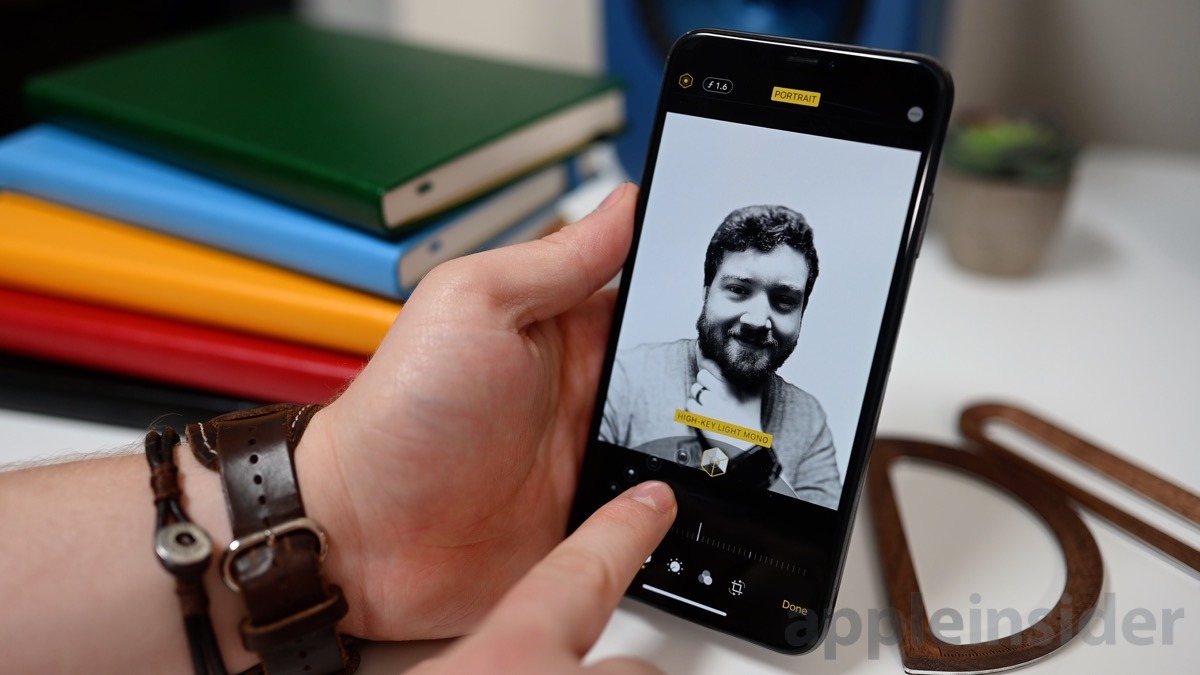
In the second beta, there were a number of higher-profile changes that users will appreciate. For example, the camera app gained two big new features. There is a new Portrait Mode option — High-Key Light Mono. This effect separates the subject from the background, turns it black and white, and white out the background. Similar to Stage Light Mono, but opposite. The second change is a new slider that allows the Portrait Mode effect strength to be adjusted.
3D Touch also has returned in the second beta. In the original, it seemed all devices — even those with 3D Touch — were relying on a long press rather than 3D Touch to fully function. In beta 2, it is quicker and seems to be true 3D Touch once more on compatible devices. Additionally, there is a shorter haptic effect and a very soft click noise when 3D Touch is invoked.
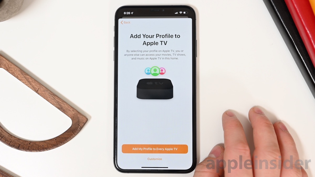
The Home app received a bunch of minor changes as well as new onboarding screens that explain the new features coming to Apple TV and HomePod such as multi-user support. Many other apps got new welcome screens or tweaks to existing welcome screens.
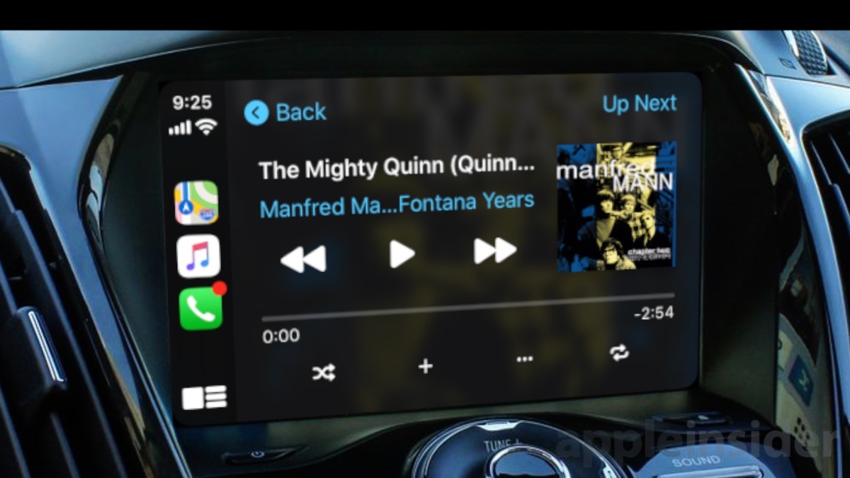
CarPlay now has the estimated time of arrival displayed on the Dashboard which can also now be accessed by swiping to the side. The Now Playing UI also has been updated to what Apple previewed which shows the album artwork more prominently to the right.
One feature that was in the first beta that wasn't available yet is a new feature to sync the audio with the Apple TV. This is a utility on the Apple TV that uses your iOS device to sync measure the audio and check the delay of your Apple TV audio and correct it. When selected in tvOS 13 beta 2, a card appears on an iOS 13 iPhone or iPad to start the process.
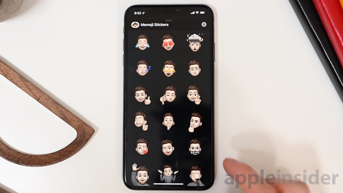
Also of note is four new Memoji Stickers with new poses such as crossed fingers and shush.
All the changes
Here is our list of all the changes found in the second beta of iOS 13.
