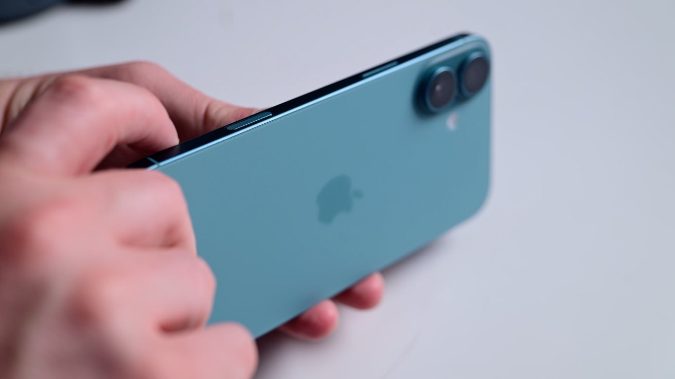
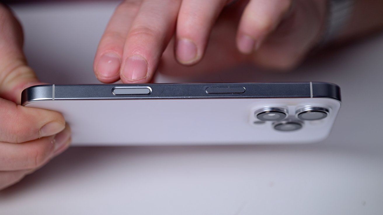
The Camera Control button, or what we presumed was going to be called the Capture Button, is a new physical control on the side of the entire iPhone 16 lineup. Here's everything you need to know, and how to get the most out of it.
Apple's Camera Control buttin is both physical and touch sensitive. With a firm press it will click like a real button, but a light-press gives you Taptic feedback like with Apple's Mac trackpads.
Using Camera Control on iPhone 16
The Camera Control button starts with that first press. Once you press it, by default, the Camera app opens.
With a second press, it will take a photo or video — depending on the camera mode you have selected.
It's very fast and easy to do. It's similar to how you could program the Action Button, but more feature-rich and dedicated solely to the camera.
While in the Camera app, you can press and hold on it to start recording a video. If you release, the capture will end unless you hit the record button on-screen.
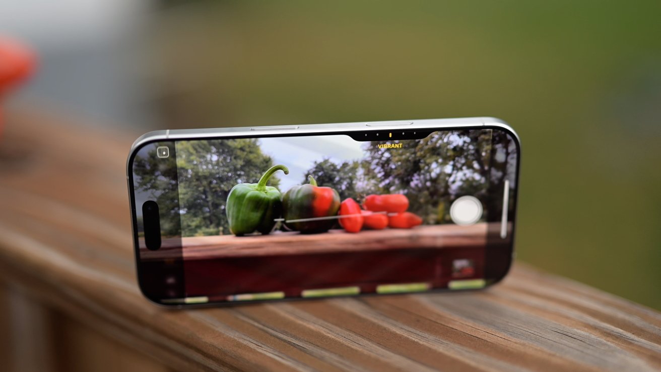
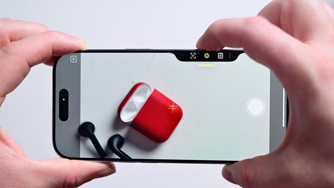
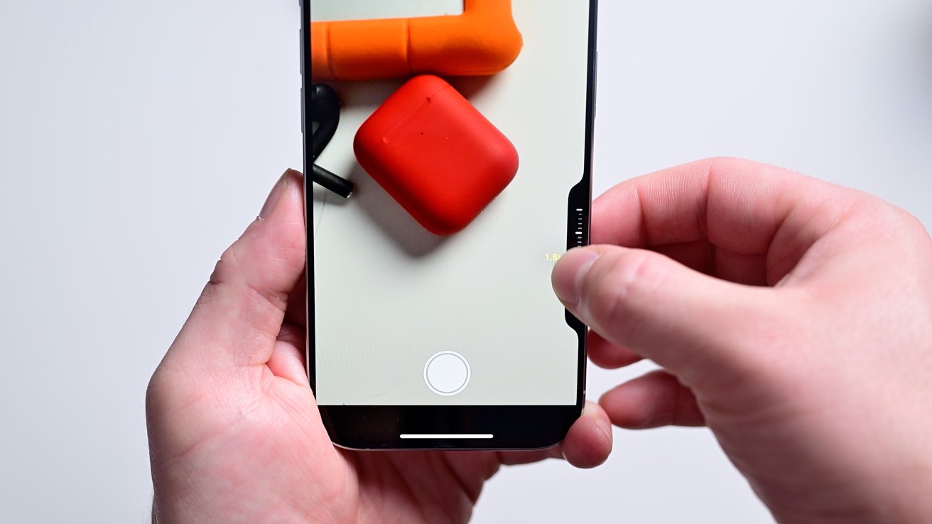
If you light-press the button, you'll see the screen flex in and a new UI appear. Zoom is default but you can change the control by double light-pressing.
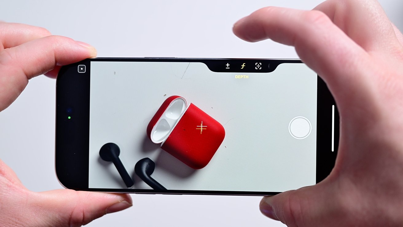
On our iPhone 16 Pro, the controls are exposure, depth, zoom, cameras, styles, and tone. Double light-press to open the menu, swipe left and right to choose from, then light-press again to select.
With any control selected, you can again swipe left and right to make adjustments. Like zooming in and out, adjusting the look of the photo, or applying more background bokeh.
Sometimes, swiping the button repeatedly is annoying and slow. Like zooming in all the way.
Fortunately, you can slide your finger on-screen too and adjust that Camera Control menu from there without the size limitation of the button.
Customizing the Camera Control button
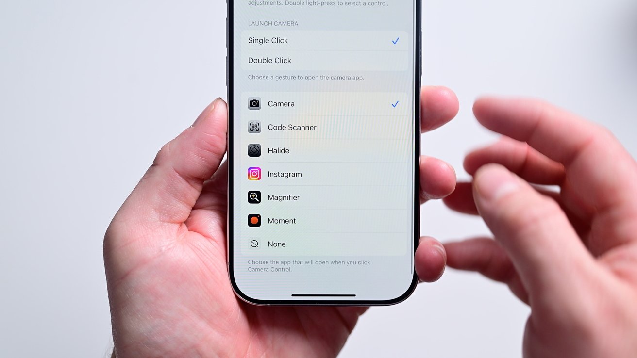
By default, the Camera Control button opens Apple's own stock camera app. Fortunately, Apple has opened this up to developers via a new set of APIs.
Third-party devs can start building this into their own apps and several excellent ones have been updated so far to add support.
We've tested out Halide, ProCamera, Obscura, Moment Pro Camera, and Instagram. All of which were quickly to adopt it and have varying degrees of features outside of just launching their apps.
You can adjust this by:
- Install and launch any supported apps like those above
- Go to Settings > Camera > Camera Control
- Choose another of the available apps from the list
From this Settings menu you can also assign the button to other camera-related titles, like the QR code scanner or magnifier. Of course, setting it to "nothing" is also an option.
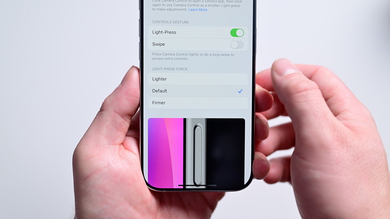
One last setting you may want to tweak is the pressure sensitivity. This is found in the Accessibility settings.
Adjust the Camera Control pressure sensitivity by:
- Go to Settings > Accessibility > Camera Control > Light-Press Force
- Choose lighter, firmer, or default
Cases
In a bit of a deja vu moment to last year's Action Button, many case manufacturers were caught flat-footed in how to design around the Camera Control button.
Since the button is touch-sensitive, they can't cover it the same way they can the other four buttons. Some got info ahead of time from Apple, others gambled on a solution, while others are still reacting.
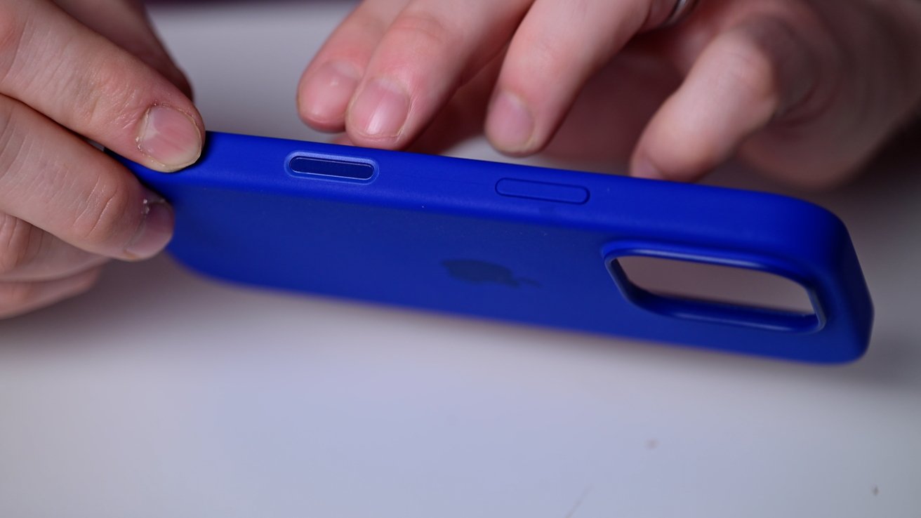
Apple, of course, managed to design a cover for its first-party clear and silicone cases. They use a piece of color-matched sapphire on top of a conductive layer to cover the button.
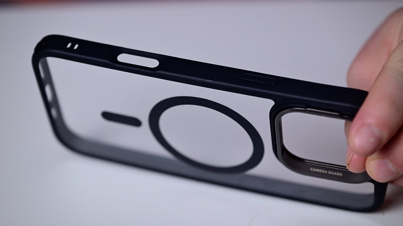
Long-time Apple partner OtterBox has a button cover on some of its cases while Spigen and Supcase guessed right this year. Many of these third-party cases use copper, rather than sapphire like Apple.
Most though have cutouts or holes on the sides of their cases. Depending on the case, this can make the button hard to use, especially on particularly thick cases.
 Andrew O'Hara






-m.jpg)


 Malcolm Owen

 Amber Neely


 Wesley Hilliard

 William Gallagher






10 Comments
I think this is really innovative and I like it.
Some quick thoughts after experimenting with Camera Control for a couple of hours this morning:
The Good:
The Not-So-Good
The Bad