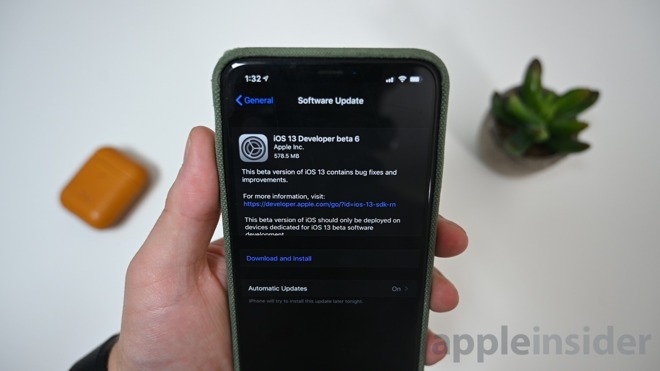
Developer beta 6 of iOS 13 has been released. Here are all the changes found this time around including tweaks to folders, Control Center, and more.

iOS 13 beta 6
Several apps have new splash screens upon launch after updating. The App Store touts the new update location -- as well as Apple Arcade. Photos teases the new video editing and immersive experience. Game Center also has a splash screen when launching an app that utilizes it.
Dark mode now has its own top-level toggle inside of Control Center. This avoids the annoyance of having to 3D Touch on the brightness toggle. It can be enabled within the Control Center settings.
Folders now have a more saturated background that reflects the wallpaper behind them. This looks good in places like a dark background, but odd in others. We aren't sure if this is a bug or a purposeful design choice.
There are a few other changes including screenshots returning to rectangular corners instead of being cropped to curves, URL previews can now be hidden on a per-app basis, and the signal bar designator for cellular is back to its smaller size.
ETA sharing in Maps seems to be gone at this time. Hopefully it returns before the full release. (Thanks Jason!)
Tapping with three fingers brings up the cut/copy/paste controls anywhere in the OS. The ability to announce messages on the second generation set of AirPods has been removed in this beta. The wording on the background location popup modal has been tweaked. The location, analytics, and Apple Pay privacy policies were also tweaked.
Anything else?
These are all the changes we've found so far but the list is obviously non-exhaustive. If you've found any other changes, reach out on Twitter @Andrew_OSU.
Be sure to check out all the changes from iOS 13 beta 2, in beta 3, as well as in beta 5.
