Apple has added a view to Reminders which shows you tasks in the Kanban column style. Here's how to use it on the Mac, and also the iPad, plus why not to bother on the iPhone.

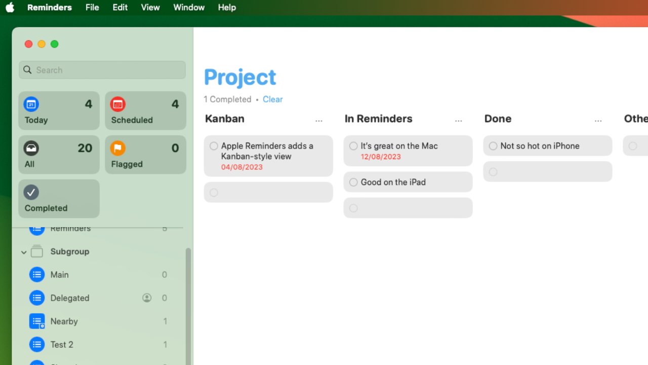
Reminders now optionally features this visual layout of tasks, known as a Kanban view
Kanban has come to Reminders in macOS Sonoma, iPadOS 17, and iOS 17, and is yet another tucked away feature in an app that now only pretends to be simple. It pretends very well, but Reminders is ever more powerful and for some people, this Kanban feature could be what makes them choose Apple's app over third-party alternatives.
Apple doesn't actually call this new feature Kanban within the Reminders app, though, so more than ever, it's hard to find it. But if you've ever seen another Kanban app, such as Trello, then you'll immediately recognize it when you see it in Reminders.
Instead of a straight list of tasks, a Kanban layout shows each To Do as its own separate graphic. It's very simple graphic: just the text of the To Do written over a grey extended lozenged-shaped background.

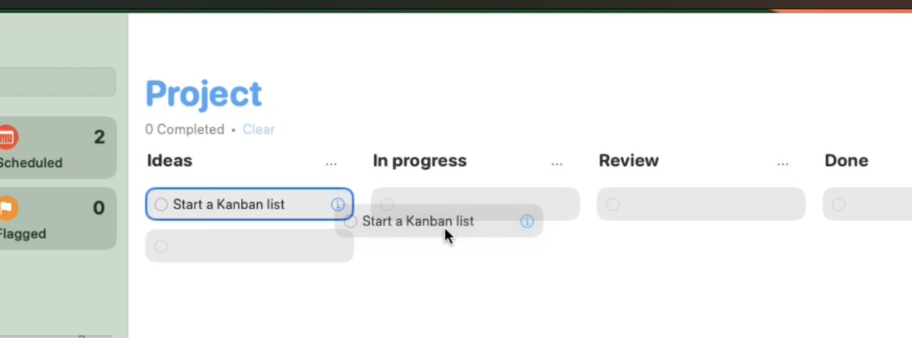
Kanban lets you drag tasks around between columns to give you a visual sense of your project
But you can click and grab on that lozenge and drag the task around. So pretty much invariably, a Kanban task list will have columns for tasks that are just started, in progress, or completed.
You can tick any task as done, just like with any other task in Reminders. But you can instead drag them from column to column so that you have a visual sense of everything that's going on.
How to setup a Kanban list in Reminders on macOS Sonoma
- Open Reminders and click Add List at the bottom left
- Give the list a name and optionally set the icon and a color
- Leave the List Type set to Standard and click OK
- Right click in the empty list and choose New Section
- Give that a name, and add more New Sections as you want
- Choose the View menu and select as Columns
You don't have to right click to add a New Section. You can alternatively choose the New Section from the File menu, or press Option-Command-N.
Apple thinks that sections will be useful in regular Reminders lists, too, and that may be so. But changing the view to as Columns is what makes this a Kanban list -- at least on the Mac and the iPad.
Using the Kanban list
Each column in a Reminders Kanban list has a blank To Do already present. You can't tick it as done, even though it has the Done circle icon, but you can click in it to write a new task.
You can also paste tasks in that you've copied from other lists.
You can edit and rename the Kanban columns that Apple calls Sections
When you drag a task from one Kanban column to another, it can be a little fiddly. You tend to have to drag it to just above another task, or just above the top blank one, before you can let go.
As for sections, you can choose File, Edit Sections and get a dialog listing each of them that you've created. Next to every section listed, there's an edit icon and that lets you rename the sections.
Where Reminders scores and falls short
No question, this new feature lets you present your tasks more like a project plan than, say, a shopping list. You can work the tasks as normal, but you can also much more readily see that you're ahead or behind.
You can see, perhaps, that one particular aspect of your work is somehow being slowed down and you need to look at it again. Or you can see more clearly that you have several similar tasks and so you could do them all together.
So it's an excellent addition to Reminders, but it isn't perfect.
For instance, you'll tend to stop ticking tasks as done. That's because when you tick a task in Reminders, it vanishes from the list and once you've got all these columns done, you'll want to see the end one growing.
Then the fact that each column in the Kanban list automatically has a blank task in it is a little ugly for Apple. It only happens when you have created sections, either in the Kanban column view, or a regular list.
Otherwise, a Reminders list will stay completely blank, except for the title you've given it. And that just seems neater.
Then the whole point of Kanban is to have columns that you can drag tasks between, and the iPhone won't show columns. It will solely show the sections as headings in a list.
Still, the more intensely you use To Do apps, it does tend to be that you do most serious work on the Mac or perhaps the iPad. The iPhone is perfect for adding new tasks, and it can be used to find what your next task is, but you won't tend to want to study everything visually like a project manager.