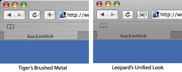
While most of the test versions of the future operating system have so far handled only the many bugs still left in its code, this week's edition allegedly contains the first signs of obvious visual differences between itself and 2005's Mac OS X Tiger.
The brushed-metal look that first appeared in earnest with Panther has almost completely faded away, according to reports. Well-known holdouts for the style, including Finder, Photo Booth, and Safari, have purportedly abandoned the metallic sheen in favor of the simpler, gradiated style that first appeared in Apple Mail 2.0 and later transferred to Leopard's version of iChat and the more widely available iTunes 7.
A frequent sticking point with critics of Apple's user interface has been its tendency to use different visual elements for program windows without a clear shift in purpose, such as the use of the gradient style for System Preferences versus the metal of Finder or the Aqua style of generic windows.
See more Leopard build 9A410 screenshots supplied by hackint0sh and Flickr.
 Katie Marsal

 Malcolm Owen
 William Gallagher
 Thomas Sibilly
 Wesley Hilliard

 Marko Zivkovic


76 Comments
Not sure I like the squared-off corners, but Apple complying with their own GUI guidelines in a consistent manner can't be a bad thing. Honestly though, to me the squared-off corners say "placeholder graphics" to me - I don't know about those "illuminous" or "onyx" names, but I think we're going to see more of a glossy black UI come this June when Leopard is showcased more fully.
Eh..looks just like UNO to me.
the squares are still rounded, it's just the Leopard screen capture tool that fails :-)
you really notice the squared edges. this would be a big change, its been rounded for quite some time. Like stated above, not sure if I like it. gotta wait for the preview in june / more pics to get a good idea i guess
Not sure I like the squared-off corners, but Apple complying with their own GUI guidelines in a consistent manner can't be a bad thing. Honestly though, to me the squared-off corners say "placeholder graphics" to me - I don't know about those "illuminous" or "onyx" names, but I think we're going to see more of a glossy black UI come this June when Leopard is showcased more fully.
The square corners was supposedly a screenshot issue and not how it really looks.
Also, it looks like they're progressing with the resolution independent graphics. The refresh and webclip buttons both look both look vector to me. I think one of the reasons they decided to do away with the brushed metal effect is that it's not feasible to do with a resolution independent interface. A simple gradient like they have in this build makes much more sense.
It does look a lot like Uno, which makes sense. It's the most logical progression of the OS X interface.