A slow day for Apple news gives us the opportunity to post some tidbits regarding last-minute design changes affecting the company's recent product launches — the iPhone and iMac.
iPhone, which went on sale nationwide on June 29th, may have made its debut several weeks earlier had it not been for a last minute material swap on the handset's top surface.
In a June 18th press release, the company announced that the entire top surface of iPhone, including its 3.5-inch display, was being upgraded from plastic to optical-quality glass to achieve a superior level of scratch resistance and optical clarity.
This move cause a two-week delay in the initial manufacturing ramp of the device, according iPhone touch-screen component supplier, Balda. In a recent financial report, the German-based firm revealed that the last minute design change prompted it to redesign parts of its production line from scratch, causing a material impact on financials.
Balda, which partly owns touchscreen factory TPK in Xiamen China, said it now expects lower revenues for 2007, but anticipates an uptick in sales beginning early next year.
iMac logo goes black
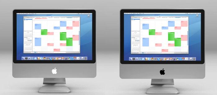
Meanwhile, Apple may have also called for a small, but last minute design change to a the facade of its new iMac enclosures. Although purely aesthetic, observers note a disparity in the color of the desktop's Apple logo as seen in the company's marketing materials.
A .Mac Sync video tutorial released alongside the new all-in-one desktops correctly presents the iMac with a black logo on Apple's U.S. website. However, the same tutorial on its European website depicts the systems with a silver logo — akin to the iPhone's mirror-like emblem.
While introducing the new iMacs last week, Apple chief executive Steve Jobs acknowledged that his design team took cues from the iPhone in designing the new Macs, including the use of black, glass and aluminum.
The disparity could indicate that Apple originally planned to mimic the iPhone's exterior more closely with the iMac. (Alternatively, the silver-logoed model may simply represent a graphical error.)
Update: A source who provided an accurate description of the latest iMacs ahead of release claims that the original design indeed called for the mirror logo. However, it was subsequently scrapped, the source says, as people "do not like to look at themselves in the mirror all day."
White, black and grey were said to be candidates for a replacement color, with black winning out despite its slightly conspicuous appearance.
 AppleInsider Staff



-m.jpg)


 Charles Martin
 Marko Zivkovic
 Andrew Orr
 Amber Neely
 William Gallagher and Mike Wuerthele




114 Comments
I much prefer the look of the silver Apple logo. Black looks too business-like for my tastes.
Slow news day indeed...
I much prefer the look of the silver Apple logo. Black looks too business-like for my tastes.
I didn't care much for the black logo, either. It sticks out too prominently.
I would have vastly preferred that the logo be silvery, and pulse with light when the unit is asleep!
In other news...
1. Apple insider has discovered, that when measured, the box that the iPhone comes in is 27 microns taller, and 11 microns narrower then the box that houses the Apple bluetooth headset. Inside sources that can only be described as reliable, have indicated this difference is a clear indicator that the iPhone is going 3G by January 2008.
2. Apple Insider has found that Apple has really scredwed the pooch, and have a ring tone not in correct alphabetical order. It has been noticed that ring tone names are all in alphabetical order EXCPT marimba, which is that the top of the list. This is a clear indication that the underlying OS is breaking down - which what could be described as a design flaw. Stay tuned for further developments as they happen!
I didn't care much for the black logo, either. It sticks out too prominently.
I would have vastly preferred that the logo be silvery, and pulse with light when the unit is asleep!
I too think a pulsing apple logo (when asleep) would have been much cooler.