The 47-page filing, published for the first time Thursday by the World Intellectual Property Organization, is titled "Dual-sided Track Pad" and incorporates references to over a dozen patent applications previously filed by Cupertino-based firm with the United States Patent and Trademark Office.
More specifically, the filing discusses several potential uses for a "capacitive array element [that] may be a dual-sided panel that is capable of sensing touch from either side and sending signals indicative of the touches to a host device (e.g., a desktop computer, a laptop computer, a digital music player or a mobile telephone unit)."
In some embodiments, Apple said the touch-based array element would be completely translucent, so that the display element of a handheld device and the array element may be configured with respect to each other, possibly including a configuration where the array element lies over a traditional display screen so that the display screen is viewable through the array element, in effect forming a touch screen.
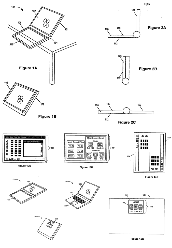
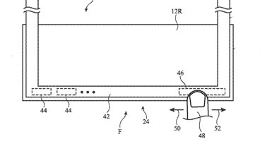
The real world implementations of this concept become more apparent from the illustrations provided by Apple as part of the filling. For example, the company portrays a notebook-like device whose internals are tucked away behind a traditional LCD screen, and whose base/keyboard component has been replaced by a framed, dual-sided translucent touch-screen.
While in the "open" position, the side of the touch-screen facing upwards would serve as a sprawling multi-touch input surface capable of receiving input from a virtual keyboard, "finger or stylus." During this time, the opposite side of the translucent touch-screen (facing down) would be immune to input. When in the "closed" position, however, the active side of the touch-screen would be reversed, with the side previously facing downwards now serving as touch-based window to the notebook's traditional LCD component, effectively morphing the closed notebook into multi-touch tablet (see images below).
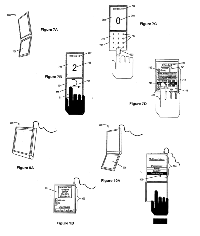
The same principles could also apply to a flip-based mobile handset, according to the filings, though the advantages in this case appear limited over Apple's existing iPhone design, save for the prospect of using both sides of the touch-screen simultaneously while in the "open" position. In the "closed" position, such a handset would function identically to today's iPhone.
Given that the touch-screen element would be completely translucent, Apple suggests several methods of displaying keyboards, number pads, and controls on panel while in the "open" position. These include using a "polarized light source so as to be slightly visible when lit" or displaying the controls through the use of minuscule LEDs embedded in the translucent touch-screen element.
AppleInsider is offering an unedited copy of the filing here: [3.1MB PDF].
 AppleInsider Staff



-xl-m.jpg)

-m.jpg)



 William Gallagher
 Malcolm Owen


 Mike Wuerthele
 Thomas Sibilly
 Wesley Hilliard




72 Comments
Ireland?
...will this do it for you?
Well now, that is kinda sorta awesome.
OK, release this, the desktop multitouch input device and the Apple TV DVR and Apple will be AWESOME!
Looks like Apple is cooking up something great once again! They should do this with all of their stuff, including desktop computers. I could even see a customizable keyboard coming out of this!
WOW! That's mostly practical too. Except the 'would be problem' with the multi-touch notebook when in the closed position, the distance between the users finger/stylus to the image would be way too far, this causes a visual alignment problem between the actual image and the position of the finger/stylus, especially when the user moves or when accessing items closer to the edges of the screen. Wacom overcame this problem in their Cintiq models by adhering the extra thin touch-screen mylar directly onto the display allowing for a minimum distance from the stylus to the image.
WOW! That's mostly practical too. Except the 'would be problem' with the multi-touch notebook when in the closed position, the distance between the users finger/stylus to the image would be way too far, this causes a visual alignment problem between the actual image and the position of the finger/stylus, especially when the user moves or when accessing items closer to the edges of the screen. Wacom overcame this problem in their Cintiq models by adhering the extra thin touch-screen mylar directly onto the display allowing for a minimum distance from the stylus to the image.
Yes, but--
Notice how Apple deliberately draws their "email" and other "UI" screens in these patents so they look totally generic and stupid?
That's so they don't give anything away they dont have to via these applications, which they know are examined microscopically by the public.
I would venture a guess that whatever these patents are intended for will look nothing like any of these pictures...and it's Apple, for pete's sake.
They would not let a less than awesome User Experience within 100 feet of their creation.