The 10-page document, published for the first time this week, was filed with the United States Patent and Trademark Office less than a month prior to the release of Mac OS X 10.5 Leopard back in October of 2007. Its short list of credits includes some of the Cupertino-based company's more prominent interface designers holding rich patent portfolios, including Bas Ording, Imran Chaudhri, and Elizabeth Furches.
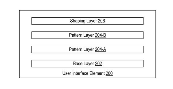
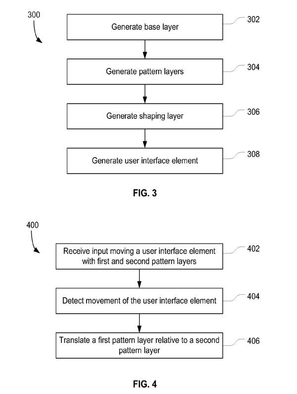
As for the filing, it describes techniques for generating common Mac OS X user interface elements through the use of multiple graphical layers — or a composite of a base layer, one or more pattern layers, and a shaping layer.
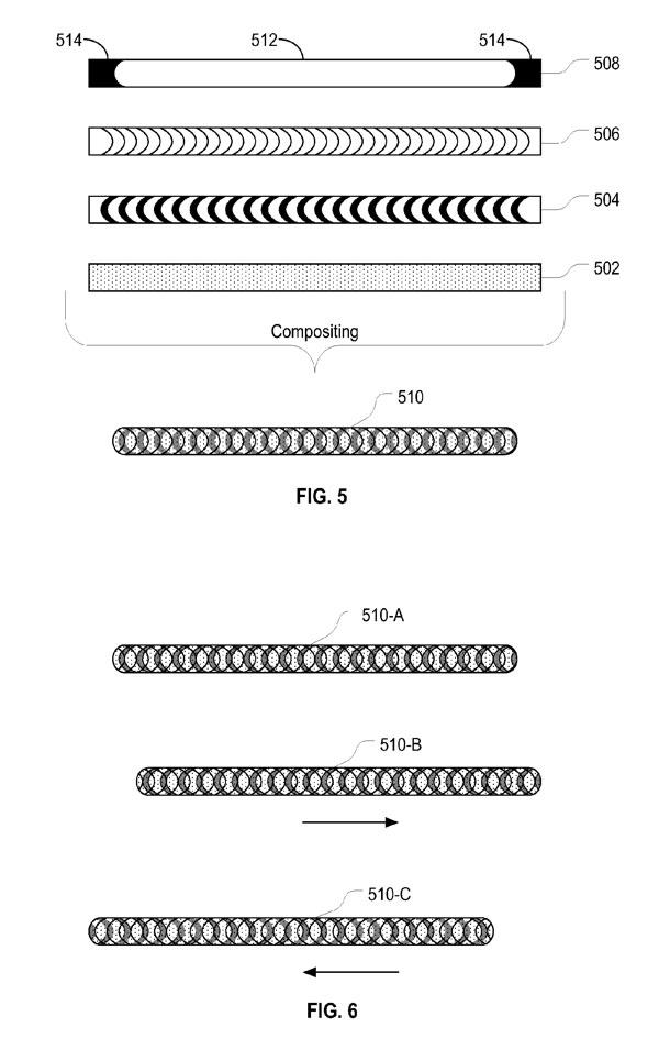
The base layer would provide the base color of the interface element, while one or more pattern layers would define one or more graphical patterns of the interface element. These pattern layers could, for example, include respective patterns of spaced-apart wave shapes that could be translated relative to each other to produce visual effects. A final layer, called the shaping layer, would sit atop these layers and dictate the overall shape of the particular interface element.
Although the concepts in the filing can be applied broadly, Apple focuses largely on describing its techniques in relation to Mac OS X scroll bars that would be formed from layer composites.
"When the scroll bar is moved rightward, the thin waves pattern (i.e., pattern layer 1) is translated rightward relative to the thick waves pattern (i.e., pattern layer 2)," the filing explains. "If the scroll bar moves leftward, the patterns are reversed and the thin waves pattern (i.e., pattern layer 1) is translated leftward relative to the thick waves pattern (i.e., pattern layer 2)."
While this implementation describes translating pattern layers in response to movement of the user interface element, Apple goes on to say that other graphical changes to the interface element can be performed in response to movement of the interface element.
"For example, a user interface element can include one or more layers that define lighting, shading, or color characteristics for the user interface element," the company says. "When the user moves the user interface element, the layer or layers change to change the lighting, shading, or color characteristics of the user interface element. For example, a vertical scrollbar can have a brighter shading as it is moved closer to the top, and a darker shading as it is moved closer to the bottom."
Speaking more generally, Apple adds that various graphical characteristics of one or more elements in a graphical user interface can be changed in response to various conditions or inputs at the computer, or in response to satisfaction of particular conditions or criteria, not just user input from a user input device.
"For example, the color or brightness of a menu bar can be changed based on the time of day, amount of computer use, activity or idleness of the computer, and so on," the filing says. "Further, in some implementations, the entire graphical user interface, not just particular user interface elements, can be changed in response to satisfaction of some condition or criterion."
Apple is rumored to be tailoring Mac OS X interface changes that will be adopted by Mac OS X 10.6 Snow Leopard prior to its release later this year. Specific details, however, are few and far between.
 Slash Lane




-m.jpg)


 Charles Martin
 Wesley Hilliard
 Stephen Silver
 William Gallagher


 Marko Zivkovic

 Andrew Orr
 Amber Neely


19 Comments
Hmm, interesting. But is this just eye candy or does it have some applicable interface advantages?
Hmm, interesting. But is this just eye candy or does it have some applicable interface advantages?
From what I read, it seems to be just eye-candy. But the filing is more about the methods of composition for the interface elements, not their practical use.
K
From what I read, it seems to be just eye-candy. But the filing is more about the methods of composition for the interface elements, not their practical use.
K
The thing that amaze me, is that Apple is the only OS dveloper that can make eye candy that doesn't big done the OS. Additionally, their eye candy always seems to make sense. It's never useless. It will probably tie in to Pro apps too.
Could also further the use for special effects, background, blue screen from motion to iChat video. Let's hope so. Wouldn't be surprised if Apple delivers the first affordable blue screen that is at a Pro level, especially if the iPhone has video backgrounds.
Can somebody explain what the difference is with the current aqua scroll bars? Maybe the way the composition takes place, but I already see such an effect on current scoll bars.
Edit: These patent describes some sorft of Doppler Effect in the scroll bars. The current ones don't have that.
Can somebody explain what the difference is with the current aqua scroll bars? Maybe the way the composition takes place, but I already see such an effect on current scoll bars.
Edit: These patent describes some sorft of Doppler Effect in the scroll bars. The current ones don't have that.
I still don't understand the relevance of what's being discussed here, if it's nothing more that a simple visual effect with no apparent usefulness.
I am definitely ready to be blown away by some cool, inovative and above all, useful interface changes at WWDC and I do hope it's more than just a cosmetic makeover.