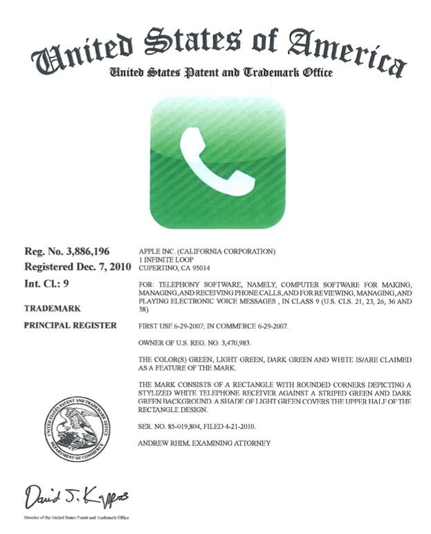
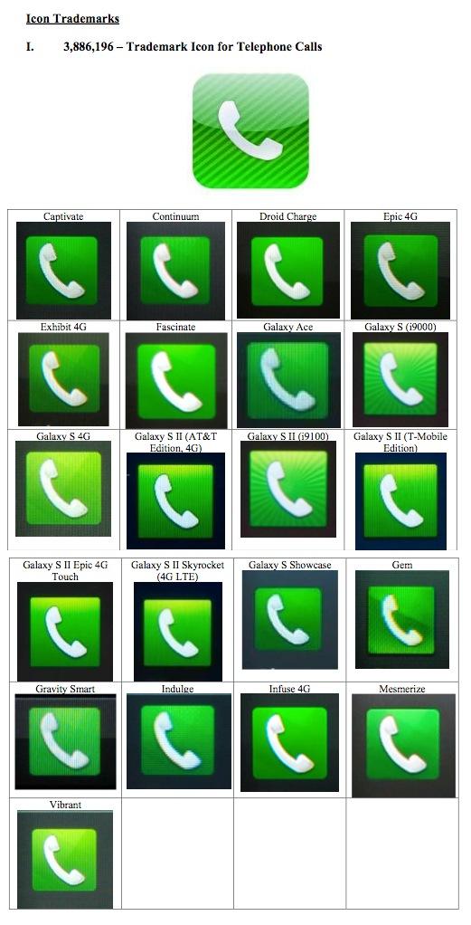
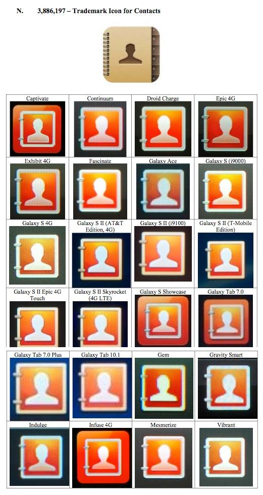
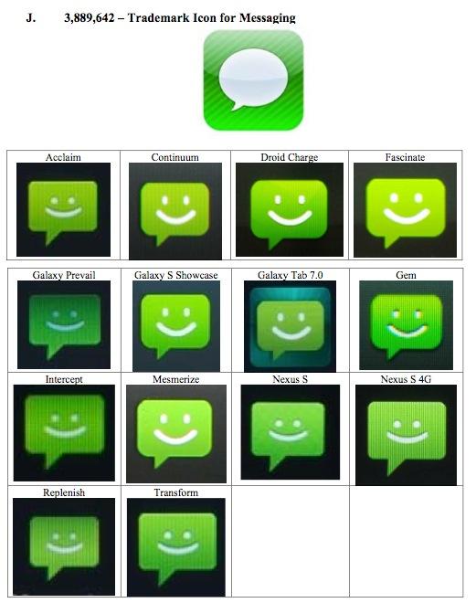
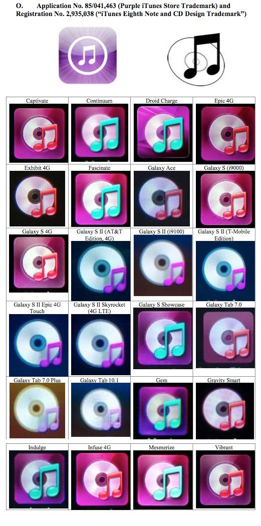
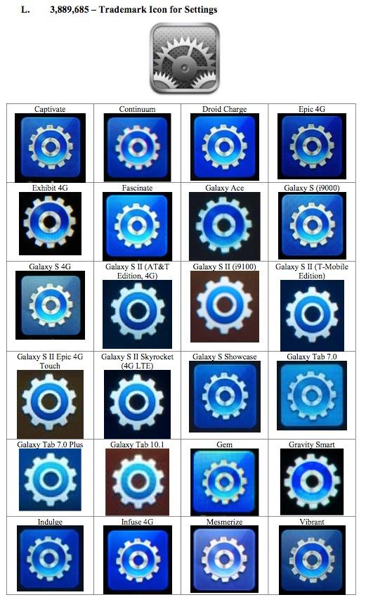
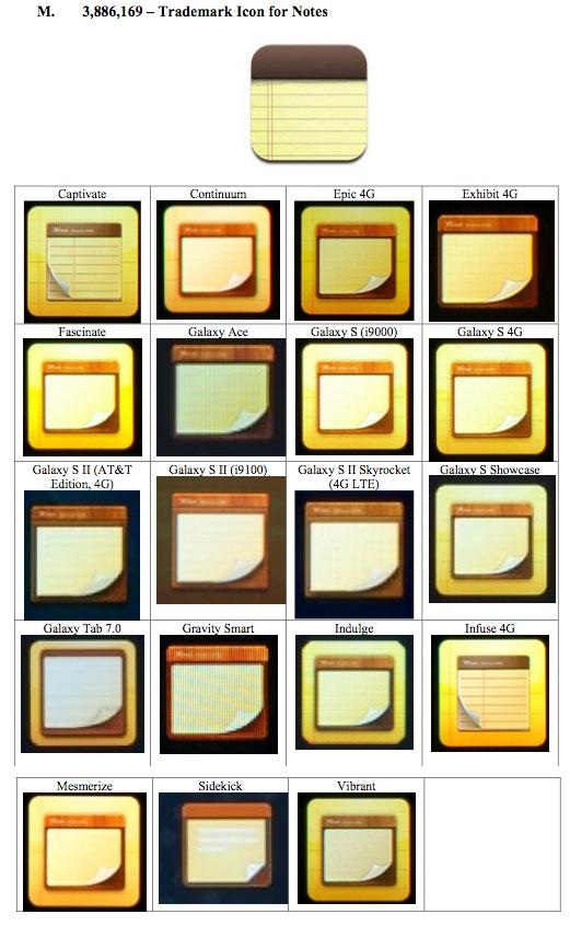
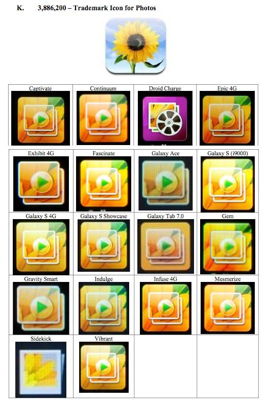
The collection of photos show Apple-designed icons for the iPhone's Settings, iTunes, Photos, Contacts, Phone and Notes apps, all of which bear striking resemblance to similar UI assets seen on Samsung smartphones.
Of the Samsung handsets sampled, including the Captivate, Galaxy Ace and Galaxy S, each featured iconography which was almost identical to Apple's designs. The South Korean company employs a custom UI skin over Google's Android operating system, called TouchWiz, thus the icons are specific to Samsung devices. The latest version of TouchWiz, Nature UX, was recently released with the Galaxy S III handset.
Apple registered a number of icons as trademarks in 2010, an example of which is provided below.
From Monday's court documents:
 AppleInsider Staff





 Andrew Orr
 Wesley Hilliard
 Oliver Haslam
 Christine McKee
 Amber Neely




102 Comments
Uh, "allegedly"? I've been posting proof of this nonsense for months.
They need taken out behind the chemical sheds and shot. Some good ol' Room 101 action for them. Monetary damages aren't even enough anymore. Buying back all old device stock and being forced to have a committee oversee all future designs isn't enough. The fact that Apple will use this suit to win in every other country imaginable to do the same thing isn't enough.
I'd want them out of the phone business entirely.
"You want a monopoly!"
I want competition. And since in five years they've refused to actually do their own thing, it's evident they never will.
Some of those are very obvious. Sunflower for photos? There's no other picture they could have used? And a phone has to be a 1980 vintage handset against a green background? Give me a break. Others, though, are not so obvious. The messaging icon doesn't impress me as an obvious copy. It seems generic enough. The contacts one also doesn't impress me much - although the binding on the left of the icons is perhaps suggestive. Notes? What else does a note look like? If they had chosen post-it notes, then people would have been complaining about Apple's Stickies. That one looks pretty generic. Settings? Could go either way. The music one also doesn't look like an obvious copy. After all, what represents music more than a couple of notes and a CD?
Like the rest of Asia, Koreans obviously struggle for original ideas.
I never realized that Samsung's music icon is basically the old iTunes icon color corrected to purple.
The only reason you copy icons is to make your device look like an iPhone.
The messaging icon doesn't impress me as an obvious copy. It seems generic enough.
Oh, yeah. That icon sure had to use green. And the tail sure had to be on the same side as Apple's.
White paper with blue lines, white paper with red lines, white paper with a black top, white paper with a red top, yellow paper with a black top… About seven thousand different combinations that wouldn't be a direct rip of Apple's stuff.
That's the only one that I think Apple will have trouble getting unanimous assent over, unless you go by the image I posted, in which case it's blindingly obvious.
How about anything else ever, since that's an exact duplicate of the iTunes icon? You honestly don't think they didn't copy anything there? Honestly?