Friday, January 25, 2013, 05:55 pm
Apple adds new "App Store Notes" section to select iOS title descriptions
A select number of featured apps on the iOS App Store are seeing a new section titled "App Store Notes," with the top box containing a short blurb in which Apple offers its take on the software.
While the new feature hasn't rolled out across the board, notes MacRumors, a few featured and top-rated apps now contain the App Store Notes section as part of the Details tab, making it one of the first things users see when browsing titles. Previously, screenshots of the app were located at the top of Details, followed by a developer description, patch notes and basic specification information.
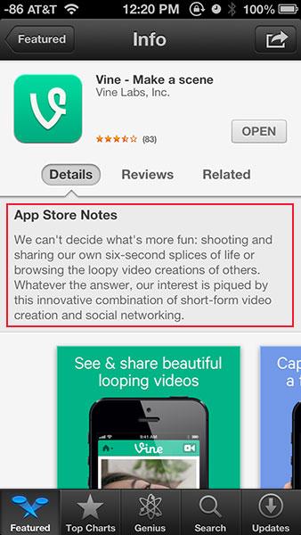
An example of the change can be seen in the above screenshot of Apple's latest "Editor's Choice" app Vine, the Twitter-owned video clip-sharing service that launched on Thursday.
App Store Notes for Vine:
We can't decide what's more fun: shooting and sharing our own six-second splices of life or browsing the loopy video creations of others. Whatever the answer, our interest is piqued by this innovative combination of short-form video creation and social networking.
Interestingly, App Store Notes do not show up on a selected app's iTunes preview page or the desktop iTunes client, though this might change as the new feature continues its rollout in the following weeks.
On Topic: App Store
- Facebook for iOS adds privacy options and status icons in update
- Firaxis' XCOM: Enemy Unknown lands on on iOS June 20
- The Atlantic magazine debuts first weekly publication as iOS-only app
- Office comes to iOS: Microsoft releases Office 365 app for iPhone
- Apple now adding 500,000 new iTunes accounts per day


Want to write for AppleInsider? Submit your application now!


This seems like bad (social) design to me.
They have the App descriptions from the developers to tell you what the app is about, and the user reviews to tell you how good/bad it is. Both of these suck because most developers don't put anything close to a clear simple description of their product up and most reviews are trash like "Awesome!" or ""Sucks!"
So instead of fixing those problems by forcing the app developers to properly describe the product, or making sure that only quality reviews get posted, they provide a third layer of description on top of the two original failed layers?! WTF?
Just make the app designer describe the app in 300 characters or less, and force them to put it at the top of the page. Then eliminate all reviews less than a paragraph or containing junk and other foolishness, and you wouldn't have to "fix" it by adding the new layer on top.