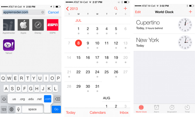
The third beta of iOS 7 features a number of subtle but significant tweaks to the pre-release operating system, including the return of event day dots in Calendar, and the removal of the ".com" button from the virtual keyboard in Safari.
The ".com" button in Safari was an annoyance for some beta testers, who complained they would accidentally hit it instead of the space bar. The button was a remnant from earlier versions of iOS, when the search field and URL entry space were separate.
Starting with iOS 7, Apple has unified the URL and search bars into one user interface element. But the remaining ".com" button made the space bar smaller, and would lead to accidental presses when users meant to search rather than type in a URL.
Monday's release of iOS 7 beta 3 addresses that frustration experienced by some developers. As a replacement, users can hold down on the period button located to the right of the space bar, and the usual options of ".com," ".net," ".org," ".edu," and ".us" become available.
In another change to the third beta of iOS 7, Apple has brought back event day dots when using the native Calendar app in month view. In the first two betas, the redesigned Calendar app lacked the dots that were used in previous versions of iOS to allow users to know which days on their calendar included an event.
With iOS 7 beta 3, individual days on the calendar will have a small gray dot underneath the date to indicate that one or more calendar entries are scheduled for that day.
Other minor changes can be found throughout iOS 7 beta 3. For example, contact options in Messages have changed from text to icons.
And in Photos, the "Add" button has been changed to a plus sign, while a new "Add To" feature when selecting photos allows for easily placing pictures in albums. Fonts throughout the system have also been made easier to read, with a slightly thicker design.
The lock screen has also been tweaked to display current music album art, controls and time all simultaneously. And "World Clock" selections in the Clock app will inform users in words how many hours ahead or behind another time zone is.
In addition, when applications are installing from the App Store, Apple has changed to a new circular, clock-like loading animation.
For an in-depth look at the sweeping changes included in Apple's next-generation mobile operating system, see AppleInsider's Inside iOS 7 series.
 Neil Hughes


-xl-m.jpg)


-m.jpg)

 Malcolm Owen
 William Gallagher
 Mike Wuerthele

 Thomas Sibilly
 Wesley Hilliard
 Marko Zivkovic


68 Comments
Thicker fonts throughout the system seems to address a major issue many had. I wonder when they will change the lock screen arrows that confuse people on how to swipe to unlock? And I'm assuming at this point the icons will not change before release...
The shadow below the text on the home screen helps when having a light background.
Now, if they just change the back button to something usable and less ugly/confusing, and redesign the lock screen, almost all the UI concerns will be addressed. Unlikely at this point I suppose. :\ The biggest thing that surprises me is that the lock screen which has been almost universally vilified by design nerds online, has remained exactly the same through [I]three betas[/I] now. Everyone except Apple seems to agree that it has numerous, serious, overlapping problems and a few attempts I've seen at user testing of it shows that it's new behaviour simply isn't "discoverable" at all. Yet it remains untouched.
Thicker fonts throughout the system seems to address a major issue many had….
I was wondering when they were going to do this as well. The funny thing about the font they chose is that Helvetica Neue is actually a "multi-master" font and thus adjustable for many different states in-between medium, light, ultra-light, etc. They could literally choose any weight they wanted, but they went with the most extreme end. Seems like they've just dialled it back a smidge to the perfect weight.
They'll refine things one by one. Even after release: this is a SUPER high-speed job that began only 7-8 months ago. iOS 7 is so new, so quickly, that it is guaranteed to have growing pains. I think I could have used iOS 7 for years and never even SEEN those lock screen arrows. They're certainly not the right solution. Maybe no solution is needed: the home screen and other apps have no indication of those gestures; why should the lock screen? Unless the lock screen is were you're supposed to LEARN that those gestures exist... a job which the arrows fail to achieve.