WebKit, the Apple-supported open source project behind Safari, is the first browser layout engine to support a new Web standard that makes it easier for developers to take advantage of high-resolution displays, like the Retina panels found in the iPhone, iPad and MacBook Pro.
The new standard, an addition to the HTML5 specification called "srcset," provides developers with an easy way to serve users different image versions based on the resolution of their device. For example, a website may serve larger, higher quality images to visitors browsing on a Retina MacBook Pro while sending smaller, lower quality images to visitors on a MacBook Air.
Websites and Web-based applications have been slow to provide support for Retina displays since the screens first appeared on the iPhone 4 in 2010. Current methods for implementation are suboptimal - they can be cumbersome for developers, degrade the user experience, or lack cross-browser support.
Using srcset, developers can specify multiple variations of an image with a single declaration, and it is designed for compatibility with older systems. Browsers that do not support srcset will simply ignore it without any adverse affect on the user.
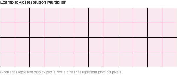
The syntax is similar to Apple's iOS conventions for Retina-ready graphics: developers simply provide an alternate filename and a resolution multiplier, e.g. 1x, 2x, or 4x. The "resolution multiplier" is a measure of how many physical pixels make up one display pixel; for example, the iPhone 5 has a physical resolution of 1,136-by-640 pixels, but a display resolution of 568-by-320 pixels. This means there are 4 physical pixels for each display pixel, or a 4x multiplier.
The World Wide Web Consortium, or W3C, the international organization that defines and administers the open standards that underpin the Web, added srcset to the HTML5 specification in May 2012.
A similar feature, called "-webkit-image-set," was added to WebKit and shipped with Safari 6 and Google's Chrome 21 in October of the same year. The asset never achieved widespread adoption, however, as it was not implemented in Microsoft's Internet Explorer and Mozilla's Firefox, which together commanded more than 50% of the international browser market at the time.
WebKit is the first browser engine to announce support for srcset, and the feature is likely to ship in Safari 7 with OS X Mavericks.
 Shane Cole




-m.jpg)


-m.jpg)




 Malcolm Owen
 William Gallagher
 Christine McKee
 Chip Loder
 Oliver Haslam

 Amber Neely


20 Comments
Great, now to have no browser but Safari ever use it.
Great, now to have no browser but Safari ever use it.
I wonder what Google is doing for their Chromebook Pixel now (if anything) that they've split off from WebKit?
Android added 4k display support with 4.3. Chrome version 30 adds HiDPI support which I believe is what this article refers too. As also alluded to in the article Chrome added support for Apple Retina display resolution last July
Yeah, did they do it via this standard right here or their own hobbled together crap?
You need to look less desperate.
[quote name="Tallest Skil" url="/t/159048/webkit-adds-support-for-high-resolution-displays-paves-the-way-for-retina-friendly-web#post_2380403"] Yeah, did they do it via this [I]standard[/I] right here or their own hobbled together crap? You need to look less desperate. [/quote] http://news.cnet.com/8301-1023_3-57593030-93/chrome-gets-high-resolution-screen-support-on-windows-too/ http://appleinsider.com/articles/12/07/31/google_chrome_browser_updated_for_apples_retina_display_macbook_pro If I've read other articles about it correctly Apple's Safari is in fact the first to finalize while Chrome may be another few weeks. Both are working with the W3C on the same standards according to the AI article, right? The only reason I replied to your post was becasue you hoped it would only be a Safari supported feature, which apparently won't be the case. That's a good thing too since Safari on any platform other than Apple's may not be an ideal choice. And yes I tried it on a Windows machine last year.