In an email sent out to developers on Tuesday, Apple said all apps submitted for review after Feb. 1 must be optimized for iOS 7, a move that will bring parity to titles presented in the iOS App Store.
Apple posted an identical message to its Developer website, noting both new apps and app updates submitted to the App Store need to be built with the latest version of Xcode 5.
With the requirement, Apple is looking to push developers who may not already be in the iOS 7 fold into action.
As noted during the unveiling of Apple's iPhone 5s and accompanying 64-bit A7 chip, the Xcode 5 development tool is now capable of addressing 64-bit processes and grants access to specialized iOS 7 APIs. Currently, only a few apps tap into the A7's potential, and while many don't need the added processing power, it appears Apple is quietly urging developers to optimize the back end as it moves toward a more cohesive iOS experience.
The note also points developers to the iOS Human Interface Guidelines, which were revamped for iOS 7's aesthetic and under-the-hood changes. In the document, Apple says iOS 7 embodies three key themes:
- Deference. The UI helps users understand and interact with the content, but never competes with it.
- Clarity. Text is legible at every size, icons are precise and lucid, adornments are subtle and appropriate, and a sharpened focus on functionality motivates the design.
- Depth. Visual layers and realistic motion impart vitality and heighten users' delight and understanding.
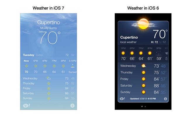
With the upcoming iOS 7 optimization requirement, Apple is aggressively pushing for a unified ecosystem that works smoothly with its latest devices. Aesthetically, developers will most likely deprecate vestiges of the previous skeuomorphic iOS 6 from which iOS 7 is such a vast departure.
 AppleInsider Staff



 Andrew Orr

 Wesley Hilliard

 Oliver Haslam
 Christine McKee
 Amber Neely






40 Comments
The biggest issue with compiling for 64-bit is that the app becomes iOS 7 only. Otherwise it's pretty easy to convert. My tiny apps converted in an hour or so, but I still release 32 bit only since I need to support older versions of iOS. (Android is interesting in comparison... Much more disparity of versions in use, but you can include the new SDK in your apps and use many of the newer APIs on older versions of the OS, something Apple rarely allows.) I do use the latest Xcode, though, so should be fine and will probably be 64-bit in a year or two.
Is it also required to force users to read entire sentences of text instead of quick-to-understand visuals? (weather and weather notification) Is it required to destroy readability by eliminating contrast throughout the GUI? Yeah, light text on light backgrounds is brilliant! :-p Is it required to fill every screen with bright color or empty white/gray space so that an iPhone feels like it needs its brightness turned down, when it's already turned down? Is monochromatic the new color? Is it also required to get users lost in the interface by avoiding clear visual cues for controls? Is it also required to avoid differentiating your app's icon? How do they call the new use of text "easy to read" with the new thin and smaller fonts? Is it also required to exterminate all elegant shapes in favor of solid, edgeless flat shapes? Is flatness a requirement? I mean... Depth? Seriously?? There's almost no depth left in the entire UI! It's pretty clear in that one example above (weather app): the new version is hard to look at, is dull & disinteresting, is harsh on the eyes, is extremely poor for users with eyesight problems, and is generally a downgrade.
[quote name="dysamoria" url="/t/161228/apple-to-require-all-ios-app-submissions-be-ios-7-optimized-by-feb-1#post_2447372"]Is it also required to force users to read entire sentences of text instead of quick-to-understand visuals? (weather and weather notification) Is it required to destroy readability by eliminating contrast throughout the GUI? Yeah, light text on light backgrounds is brilliant! :-p Is it required to fill every screen with bright color or empty white/gray space so that an iPhone feels like it needs its brightness turned down, when it's already turned down? Is monochromatic the new color? Is it also required to get users lost in the interface by avoiding clear visual cues for controls? Is it also required to avoid differentiating your app's icon? How do they call the new use of text "easy to read" with the new thin and smaller fonts? Is it also required to exterminate all elegant shapes in favor of solid, edgeless flat shapes? Is flatness a requirement? I mean... Depth? Seriously?? There's almost no depth left in the entire UI! It's pretty clear in that one example above (weather app): the new version is hard to look at, is dull & disinteresting, is harsh on the eyes, is extremely poor for users with eyesight problems, and is generally a downgrade.[/quote] Wow I guess I must be special because I have yet to get lost in iOS 7. And according to Apple's developer portal 76% of devices are now running iOS 7. Highest uptake of any iOS version. But clearly iOS 7 isn't for you so perhaps you'll be more comfortable using Android or Windows Phone. The good thing you have choices. :)
[quote name="Rogifan" url="/t/161228/apple-to-require-all-ios-app-submissions-be-ios-7-optimized-by-feb-1#post_2447375"] Wow I guess I must be special because I have yet to get lost in iOS 7. And according to Apple's developer portal 76% of devices are now running iOS 7. Highest uptake of any iOS version. But clearly iOS 7 isn't for you so perhaps you'll be more comfortable using Android or Windows Phone. The good thing you have choices. :)[/quote] The only time I get lost, or rather not know where to go, is when I'm trying to locate seldom used options in Settings. I'd love for a search field in Settings that would point me to the right option by letting me simply search and click it to access it as well as searching for it and seeing a sub label that lists the path. For instance, searching for battery and seeing General » Usage » Battery Percentage.
I'm curious how they plan to enforce this now that human beings no longer seem to be looking at the apps. It's easy for software to tell if an app was compiled by Xcode 5, but not so easy to know if it's following the Human Interface Guidelines.