The stylishly simple and minimalist look of Pages hides a powerful writing tool — and a page layout one too. AppleInsider has a word.
Maybe Apple should rethink how it does software. With Keynote, Numbers, and now Pages, it's always the same story. These apps are so simple to use that people unthinkingly assume they're underpowered.
We have regularly heard people saying Pages is fine for basic needs but it isn't Microsoft Word because it doesn't have feature X or Y. Sometimes we know for a fact that this isn't true and most of the time we suspect it isn't. If you know where to look, Pages has startlingly powerful features.
Of course, there are also times when we know for certain that the complaint is correct. This would chiefly be whenever someone says you can't do outlining in Pages. There is a way but it's an unsatisfying workaround that we'll tell you about only because you're now curious.
For just about everything else, though, Pages is deeply well designed and if it hides its powerful features, it doesn't hide them very well. You can quickly go from new user to expert and Pages will help you along every step of the way from idea to finished writing.
All of the following applies to Pages on the Mac. Much of it is the same on iPad and iPhone but that is a very different version of Pages with its own benefits and issues.
Starting from scratch
Seemingly you can't just start a new, blank document in Pages and get writing. Instead, it looks as if you have to go through choosing File, New and then picking from an array of templates.
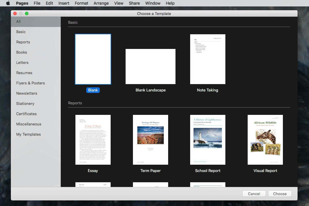
Templates are fine. Templates are great. Pages comes with more than 70 — we lost count — with pre-designed documents suited for everything from an academic report to an envelope.
These templates are divided into 11 sections such as Books, Letters, Flyers & Posters. There's also a 12th called All which does naturally list every template but it does so in a list divided into these same sections for ease of finding.
The last of the sections is called My Templates. If you ever use templates then this section is the single most useful of all the sections and just frustrating that it's at the end. There is a way to jump to it faster than clicking on the section or scrolling down through All, but it's not massively faster.
When you first open this Template Chooser and the section labelled All is selected, quickly type the letters M and Y. That takes you to the My Templates section but you've then got to use your mouse or trackpad to click and select one of the templates. You can't press the right arrow key to move from the sections into the templates and you can't do the same typing trick to jump to one.
What we'd really like is an ability to mark templates as favorites and have those be the first thing you see in the chooser.
That's partly, though, because we don't use many templates. By far the giant majority of the time, we just want a blank document. Officially a basic blank document is still a template, just a rather empty one, but that's what we want — and you can cut down the steps to getting it.
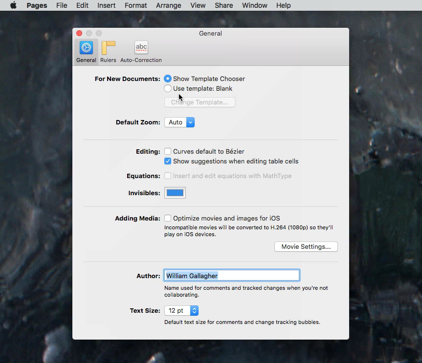
Go to Preferences, General. The top section there is called For New Documents and it has two options. By default, Show Template Chooser is selected but you can switch it to Use Template instead.
Then you have to specify which one you want and that means clicking on the button Change Template. Do that and you're presented with the Template Chooser again. Select the blank document, though, and from now on that's what you get whenever you choose File, New.
You've spotted the problem, though. Once in a blue moon, we do want to use a template and we've now locked ourselves out of the Template Chooser.
To get it back temporarily, choose File, New again but hold down the Option key while you do.
About that outlining
Use that option key trick to open the Template Chooser and now look for one called Note Taking. This is the workaround for outlining in Pages.
It didn't used to be. Pages had a fine outliner back in the day, back before Apple revamped the entire app in 2013. That was a typical Apple move that did make a better app but at the cost of major features that the company might then slowly restore. So far it hasn't restored outlining.
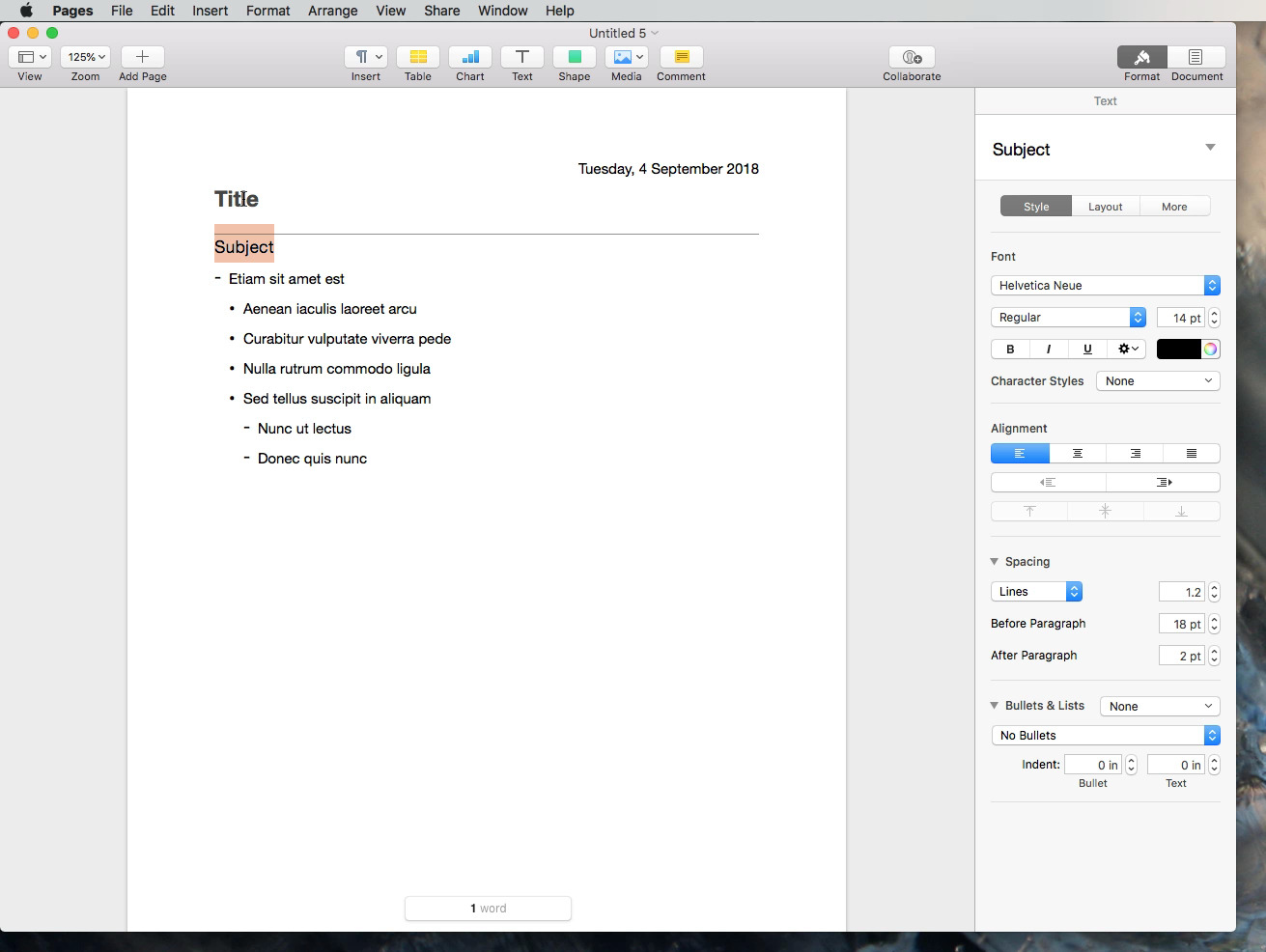
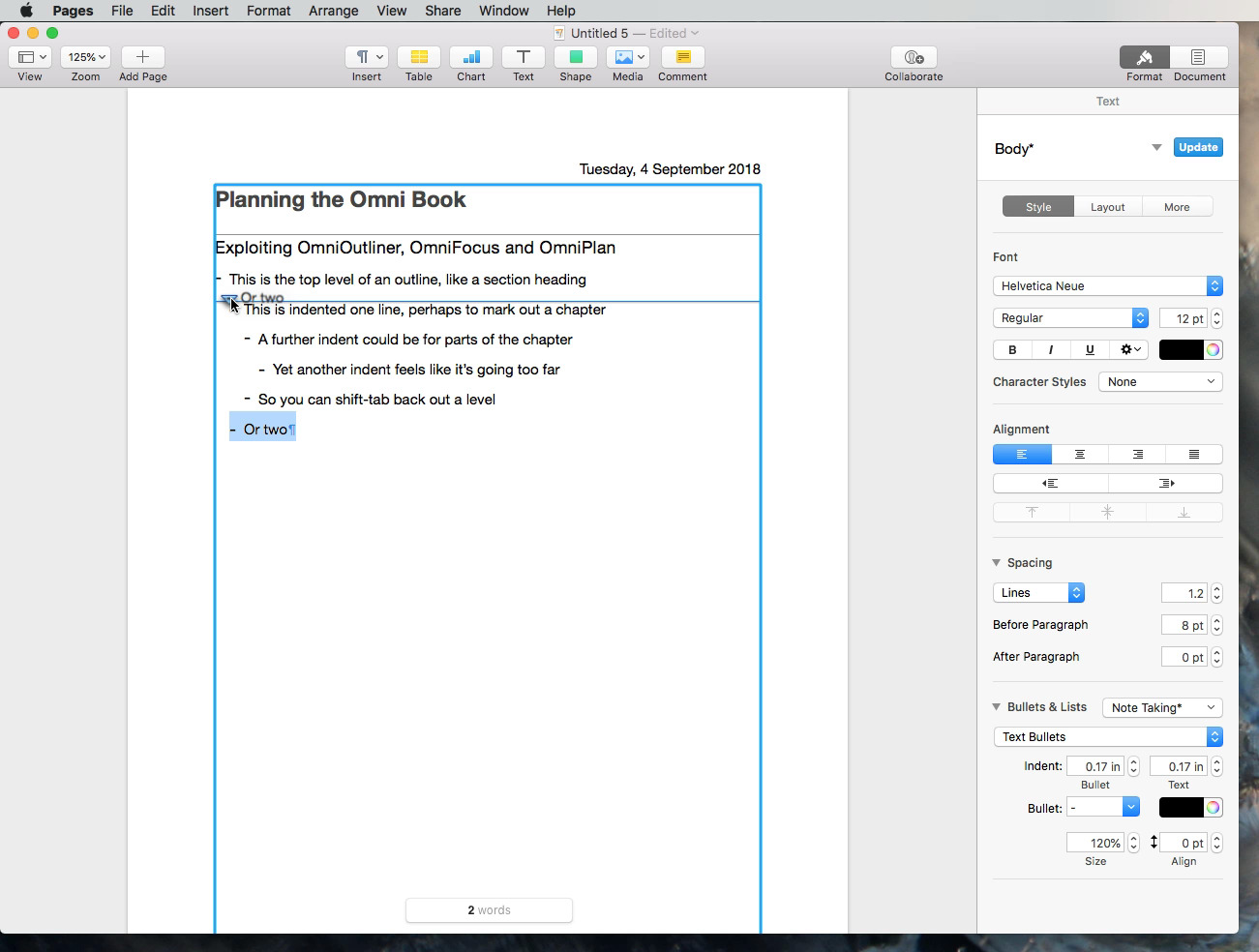
However, it does have this Note Taking template and it at least looks a bit like an outlining tool. It comes with an example of outline-style headings and indents.
Select all of the example text, hit delete, and start typing. If you begin a sentence with a number or a Roman numeral then when you hit Return at the end of it, you'll automatically get a correctly-numbered next line.
So you can rapidly produce a numbered list.
You can also create the kind of headings and subheadings you get in outlines. With your cursor at the start of a line, hit Tab and you indent that line. Anything you type now and anything that was already on that line will be changed to a subheading of the line above.
You can keep tabbing to indent lines and shift-tabbing to out-dent them. Eventually you end up with a document that looks very much like an outline. If you're doing this to present a proposal to a publisher, it may even be enough. Doubtlessly you're going to add some lines and delete others but the basic shape is there and complete.
Only, outlining is only partly about presenting your work. It's practically an accidental side effect that an outline is a presentable document that helps you sell ideas. Really outlining is about finding and shaping those ideas.
It's about helping you get to the core of what you want to convey and then about finding how exactly to present it in the best order.
Pages does none of this. The closest it comes is in how it lets you re-order entries in the outline.
Each line begins with a symbol such as a bullet point for the main headings and a minus sign for the subheads. Click and hold on one of these symbols and you can drag the line up and down to wherever you want. When you finish dragging, Pages renumbers the whole document to reflect the new order.
It definitely works but it's very slow. It's sufficiently cumbersome, too, that you're prone to dragging a line up and accidentally dropping it in the middle of another one. That's because this isn't outlining, it's really the same kind of drag and drop that word processors use for moving paragraphs around.
Then outlines for complex projects tend to amass detail that's vital to record, vital to be able to arrange, but also overwhelming when you're trying to see the big picture. Outlines should be able to collapse and expand sections so that you can choose how much detail you see at any one time.
Pages can't do this but alternatives like OmniOutliner can. If you write complex documents, if you plan events, if you do anything where you start with a mess of ideas that you have to sort out, just go buy OmniOutliner.
Styles
All of this planning and outlining is manna to some writers and anathema to others. If you're using Pages for anything substantial, though, then it pays to prepare the ground at least a little. Even if you can't bear outlining your novel and you'd rather just dive in to the writing, still take a moment to look at Styles.
Just as Word does, Pages comes with many predefined Styles which state that chapter headings will all be in, say, Helvetica 14pt bold. They might say that body copy, the main text your reader sees, is Times New Roman 12pt.
So long as you take a moment to select a line you've just written and tell Pages that it's a chapter heading, this is all fine and handy. Your chapter headings will look neat.
That's not why you should spend some time with Styles, though.
Later on when you have 80,000 words written and you print it all out for the first time, you might find you loathe how it looks. With Styles, you can edit how chapter headings look. Tell Pages that now chapter headings are to be Garamound 16pt italic and it will change every single heading in the document immediately.
And even that isn't the whole story. If you have conscientiously marked what's a chapter heading, what's a subheading, what's the body copy and so on, Pages can do some work for you. It can create a Table of Contents in a flash.
So be conscientious. As you write or at most when you first edit your text, select a line and click on the Format icon at top right of the Pages screen.
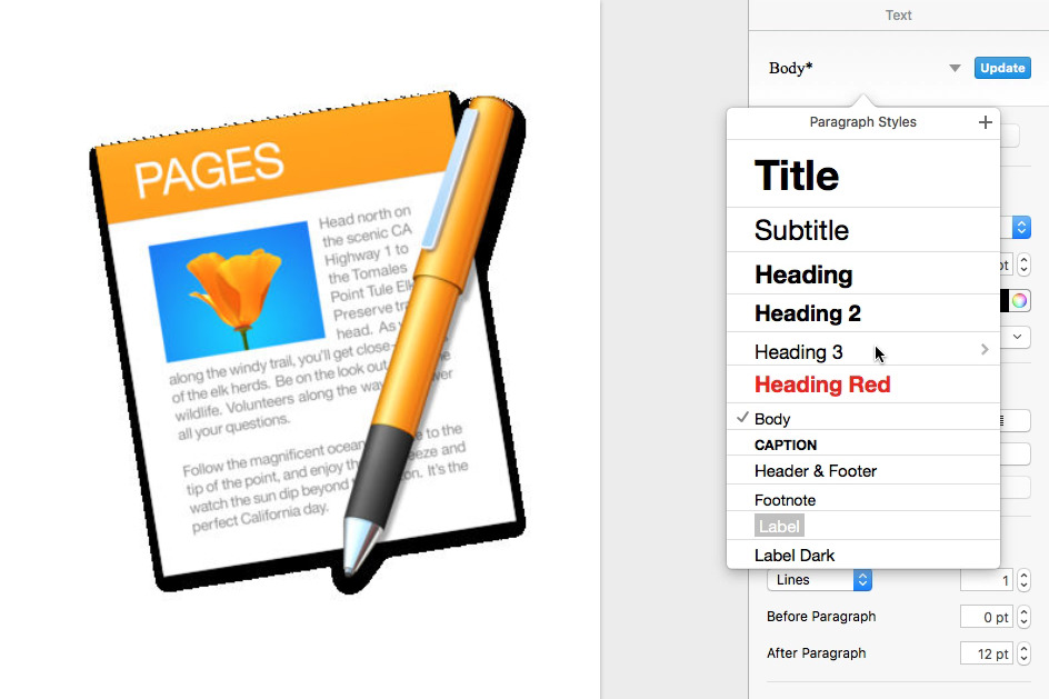
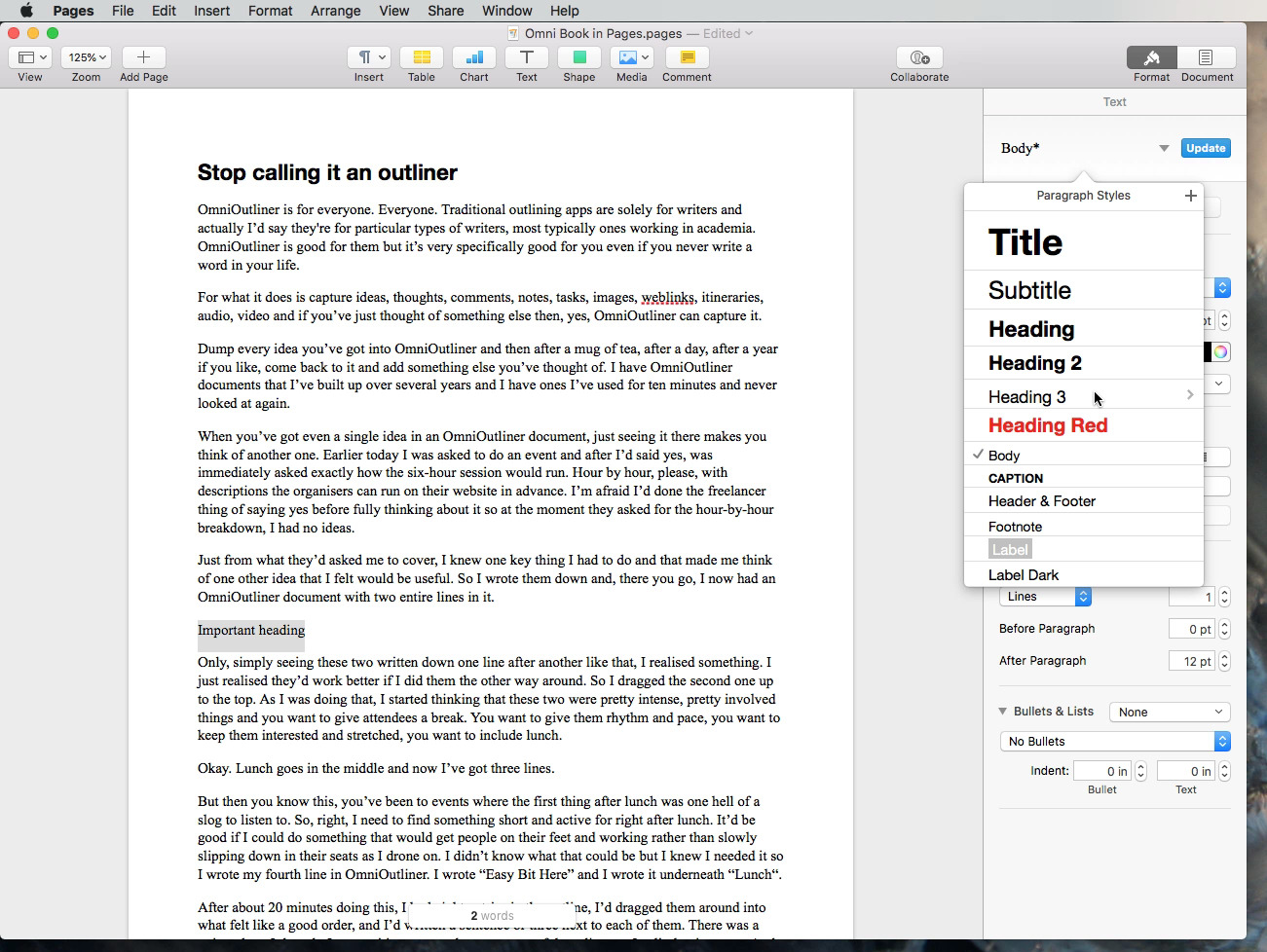
When you do that, a pane full of options appears with the top section headed Text. Under that is a large dropdown which lists the current style. If you've not been in this section or you've not used Styles before, then it will probably be showing the word Body.
Click on it and you'll see options to change the selected text to a different Style such as heading, caption, footnote and so on. There will be a tick next to the one Pages thinks this text currently is.
You can choose from the list to change that selected text from Body to Heading but you can also do more — and it's a little confusing.
Click to close the dropdown and you'll see in the rest of the pane that there are options for changing the font face. So change the font, alter the color, add extra spacing between paragraphs, do anything you like.
It will all affect the text you've got selected — but nothing else.
The Body or Heading line at the top of the screen will change to indicate some of what you've been doing. So if you did change the color, for instance, you might see Body written in green or whatever.
There will also be an asterisk which means that this text is based on, say, the Body style but has been altered.
You can now click back in the text to clear the selection and carry on working.
If what you want to do is change the entire body text of the whole document to green, though, you have to do exactly the same thing — but then take another couple of steps.
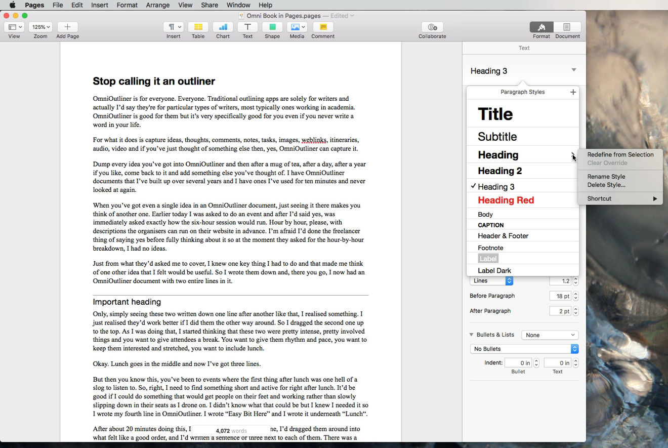
Select a small sample of text and make all of the formatting changes you want. Then while it's still selected, click again on the Style name at the top of the Format pane. Again there will be a tick next to the Style that Pages thinks this is but if you move your cursor down to that line, you'll get an extra icon showing a pop-out menu.
Choose that and you get options including Redefine from Selection. Click on that and now you've told Pages that you want all text like this to have these new settings. And since you've done this in Styles, that's exactly what you get. Instantly, the entire document changes to reflect these changes.
Paste and Match Style
Maybe you're copying from a draft you wrote in Word or maybe you're extensively quoting some website, we're not judging you. Once you've copied any text and you paste it into Pages, though, you find it doesn't look like the text around it.
You can paste it in, then select it all and use Styles to tell Pages what the text should look like.
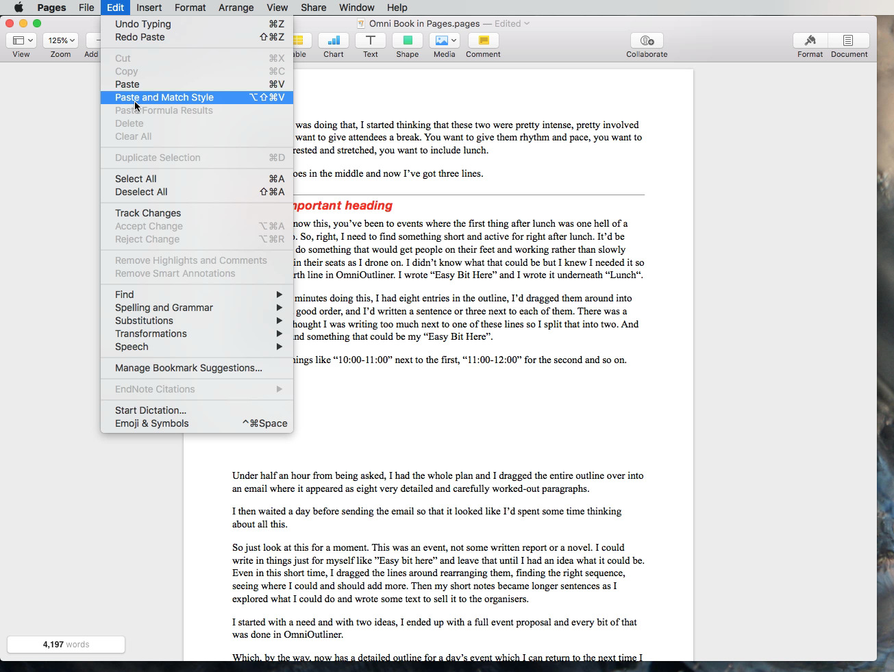
It's easier, though, to get Pages to do that work for you automatically. Instead of pasting with the Command-V keystroke, do it by using Command-Option-Shift-V. Alternatively, choose the Edit menu and rather than choosing Paste, choose Paste and Match Style.
The text you paste immediately looks like the existing text around it and Pages knows that it's Body or Heading and so on.
This is sometimes mistakenly called Paste Special or Paste Plain. These are Word functions and if you're pasting text into a plain, unformatted document then you can think your bold, italic, green text is being converted into plain. Neither of the paste options in Pages will handle issues like converting smart quotes to dumb ones, though.
So if you are compiling work in Pages that you intend to put on a website later, don't rely on Pages's formatting. Use a utility like TextSoap instead.
It's not just text
Pages truly blurs the line between being a word processor like Word and a page layout app such as Adobe InDesign.
It's not as powerful as InDesign but it approaches laying out pages in much the same way.
If you have no interest in page layout — because you're writing text for someone else to put into a book, for instance - then you just write your text as normal.
However, if you do need to be concerned with the layout of the document, Pages provides the tools to manipulate your text and shape it around images.
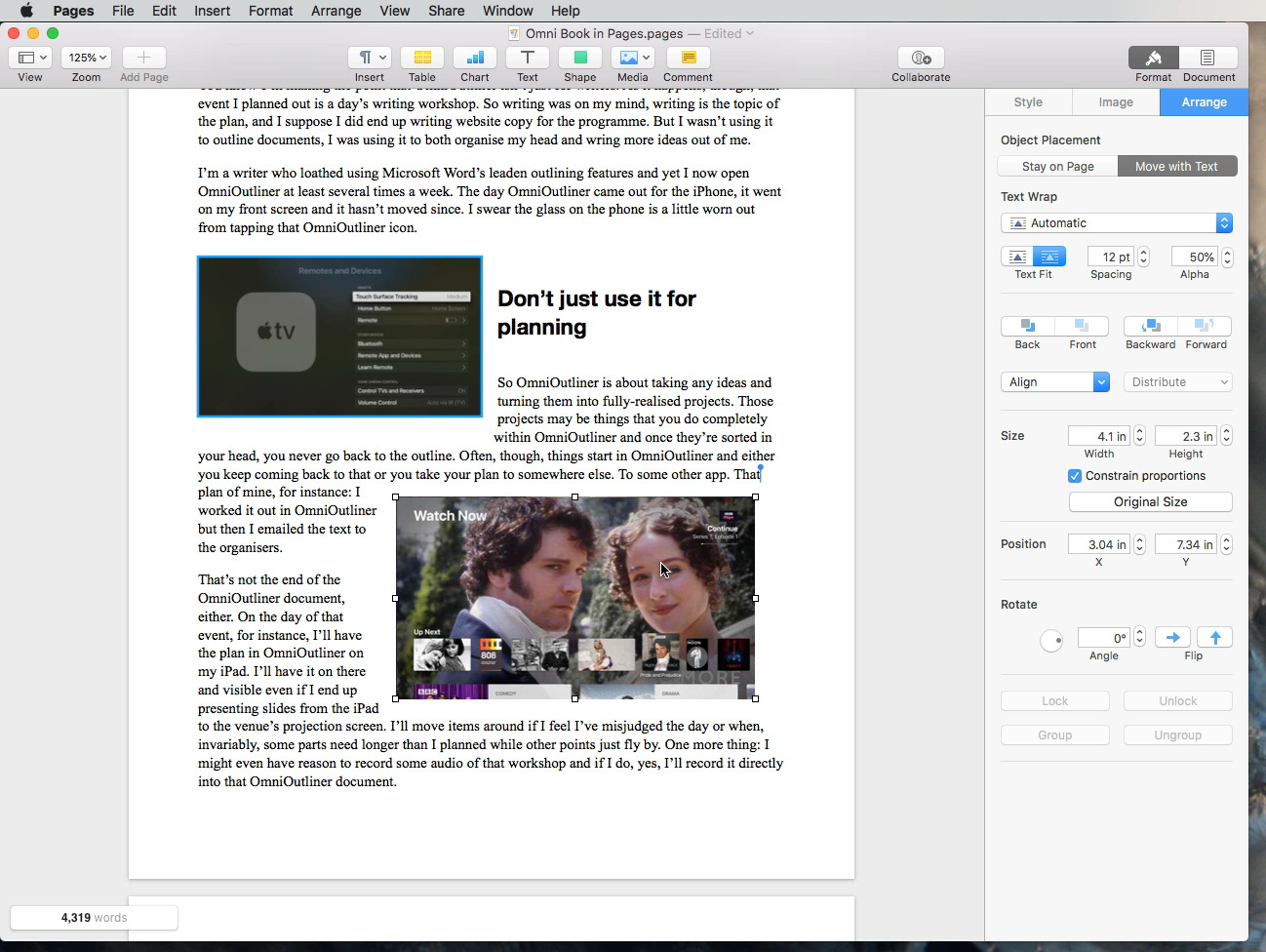
Just drag any image into your document. Click to resize it — always make the image smaller, never bigger because otherwise it will look fuzzy — and drag to position it. As you drag the image around, all of the text scurries out of the way: Pages automatically flows the writing to fit either side of the image.
It will do that whether you add one image or many. It will do it whether you add six images and a movie, too.
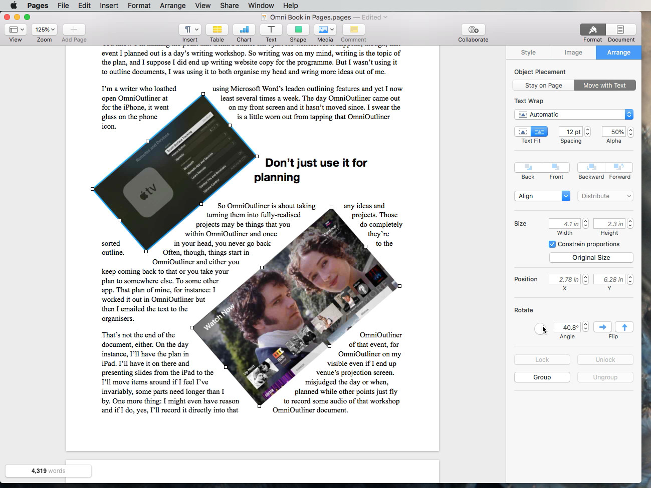
Plus you can select all of the images at once and then rotate them together. Select them, choose the Format menu and click on Arrange. On the pane that appears, there'll be a rotate section at the bottom. Type in precise degrees or just rotate the control and every image will swivel about in precisely the same way.
It's that precision you want: this is how you can be certain you've adjusted every image as you intend. It's how you can be sure you haven't nudged one of them out a degree or two.
Cut it down
It is easier to add images and video to a Pages document than it ever is to a Word one. You may think that Word will crash as soon as you run out of salt to throw over your shoulder, but really if it crashes then there's a good chance it's because of your images.
Word will let you drag a feature film in to a document and then trim it to 30 seconds or crop to a postage stamp. Yet behind the scenes, that brief postage stamp is still really a full-length movie and it's huge. It makes Word documents big and cumbersome.
The same is true of Pages — initially.
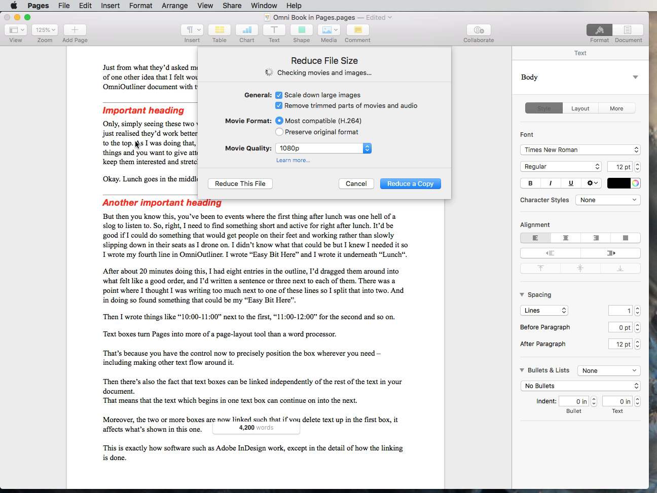
When you have a document with video and big images in, the file size does get huge and it does keep the entire movie even if you trim. Until, that is, you choose File, Reduce File Size.
Choose that and Pages will calculate how much smaller your document can be if you accept all its recommendations. You can choose not to, you can tell it that you don't want to lose that full movie. However, by default you do lose everything that can't be seen in the document or where a lower quality image is fine for printing or so on.
Do choose this when you're sending the document to someone else but for yourself, keep the un-reduced document. It's brilliant that you make files much smaller but you can't get back what you take out. So having the full-size copy safe is important.
Overblown
You start off thinking Pages is a basic writing tool and you end up having to use its most obscure tools for cutting down the size of the documents you make in it.
Writing and desktop publishing are sufficiently different tasks that it's remarkable how Apple has got Pages to be so good at both of them.
However, that was another reason to hide complexity and the result has been that we don't appreciate Pages as much as we should.
Keep up with AppleInsider by downloading the AppleInsider app for iOS, and follow us on YouTube, Twitter @appleinsider and Facebook for live, late-breaking coverage. You can also check out our official Instagram account for exclusive photos.
 William Gallagher


-m.jpg)




 Charles Martin
 Marko Zivkovic
 Andrew Orr
 Amber Neely

 William Gallagher and Mike Wuerthele




21 Comments
I would be using Pages exclusively if there was a comprehensive mail merge capability built into the program. There is an add on, but it too is limited in its ability. Consequently, I am forced to use Word for certain tasks
I tried this.I don't see this.Is it on El Capitan?
.
You've spotted the problem, though. Once in a blue moon, we do want to use a template and we've now locked ourselves out of the Template Chooser.