Apple has arguably made its biggest user interface change ever to the Home screen in iOS 14. AppleInsider takes a close look at the all-new widgets, Today View, Home screens, and App Library in the new operating system.

New widgets in iOS 14
The Home screen is critical. Users visit it the most to launch apps, check notifications, and slide over Today View for widgets and information. The revamp it as part of iOS 14 encompasses many distinct features that are all profound changes on their own. Let's break those down a bit further.
Widgets
Widgets have been wholly updated with new designs, sizes, and functionality. Apple says its taken what its learned from creating the Apple Watch and complications and applied that knowledge to the updated widgets.
Widgets now come in three different sizes, a small square, a medium double-wide rectangle, and a large box that envelops roughly half your iPhone screen.
In Today View -- the screen to the far left of your various Home screens still is full of widgets. The edit button has been removed from the bottom, instead of being tucked away in a contextual menu that is opened by long pressing on any of the existing widgets. Press "Edit Home Screen" to enter jiggle mode or quickly add a new one but tapping the "+" button in the top left corner.

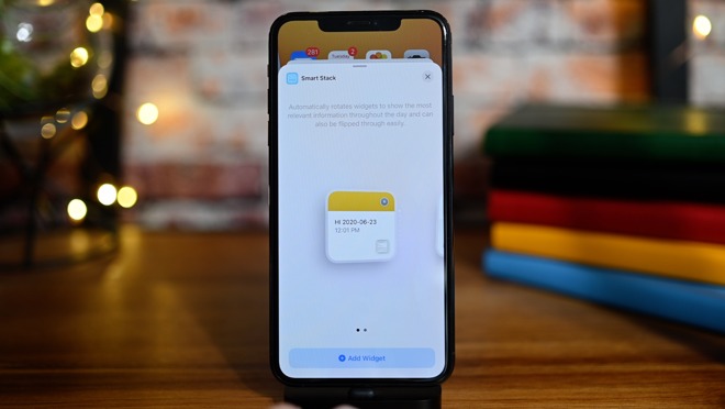
The small Smart Stack widget in iOS 14
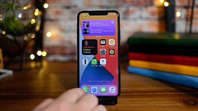
Widgets are now able to be dragged around, even before entering jiggle mode. Just tap and drag to rearrange. What's more, they are no longer confined to Today View but instead can move onto any of your Home screens, interspersed among your app icons.
This opens a huge array of options as you choose between the differently sized widgets and how they are mixed with your apps across various screens. By dragging one widget on top of another, widgets can be stacked, further creating information-dense portions of your display.
The medium recently played widget in iOS 14
For iOS 14, Apple has polished all of its existing offerings, with widgets for Apple Maps, Music, Podcasts, Notes, Stocks, News, Photos, Fitness, and more have dedicated widgets in various sizes from Apple. To add a new widget directly to the Home screen, it is the same as Today View. Go to jiggle mode and tap the "+" to the top left where you will be taken to the widget catalog.
This widget select will house all of Apple's widgets, as well as new ones from your favorite third-party developers.
Apple also created an entirely new widget called Smart Stack. Smart Stack is a group of widgets together that will intelligently rotate throughout the day. In the morning it may present Shortcuts you run, followed by your maps, then podcasts for when you at work, music when you get home, and the news for as you sit down to read in the evening. This is all dictated by how you use your phone throughout the day.
Editing the Smart Stack widget in iOS 14
The Smart Stack widget can be edited as well. You can turn off specific modules by long-holding on the Smart Stack and tapping "Edit Stack." You are shown a list view of the different modules included in the stack that you can reorder as you choose, or swipe from right to left to delete them. There is a toggle as well to disable the auto-rotating smart feature.
App Library
Beyond widgets, Apple has introduced App Library. In a similar vein as Android's app drawer, Apple's App Library feature is tucked away at the far right of all of your Home screens. To get there, go to your last Home screen and swipe right to left again.
App Library is home to all of your apps. When you bring it up, all of your apps are categorized into several boxes, based on various data. The first is a box of suggestions which are recommended based on your usage such as ones you open frequently or at that general time of day. Then there is Recently added, which is just as it sounds.
The App Library in iOS 14
Others include general categories like productivity, social, creativity, and more. Each of these categories has three apps presented larger with a small set of icons in the lower right corner of the box. The big icons are ones that iOS believes you will most likely need and the small subset opens up a list view with search of all of the apps in that category.
Instead of diving through all of those groupings, you can pull down from the top -- or tap on the search box -- to bring up an alphabetized list of all your apps. You can search through them, swipe through, or drag your finger down the alphabet to the right to find the app you're looking for.
If you have countless apps on your phone, swiping through a dozen Home screens may be obnoxious to access App Library. To rectify this, Apple made it possible to hide additional Home screens.
Hiding Home screen pages in iOS 14
The idea is that most users have muscle memory for their first few home screens but after that lose recollection where apps reside. A lot of users simply use the universal search bar to open apps as well, negating the need for all the Home screens cluttering up the interface.
How to hide pages in the App Library on iOS 14
- Enter jiggle mode on the Home screen
- Tap on the pagination dots at the bottom of the screen
- Uncheck any pages you wish to hide
- Tap Done
Meet your new Home screen
Together, these new enhancements create a much more accessible, information-rich, and fast Home screen experience for steadfast iPhone users.
Many of these features users have clamored for years, with Apple just now delivering but doing so in traditional Apple fashion. Everything feels polished and designed this way for a reason.
The biggest deficiency is with iPad. iPad is getting many of these changes too, but it distinctly lacks both the App Library as well as the ability to place apps anywhere on the Home screen. They are still confined to the Today View list that is able to be placed on the first of your Home screens. The thinking seems to be that the iPad's display is larger so finding apps is less of a chore, but it still would be beneficial to users and we hope Apple does implement this through the iPadOS 14 by the time it exits beta.
Stay tuned to AppleInsider for more in-depth coverage on new features with iOS 14, iPadOS 14, watchOS 7, tvOS 14, and macOS 11 Big Sur.
