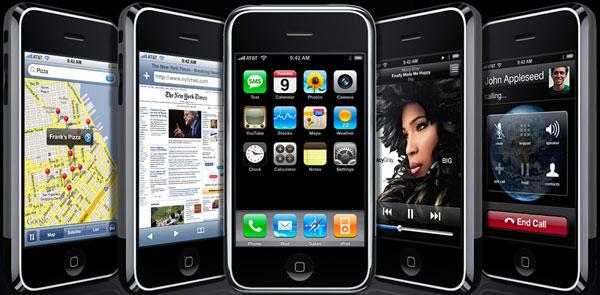
While the iPhone is primarily marketed as a mobile phone, it's also the latest generation of iPod, a handheld computer with a web browser, an organizer, a note taker and a camera. Are all of its features worth its $500-600 price, particularly in view of criticisms lodged against AT&T's service and the missing features in the device itself?
While Microsoft CEO Steve Ballmer laughed off the iPhone as "the most expensive phone in the world" shortly after it was announced at January's Macworld Expo, there were actually a number of popular smartphones already in the $750-900 range, including several Windows Mobile phones.
Critics like to compare the iPhone against these premium priced phones in terms of features, but against simplistic phones when talking about price. While that may seem unfair, the iPhone stacks up well against the highest end phones in its features, while also being so aggressively priced that it is actually less expensive than many of the cheapest smartphones when the cost of the required service plan is included.
Take Ballmer's own example: the Windows Mobile-based Motorola Q offered by Verizon Wireless. Pitted against the iPhone's $500 (4 GB version) or $600 (8 GB version) price tag, the Motorola Q's $99 price seems far more affordable. However, the Motorola Q isn't really $99; it was only ever offered at that price after mail-in rebates and with a two year contract for Verizon's voice and data plan.
Those plans start at a minimum of $80/month, making Verizon's two-year commitment at least $1920. When I went shopping on Verizon's website, the cheapest version of the Motorola Q I found was $180 after all discounts. Even if I actually collected the $50 mail-in rebate, I'd still be paying $2100, not including the sales tax I'd pay against the true $330 price of the phone and other related fees.
The $500 iPhone, paired with a similar service plan from AT&T and its activation fee, comes to $1956, significantly cheaper overall. That not only makes it a no brainer to upgrade to the 8 GB version of the iPhone, but also dangles the question: how can it be that the multi-featured iPhone is being compared in cost against cheaper and far simpler smartphones if the iPhone is in reality not any more expensive at all?Â
In order to hit such a competitive price, was Apple forced to leave a lot of features out? After camping out overnight on iDay in front of the Apple Store at Union Square in San Francisco, I spent the weekend testing out the new iPhone to find out. Here's an overview of what the iPhone does by feature set: iPod music, iPod video, web, email and messaging, PDA and phone features, followed by some overall impressions and a listing of features it is missing when compared to the high end of smartphones priced closer to $1000.
It Must Be Seen
The iPhone is simply the most incredible piece of consumer hardware I've ever touched. In working with it, it repeatedly occured to me that I simply could not have imagined this could exist today. I work with a lot of consumer devices for clients, so I'm familiar with the hardware and software powering the highest end gadgets. The iPhone simply embarrasses my own expertise, which I am usually loath to admit.Â
Last year, I described a fantasy version of what Apple's sixth generation of the iPod could deliver in the wish list article "Generation 6 iPods," giving it a large display, mobile messaging abilities, a camera, an organizer and journaling features. What Apple delivered in the iPhone was simply beyond what I had imagined to be possible.
What is it that makes the iPhone so revolutionary? More than any one thing by itself, it's the interplay of hardware and software features that all integrate together to make the iPhone a seemingly impossible reality.
The iPod 6.0: Audio & Bluetooth
The first and most obvious aspect of Apple's iPhone, outside of being a phone, is that it is a major leap forward for the iPod. The only problem for iPod users hoping to use the iPhone solely as an iPod is that the phone requires activation to use it. Prior to setting it up in iTunes, no features are available outside of an emergency call option. There is absolutely no way to buy the iPhone and use it without a data plan.
The iPod's round click-wheel was praised for being simple and easy to use, but it can also be frustratingly inaccurate. It's now gone entirely. Replacing it is a touchscreen featuring CoverFlow, standard QuickTime movie playback controls, and the audio and video track lists that work identically to the iPhone's contacts, email, and Visual Voicemail. CoverFlow is far more useful on the iPhone than it is in iTunes. It's like having a box of LPs to flip through buried inside the tiny device.
Unless the headphones are plugged in, audio is delivered from the speaking end of the iPhone, making it highly directional. Even in a noisy environment, I could listen to audio from arm's length, cupping the bottom of the unit to direct sound at me and away from others. The built-in speaker is small, but reproduces a good range of audio frequencies when playing back songs or video clips. At full volume the audio begins to clip and distort, but set at about 75%, it is plenty loud enough to sit on a desk and use like a boom box, with reasonably good sound quality.
The iPhone has a physical mute switch above its rocker volume control. Turning on mute does not silence audio playback; it only sets the phone ringer and other audio signals to vibrate. The volume control can be used to rapidly mute all audio in case of an inadvertent playback panic.
The top mounted sleep button locks the screen and turns it off, an overall improvement over the iPod's hold control because it does not deactivate the iPhone's volume control. It is difficult to accidently turn up the volume during display sleep, because the volume rocker switch requires a deliberately firm touch to change. Either the home button on the front or the sleep button can be used to wake the iPhone. The sleep button can also be used to fully reset it when held down together with the home button.
The earbud headphones Apple provides with the iPhone supply an integrated mic with a button; users pinch the button to take an incoming call. While listening to music, the button pauses the music with one pinch, or skips to the next song after a double pinch. The unit has a deeply recessed headphone jack that some have reported to be a too tight of a fit for alternative headphones, particularly headsets equipped with a right angle plug rather than a straight one.
Apple also offers a $20 TTY adapter that can also be used to extend the headphone port for use with incompatible headphones, but it looks rather clumsy to use it for that purpose. It is designed for use with a TTY device, also known as a TDD or telecommunications device for the deaf, which operates like a teletype to allow users with a hearing disability to place calls.
Plugging in a pair of headphones mutes the built-in speaker, but unplugging them pauses playback; it will not automatically start playing out of the main speaker again unless playback is manually restarted. If the iPhone is locked and the headphones are removed, the user has to unlock the phone and enter the iPod app to resume playback (unless the iPod was left as the top app before locking). Of course, with the included Apple headphones playback can be restarted using the convenient mic button, a handy trick earlier iPods couldn't perform unless the clumsy remote cord was attached.
It appears that the iPhone does not directly support Bluetooth headphones, although hopefully that ability will be made available in a software update. Just like existing iPods, the iPhone will need an external Bluetooth transmitter for use with wireless headphones. The iPhone currently only supports Bluetooth connections with a mobile phone headset, and will not pair with a Mac or other device for direct file sharing, data syncing, or other Bluetooth profile use.
As described in "From iDay in SF: A Finer EDGE and New Bluetooth Info," Apple's clandestine, last minute Bluetooth certification for the iPhone revealed the use of the Bluecore 4 Bluetooth chip from CSR, paired with BLUEmagic 3.0 software from Open Interface North America. That means Apple didn't use its own Bluetooth software, for reasons that will be apparent in future wireless products Apple has planned.
There is no mechanism provided for an iPhone "disk mode," allowing users to copy files directly to the device. The iPhone offers no concept of direct access to a file system or a command line at all.
On page 2: "Thankfully, it Uses the Same iPod Dock Connector," "The iPhone Display and Video iPod Features," and "The Web, In Your Pocket."
One of the most puzzling and stupid mistakes made by Palm was its habit of changing the sync connector on nearly every new generation of Palm devices. This rapidly made every new wave of Palm accessories obsolete, frustrating users and making it more attractive to switch to something else rather than remaining a Palm customer.Â
Apple wisely designed a future proof dock connector for the 3G iPod which married USB, Firewire, video, and audio all into the same plug. Apple continued using the same connector on every new generation of iPods, including the Mini and Nano lines. The iPhone uses the same plug, making it physically compatible with all of the power charging adapters, audio devices, and other cables that are already widely available.
The iPhone can charge using a Firewire cable, just like the 5G video iPods, so external battery packs using Firewire still work. Being able to recharge from a Firewire or USB external battery pack deflects a common criticism about the iPhone lacking an easy to replace battery, as described in "David Sessions Tries to Milk iPhone Battery Panic in Slate." Apple says the iPhone's battery should last through 300-400 charging cycles before its performance starts to degrade. The third party industry offering replacement iPod batteries for $5-15 will no doubt start servicing the iPhone when its batteries begin to retire.
In preliminary testing, it appears that the iPhone easily breezes through 6-8 hours of heavy use, even when playing back music and using WiFi to browse the web. By default, the iPhone actively searches for available WiFi networks, but this battery intensive search can be turned off under Settings. Settings also presents an airplane mode, which makes it easy to turn off all of its radios in one step to comply with inflight regulations while still using its other features.
The iPhone Display and Video iPod Features
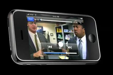
Video playback controls are intuitive and easy to use. They work the same everywhere; even videos in web pages open into the full screen player rather than playing inline, adapting to make full use of the iPhone's screen. Playback of both local and even streamed video was excellent. After watching a local video copied over from iTunes, the iPhone even offers to delete it to free up space.Â
Having a much larger screen with a much higher resolution (480x320 at a very sharp 160 dpi) means the iPhone is actually very good at playing videos. Its touchscreen sensitivity feels perfect; it does not require applying any pressure. It does require using a naked finger, as the screen senses electrical capacitance. A gloved finger or a plastic or metal stylus won't do anything. That means the iPhone's wake slider won't accidentally unlock when its bouncing around in a pocket unless there are fingers involved. It's even tricky to activate the slider with an elbow or another body part, because the screen ignores anything that isn't finger sized.
The glass screen is not easy to scratch, although there's no reason to avoid using a protective plastic film on it. The screen is bright even when viewed outside in direct sunlight, and the image appears impossibly crisp with a very wide viewing angle, making it easy for a number of people to watch video clips at the same time.
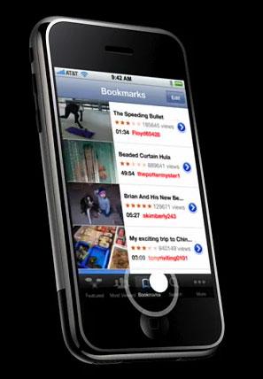
That makes its YouTube viewer far more handy that I imagined it would be. The iPhone really unleashes the potential of YouTube to mobile users, although it greatly prefers speedy WiFi to the minimal bandwidth provided by EDGE. The iPhone's highly responsive YouTube browser is much better than the Apple TV's version.
Google only recently began its conversion from Flash video to the vendor-agnostic MPEG H.264 format, so there is still a limited selection of videos available. It appears that move was prompted by Apple, in order to make YouTube compatible with Apple TV and the iPhone. By migrating YouTube videos to H.264, both devices can decode YouTube videos using their dedicated hardware, rather than being forced to decode Flash videos using a software codec running on their general purpose processors. This move also means that Apple could avoid putting Flash on the iPhone entirely, potentially crippling Adobe's attempts to push Flash Lite on competing mobiles and more Flash/Flex/Apollo/AIR on the web.
Unlike the video iPods, it appears there is currently no way to use the iPhone to play back video to a TV. This may be possible in hardware and could be delivered in a future software update, but it is also possible that the iPhone lacks the appropriate hardware to support video output, or that Apple could choose not to provide access to it in a misguided attempt to differentiate it from the fifth-generation iPod. In demonstrations, Apple frequently linked the iPhone's display to an external monitor, suggesting that it does have video output hardware. Currently, plugging the iPhone into a video iPod dock brings up a message that says "this accessory is not made to work with iPhone."Â
The Web, In Your Pocket
In addition to being a great leap forward as a music and video player, the iPhone is also an excellent web client. Unlike Nokia's N800 Linux-based web tablet, the iPhone isn't just a shrunken PC acting as a web browser toy, but instead adds an excellent mobile web browser to an already great phone and a brilliant iPod.Â
The iPhone's Safari browser is fast and fun when using WiFi, rapidly loading pages and providing an easy to use, finger-driven zoom mechanism that is highly intuitive. Safari on the iPhone demonstrates the power of a resolution independent display. While zooming in and out using a finger pinch, web pages are rapidly rendered with razor sharp text at any desired scale. This feature isn't scheduled to fully arrive on the Mac desktop until 2009, largely because existing third party applications need time to declare their resolution independence.
The iPhone imports bookmarks from Safari on the computer it syncs with, as well as storing an easy to reference history of visited locations. Don't worry, it's also very easy to remove an embarrassing history of visited sites. Imported bookmarks are organized just like the desktop version of Safari, making them easy and familiar to reference. Bookmark matches are rapidly suggested as a URL is being typed in. Once you visit a site, it's therefore very easy to return later without typing it out again.
It does not import autofill data or security logins, nor does it offer to save any logins entered on the iPhone itself. That makes visiting any site that requires a login a lot more painful than it would be from a desktop, but also makes it harder for thieves to assume your identity if they were to come across your unlocked phone.
If you follow an RSS feed URL in the Safari brower, the iPhone will hand off the XML to Apple's servers to parse at reader.mac.com, which then present a familiar Safari RSS style web page for browsing the stories linked in the RSS feed itself.
While the iPhone's Safari is very good, there are a variety of web features that do not work, some due to assumptions made by web developers that all their viewers are all on desktop PCs equipped with a mouse. The iPhone may help make the web more accessible by challenging that assumption. Anything outside of JavaScript and QuickTime that requires a browser plugin will likely not work. That includes Adobe Flash and Shockwave, Windows Media and Real embedded and streaming audio and video, any client side Java web applets, and SVG. "The iPhone Threat to Adobe, Microsoft, Sun, Real, BREW, and Symbian" offers a look at why Apple appears disinterested in ever suppling support for Flash, Java, and proprietary audio and video formats.
It might be a bit of a surprise that the iPhone does not support Apple's own QuickTime VR, as well as any QuickTime videos that do not use the H.264 codec, or any audio files apart from MP3, AAC, WAV, raw CD AIFF, Audible books, or Apple Lossless. Even though the iPhone's software architecture appears to have more in common with the Mac than the iPod, it is designed to act more like an iPod than a Mac.
Among the web sites that do not yet fully support the iPhone are Google's Docs and Sheets web apps for using and editing spreadsheets and word processor documents. After being warned that the applications "do not yet support Safari," I was able to view documents using Google's apps on the iPhone, but not edit them. Google has announced intentions to extend its support for the iPhone's browser, describing it as an ideal platform for Ajax development, as noted in the article "Apple's Secret iPhone Application Business Model."
In addition to Safari, the iPhone also provides simple web powered widgets for Stocks, a Clock with multiple time zones, location based Weather updated by Yahoo!, Google Maps with satellite images and step by step driving directions, and YouTube videos. All are responsive, beautiful, and surprisingly quick to update over WiFi, even on the edge of a hotspot with only a single bar of signal. Outside of WiFi hotspots however, the iPhone is limited to EDGE mobile data service, which ranges from a tenth to a quarter the speed of a broadband connection, or about 3-4 times faster than dialup speeds. Browsing the web or looking up maps on EDGE is frustratingly slow, but it does work.Â
With my Sprint Palm Treo, I gave up on trying to use the web with its "Blazer" browser, because when pages did get around to loading, they were frequently unusable anyway. On the iPhone, EDGE is slow, but most pages do load properly, making it far more useful than phones with faster 3G service but saddled with a far less capable mini-browser.
On page 3: "Email, Messaging, and Networks," "The New PDA: Contacts, and Calendar, and Data Sync Features," and "The iPhone Phone."
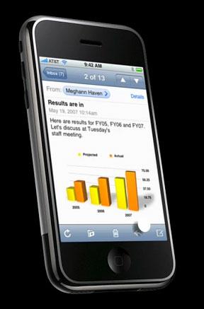
Despite the populist meme that the iPhone would not be "compatible with corporate email," it has no problem accessing standard POP and IMAP mail, as noted in "Using Apple's iPhone in the Enterprise." Users who are not allowed to connect to their company's IMAP email service remotely should try connecting to their office using the built in VPN client.Â
I have more testing to do, but it would appear that the iPhone offers the same PPTP and L2TP VPN client software as the desktop version of Mac OS X does, suggesting similar results between the two. Corporate VPN systems that require a non-standard VPN client are unlikely to work with the iPhone's software, particularly hardware VPNs by vendors that provide poor Mac support such as Cisco and SonicWall. Microsoft's PPTP VPN software that ships with Windows Server does seem to work well with the built-in Mac client, and should therefore work with the iPhone. Once connected to a corporate network via a VPN tunnel, an iPhone user should be able to access their email just as if they were actually connected on location with their company's private internal network.
The email application itself is the best email client I've ever seen in a mobile device. It supports HTML email and graphic attachments, and is the preferred way to send messages to other iPhones or computer users. While it supports replying and forwarding emails, there is no option to reply to all, making it clumsy to respond to emails with multiple parties addressed as blinds or carbon copies.
There is no email spam filter on the iPhone itself, leaving users at the mercy of their company's or service provider's server-side spam filters. Users deluged by spam can also choose to set up email forwarding through a separate private account, and only forward emails from known users. Mail also lacks a mass delete or multiple delete option, making spam deletion a manual per item task.
The iPhone's interface encourages the use of free Mail over fee-based SMS messaging. The web browser "shares" URLs by inserting them into emails, with no option for texting them instead. Notes similarly provides one button forwarding of a note's text to Mail, but no option for sending it to SMS. Because the iPhone has no other mechanism for copying text, this actively discourages users from sending out SMS messages by default, forcing them to manually type out SMS texts instead.
Email also provides virtually unlimited text content, where SMS has a limit of 160 characters that can be sent per message. The iPhone only "attaches" one photo per email, because there is really no way to attach files directly; users simply push the photo to Email from the Camera application. There is no option to send photos from the Camera to other applications beyond Mail, aside from using the photo as a background wallpaper or assigning it to a specific contact.
Many smartphones do not support emails with inline graphics, making it somewhat clumsy to send them photos via email. Simpler "feature phones" can't receive mails with photo attachments at all. That's why many phones support MMS, the multimedia version of SMS texting.
However, both SMS and MMS are anchored to the mobile industry, and are billed by the message rather than being included in most all you can eat data services. The iPhone does not support "texting photos" using MMS at all, although it does support SMS for texting other mobile phone users. Incoming SMS messages appear in a translucent overlay over the main screen, even when phone is locked.
To send photos taken with the built in Camera app, the iPhone uses Mail, just as a desktop computer would. Hopefully, SMS will go away as more mobile devices become standard email clients.
There is also no support on the iPhone for AOL Instant Messaging or Skype VoIP audio chats, but like SMS, it would be best if both proprietary systems went away completely and were instead replaced by and open Jabber and SIP-based chat client that could handle both instant messaging and voice chats, just like Apple's own iChat client.
Some have speculated that Apple agreed not to provide an iChat app for the iPhone in order to prop up AT&T's SMS business model, which allows it to charge extra for individual messages. All AT service plans include 200 text messages, but anyone under 30 has no problem firing out 1000 or more text messages per month, requiring a special SMS plan rider that AT&T would hate to give up. At the same time, Apple has marginalized the SMS client on the iPhone to the point where users have to go out of their way to send text messages. The iPhone subtly pushes users toward Mail at every opportunity.
The New PDA: Contacts, and Calendar, and Data Sync Features
After mobile phones began delivering simple organizer features around 2002, the market for standalone PDAs began to dry up quickly. Even so, the high end of smartphones haven't done a great job in delivering outstanding examples of a mobile calendar and contact application. Many phones also have sync problems or limitations in what types of data they can sync with a PC.
The iPhone extends the work Apple has already done in its own Sync Services and in iTunes. The iPhone only syncs with iTunes, which is also required to authorize the phone initially. Users can't copy over songs or movies manually, and song files can't even be copied individually inside iTunes; it only syncs songs with selected playlists.
There is no way to mount the iPhone as a disk device either. There are no files to manage anywhere, no filenames, no folders, and no disks anywhere in the iPhone world.
The iPhone also lacks any support for syncing over Bluetooth or WiFi, requiring the included iPhone dock or an iPod USB dock connector cable. While it might seem like a good idea, sync over WiFi at a typical 6-20 Mbit/sec would be many times slower than over USB 2.0's 480 Mbit/sec speed. Bluetooth 2.0 EDR, which offers a top potential of 3 Mb/sec, would be even slower, making it completely pointless for media file syncing. However, Bluetooth data sync for contact and calendar data might make some sense in a future revision.
The real problem with wireless desktop sync is that there's too much to sync on the iPhone. When including large media files, bookmarks, account information, and other data, it doesn't make sense to only sync a few things wirelessly with a desktop PC. Since the iPhone has to be recharged regularly anyway, it makes little sense to use a radio to sync portions of its data at incremental periods in between charges.
Further, why sync wirelessly with the desktop at all? Why not just sync that data over the Internet via WiFi at regular intervals instead? Mail already does this, but the iPhone's Calendar and Contacts do not currently have the capacity to sync with a server over the Internet in the same way. Expect that to change in an upcoming software update, particularly now that Apple is pushing into the calendar and directory server market with Leopard Server. Apple is also likely to open up integration with .Mac sync independent of iTunes, so iPhones could sync their calendars directly with a .Mac schedule over the web rather than using a local desktop sync.
Until that happens, the iPhone's Calendar and Contacts only sync with the desktop using iTunes, and only over USB. On a PC, it iTunes syncs with Outlook, while the Mac version syncs with Mac OS X's included apps. In Leopard, iCal will turn into a full system wide calendar store, allowing any application to access event data, just as is now possible with Address Book for contacts. Notes is also scheduled to sync with the desktop in Leopard. The other missing bit of organizer data is To Do events, which aren't on the iPhone at all yet. That's likely because the iPhone is also waiting for Leopard's retrofitted To Do architecture, where it will also be integrated into the system-wide calendar store.
The iPhone's Calendar application is clean and uncluttered. It provides a nice itinerary-style listing of the day's events in addition to daily and monthly calendar views. The day view shows the day by hours, with events appearing as iCal-like bubbles sized in proportion to the event length. The month view adds a monthly calendar, while the list view simply lists the day's events in a simple time sequence.
Contacts do not appear on the iPhone's home screen; they appear under the Phone page. Contacts are listed in the same style as the iPod songs, which makes it easy to spin through long lists and find a given name. There's no way to bring up the keyboard to find a contact directly. There's a tiny listing of the alphabet on the right edge of the screen that lets you jump to a letter, but the finger flick method for quickly spinning though names is so fast that its not difficult to find a name. This does require reading through lots of listings however. Apart from a favorites list of commonly called users, there isn't any fast way to pull up a name without some finger scrub searching.
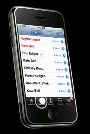
Next to the Contacts list under Phone is the Recent listing, which shows all calls placed. Missed calls are listed in red, and can be isolated from placed calls by tapping the missed calls button. Oddly, the Recent listing does not distinguish between incoming and outgoing calls in the list. Touching a name in the Recent list immediately calls the person back. To examine the details of the call, you have to tap the more icon, which brings up the caller's contact page and a listing of all the recent calls made with that contact by date and time. It does not record each call's duration, which would be nice to have.
There is only an indication of whether a recent call was incoming or outgoing on the actual contact information page, not in the recent call listing itself. In cases where the caller's contact page lists multiple home, work and mobile numbers, there is also only a subtle clue given as to which number the caller dialed from: the incoming number that attempted the missed call is highlighted in red, while the number used to make a completed call is listed in blue. If a caller's number has been added to your favorites page, a star marks the favorite number.
All of this attention to detail suggests the iPhone is actually on revision 3 or 4, not the first edition of a brand new platform. It also erases any remaining credibility of the pundits who lined up to declare the iPhone was "not a very good phone" before ever having seen it.
The iPhone Phone
As a phone, the iPhone is slick and easy to use. It's not just a basic GSM phone however, it's a handheld computer that also happens to use a GSM SIM card to access AT&T's mobile network. While lots of people will be working to hack around that limitation, it won't be simple. The iPhone's software image is encrypted, and the unit ties its internal software to the iPhone's GSM SIM card at activation. That means users won't be able to pop out their existing SIM card and plug it into the iPhone, although the iPhone's SIM card may work in other GSM phones.
Users with contacts saved to their existing SIM card need to sync them to their computer before transferring their account during activation, because the iPhone doesn't integrate its own contacts with the SIM card's stored numbers.
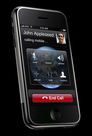
The iPhone's very attractive new visual voicemail feature, its integration with contacts, and the drop dead simplicity of setting up merged conference calls make the iPhone a significant leap ahead of more basic smartphones. My Palm Treo drove me nuts because its call waiting feature made it impossible to dismiss a second call without hanging up on both calls. The iPhone's easy to read display of options makes it extremely simple to actually use the iPhone as a phone, and makes more advanced features very accessible.
The phone itself has good sound quality but was only loud enough in my testing when the volume was turned all the way up. I still have good hearing; some have complained that it isn't loud enough. When using the included headphones, the phone seems a lot easier to hear. In either case, callers reported no problem hearing me, and I'm not a loud talker. I've never used headphones with a mobile phone before, but the integration with music playback makes it an attractive option. The Apple's $130 Bluetooth headset was not yet available to review.
The iPhone's speakerphone was clear and easy to use, but does not get extremely loud either. Because the iPhone makes setting up a conference call so easy, I found myself using the feature with a speakerphone far more frequently that I have on other mobiles.
There is no current support for voice activated dialing, making the favorites contact list the fastest way to place a call. The iPhone appears to only support pairing with one Bluetooth device at a time, and currently only with a headset, making it impossible to use it with car integration or multiple devices at once. That is likely to change in future software upgrades.
There is only a short list of basic ringtones, and no options for buying jingles that mobile operators love to sell for $2 or more. Eagle-eyed observers watching the early demonstrations of the iPhone's sync interface in iTunes noticed that internal builds of iTunes had a Ringtones tab, which has since gone missing. The iTunes license was also altered to prohibit users from using purchased songs as ringtones, a move that could only have been prompted by the RIAA. Until Apple sets up a deal with the labels to allow songs or other audio clips for use on the iPhone, its ringtones will be limited to a variety of simple blips.
The most difficult aspect of the phone for some may be activation. Several users reported struggling for hours to transfer their accounts, stymied by AT&T's confusion over phone number prefixes that can only be set up if the user supplies an address for the area associated with their phone number. AT&T also gave some users a frustratingly long runaround because their account had been associated with a business account in the past, or because their existing number was part of a family plan.
Transferring my own phone number from Sprint during activation was completely painless however. Incoming calls continued to be routed to my previous phone for almost 24 hours before I received a confirmation text from AT&T confirming that the transfer was completed. No doubt Verizon and Sprint lost many of their best customers this weekend.
On page 4: "Impossibly Small", "Impossibly Solid First Generation Software", and "Impossibly Familiar and Intuitive," "Impossibly Smart," "Impossibly Minor Flaws," "Engineered to be Mobile," and "Text Entry: Think Different?"
Another component that works to set the iPhone apart is its impossibly miniaturized hardware. In marketing photos, the iPhone appears to be the size of a small book, even when placed in the giant hand model Apple used. Even having seen a prototype under the glass at Macworld Expo, and in the hands of Apple executives as I've talked to them over the last six months, I was still unprepared to hold one myself. The more I use it, the more remarkable I feel it is, and its "big feel in a small form factor" seems to be a major component of why.Â
It disappears in nearly any pocket, but its ultra high density screen makes it appear to be larger than it really is when using it to browse the web or to watch videos. The iPhone's imposing heft of functionality tucks away inside its tiny frame in a way that feels uncanny.Â
Some have complained about its solid density, which makes the iPhone seem heavier than its size might suggest. Other phones seem to include large pockets of dead air, particularly if they feature removable batteries. My Palm Treo was not only full of air, but also creaks when handled, as if built from second hand plastic parts salvaged from a recycling bin. The iPhone feels like an iPod, as if carved from a single piece of titanium.Â
Part of its magically thin and indestructibly solid feeling design comes from Apple's decade of experience in creating increasingly smaller and more powerful devices like the iPod Nano, which still seems too impossibly thin to be something that can be mass produced at low cost. Apple certainly worked with top vendors to identify the best chip sets to source, and the iPhone demonstrates the state of the art in miniaturization at a consumer price target.
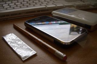
Having said that, I must break the magician's code to reveal that part of the iPhone thinness is actually a clever illusion. Like the iPod, it uses rounded and beveled edges to appear thinner that it actually is. It feels as thin as pencil, when in reality it's thicker than a CD jewel case, by almost exactly the thickness of a credit card. If you have a CD and a credit card, you can put them together to see how fat the iPhone really is. You can also put them together to see how phat the iPhone really is.
It's not only implausibly svelte, but also just impossibly small overall. Two can fit inside CD jewel case, making it exactly half as wide as a CD. Its measurements have been posted on Apple's website for six months, but its still a shock to have one in the hand. It feels like some kind of experimental technology inexplicably delivered back in time from benevolent researchers living ten years into the future.
Here's a photo of the iPhone next to a stick of gum, a pencil, and the thicker 30 GB version of the 3G iPod.
Impossibly Solid First Generation Software
One of the ideas associated with first generation products— and for some reason, particularly those from Apple— is that the first run is always plagued with irritating bugs and sloppily rough edges, so it's always better to wait around for the product to get fixed after a minor revision or two.Â
While logic and physics would certainly tend to support such an idea, it didn't turn out to be true in the case of the first generation Titanium PowerBook I bought in 2001, it wasn't true with the first Power Mac G5 I bought in 2003, it wasn't true with the first generation Mac Books I bought in 2006, and it doesn't seem to be the case with the iPhone.
Its software is remarkable not only in its solid feel, but in its powerful usability, its completeness, and its thoughtful attention to detail. Snappy "spring-loaded" animations make dragging through lists of contacts or songs feel as if you are directly manipulating a reel of magical cellophane spooling through the device.Â
Take a photo using its built-in camera and the snapshot falls downward into the photo library icon, intuitively hinting at how to jump to the collection of photos already taken. Pay even closer attention and you'll notice that the photo you take first turns translucent before shrinking and falling down into its genie bottle home inside the library icon.Â
Tap the trash can to delete the current photo, confirm the delete, and the trash can's lid opens, the discarded photo slurps down into the trash can, and the lid pops shut behind it. The trash even jiggles a bit, as if a particularly large photo were bouncing around inside it on the way to the bottom of the can.
This device is so full of unnecessary interface embellishments that it appears to be the work of artisan crafters working to impress the world with their witty creative wizardry rather than a corporation scheming to earn money and market share. It simply does not feel possible that the iPhone should exist, but here I am holding it in my hand.Â
How did Apple perfect a complete design language for its mobile handheld without anyone hearing about its details in advance? While evocative of the Mac OS X desktop— such as its Dock-like set of icons along the bottom of its screen— the iPhone diverges from the familiar windowed desktop in significant ways.Â
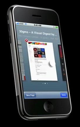
For example, there are no direct representations of files or windows. It manages multiple tabs of independent browser web pages in Safari using a Dashboard-like display of multiple panels that are dismissed by a tap on their offset "X" close icons. Despite packing the same core operating system and advanced graphics capabilities used in full size Macs, the iPhone does not aspire to be a mini desktop at all. The engineering decisions made by the iPhone designers won't please everyone however; a number of feature omissions that might annoy some users are noted below.
Â
Impossibly Familiar and Intuitive
The iPhone introduces several new human interface conventions that one might expect to be impossibly confusing and unfamiliar, especially for those of us irritated by unnecessary complexity and pointless changes made simply for the sake of change. Instead, nearly all of these concepts seem to be impossibly intuitive.
The most obvious is the home button, which acts like Windows Start button, but without resorting to use Windows' horrible Start menu listings of deeply nestled options. The iPhone is actually completely free of any drop down menu bars at all, making it simpler and more approachable overall than Windows Mobile phones by orders of magnitude.
If you get lost, just press the home button and the familiar startup screen appears. It also acts like a task switcher, so that in the middle of a phone call, you can jump to the home screen, enter Safari to look up a web page, then jump home again to enter Mail to send a note, and then return to the call to initiate a three-way conference. There is simply nothing complicated to learn about how to accomplish all this, it just works.Â
Beyond the iPhone's overall interface behaviors, its individual applications also deliver a cleverly playful design language that injects nostalgic familiarity with real world devices and futuristic flourish powered by subtly animated visual cues, realistic textures, glossy finishes, and clever use of translucency effects.Â
The Notes application is designed to look like a common yellow memo pad, and uses a clean hand-printed font, although thankfully not the infamous Comic Sans (it's Marker Felt). The top edge of the virtual notepad even subtly suggests that the first few pages have been ripped out.Â
Each note is time and date stamped when it is created or edited, so recently touched notes percolate up to the top of the list of "documents" listed under Notes. Tabbing between notes rapidly flips the pad's virtual pages, using shadowing effects to subtly simulate the feeling of using a real pad of paper. Even the icons are roughly drafted to suggest they were sketched out by hand. No manual is required to figure out that the trash icon deletes a note, while an envelope copies the note text into to a new email ready to address and send.
Â
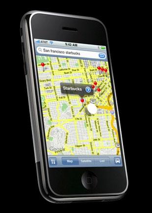
The iPhone's Maps application has already been widely demonstrated; its slick integration of Google searching, Google street and satellite maps, and locally stored contacts is best described as breathtaking. When I searched for my zipcode and 'haircut', it not only dropped pins in the map for all of the local businesses, but also tagged my usual barber by name, because it cross referenced my contacts and found a match with Google's search results.Â
Impossibly Smart
The more subtle details in Maps are its smart map resizing that shows an appropriately zoomed area of the neighborhood being searched, the cleverly animated pins that drop to mark search locations, the translucent tags that label the pins, and the smart selection techniques that allow you to select pin points that are very close together, even when being forced to use clumsy fat fingers.Â
The iPhone analyses the various targets available on screen, not just where you've touched. That makes it easy to choose between two targets that are too close together to accurately distinguish between using a big finger. Rather than trying to touch a specific magic dot itself, you only need to poke in the general direction, and the iPhone's software intelligently determines the probabilities of your intended targets for you.Â
That kind of smart behavior is quick to get used to, and will likely result in a new dissatisfaction for any and all systems that offer anything less. Apple just raised the bar dramatically for everything in the consumer electronics space, not just within the mobile phone market.
Similar intelligence went into text input. One of the most frustrating things about trying to browse the web using my Palm Treo was that it was impossible to select the URL and delete it. Safari on the iPhone offers a delete button that wipes the existing URL in one push. It isn't easy to edit or delete a portion of a URL however; the iPhone lacks any mechanism for copying and pasting text or selecting arbitrary sections of text for replacement.
According to Apple's website, as the user types the iPhone watches the letters entered and determines the likelihood of the next letter. If typing W or R makes no sense in the context, it will assume you are meaning to poke at E, and adjusts the keyboard target mappings appropriately. Even so, I didn't have any special troubles entering specific lettered codes that made no sense as actual words, although it did try to offer corrections as I typed them.
The iPhone also provides a magnifying glass interface concept for precise positioning of the text cursor. Simply touch and hold near the text, and a loupe pops up to allow precise cursor placement between specific letters. The loupe also does some subtle translucency effects and peripheral blurring to create a clearer impression of being a virtual optic lens, making it another example of how the iPhone wraps the familiar and futuristic together.
Image (if possible)
Impossibly Minor Flaws?
While I'll address some of the iPhone's more significant missing premium features below, it seems is that it is actually missing very little in terms of expected features, which is both odd and somewhat suspicious for a first generation product that not only blazes a trail into a previously uncharted territory of mobile devices, but which is also being delivered by a company with no prior experience in building mobile phones.
The iPhone is remarkably stable for being the 1.0 release of both the platform and all of its applications. Apple transitioned large portions of Mac OS X to the iPhone's ARM processor with the same precision and solid results as last year's move to Intel processors. That's a massive undertaking, and being able to duplicate it indicates a lot about Apple's engineering and quality control finesse. Still, its unreasonable to suggest that applications will never experience problems on the iPhone. What happens when it crashes?
In many cases, users may never notice. While furiously flipping between applications, I twice noticed that the music playing in the background had stopped. I first assumed I had reached the end of the playlist, but then realized that my browser session had crashed. The iPhone simply returned to the home screen and waited for me to relaunch Safari, which was busy reloading my webpage before I realized what had happened. The iPhone itself didn't inform me that things had crapped out, it just got back to work.
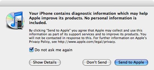
After syncing the iPhone, it asked me if I wanted to submit the crash report to Apple. The crash report itself had very little information in it, apart from referencing the hardware as "iPhone1,1" running "OS X 1.0 (1A543a)," indicating that Apple does in fact internally refer to the iPhone's ARM OS as "OS X," at version 1, rather than the internal major version 8 related to Mac OS X Tiger 10.4.
Typically, a 1.0 product strives to deliver a limited set of functionality; what's left out is missing due to finite resources and is promised for later delivery in a future model. On the iPhone, many things that appear to be missing are actually left out purposely as an engineering decision.Â
Engineered to be Mobile
The first thing conspicuously missing relates to text entry. Apple, the inventor of the familiar graphical user interface conventions of Command -X -C -V, purposely left out any way to select, copy, paste, or replace text. Those text entry concepts predate the Mac, and are considered integral to word processing in general. On the iPhone, it appears one can only insert the cursor and delete characters one key at a time, or simply wipe entries in one fell swoop.Â
Why has Apple purposely left out such an obvious thing? It appears that the answer is that the iPhone was engineered to be a mobile phone, designed to consume content, record short Notes, and enter search items. It's not a handheld version of the 1980's desktop, and purposely intends not to be. Â
That's a huge difference in strategy over the "Mobile Windows Everywhere" concept Microsoft unsuccessfully floated repeatedly during the early 90s with Windows for Pen Computing, during the mid 90s with the vaporware WinPad, and again in the late 90s with Windows CE. WinCE has struggled to find relevancy for its idea of cramming the Windows desktop into a small form factor for a decade now, failing to the tune of many billions of dollars in losses.
It's no surprise to find that Apple didn't embark on the same strategy. Instead of being a little Mac, the iPhone is positioned as a mobile phone that also does useful mobile-related things, not a desktop that is stripped to fit into a mobile sized box and happens to also do phone features.Â
Being designed for a specific purpose— rather than being stretched to fit a differently sized product category— is a major differentiating concept behind everything about the iPhone. It also makes it difficult to directly compare it against other products, simply because most devices blindly follow conventions out of convention.
That also makes it easy for blind followers of convention to dismiss the iPhone by creating lists of "features" that it conspicuously lacks, similar to the lists of "features" missing from the iPod: no built-in radio, no ability to play Windows Media files, and no ability to use disposable batteries.
Text Entry: Think Different?
Lacking any system-wide, complex text entry and copy/paste functionality greatly simplifies the iPhone. It also requires users to approach it differently. Notes is not designed to be a word processor, it's designed to take notes in the manner of a notepad. That makes Notes simple and easy to use, but makes it frustratingly difficult to compose long documents on the iPhone.Â
With the iPhone, Apple seems to suggest that task is perhaps not really even a good idea on a mobile. Many will disagree, but the number of people who want to write essays by thumb are certainly outnumbered by those who would prefer an uncluttered and responsive phone over one that tried to accommodate such fringe demands.
Microsoft isn't the only mobile software maker to fail to grasp the concept of less being more. Sony Ericsson is particularly notorious for loading its mobiles with complex software that seems to offer great potential, but which in reality do nothing at all for most people because it's all impractically useless.Â
One example is Sony's mobile ringtone composer that allows phone users to poke out notes for creating custom ringtones. In reality, composing music is not a function that a mobile phone can do well. That leaves the application as something that few can even use, but that everyone has on their phone taking up space. There are too many other examples of mobile junkware to even mention.Â
Engineering is the art of knowing what to include and what to leave out, based on the value it offers and the expense it incurs. Apple seems to have targeted value relentlessly, offering Spartan apps on the iPhone 1.0 which all do what they promise to do well, and none that attempt to bite off far more than it can actually deliver.Â
Paired with the capacity for the iPhone to upgrade its abilities via software, this creates a remarkable platform that is not only impressively complete in its first version, but which has impossibly infinite room for growth. Its purposely missing software features actually make it more powerful.
On page 5: "The Missing Features" and "The Wrap Up."
Having celebrated Apple's risk taking stance in pioneering the practical over the feature ridden, it feels important to point out that many people will not agree with Apple's engineering decisions. Keeping in mind that some features are subject to change with the arrival of new software updates, I made a list of various hardware and software features that range from controversial to simply being problems I think Apple needs to address.
Zero Text Editing: while keeping the iPhone's text entry simple, this does present some puzzling challenges. For example, when browsing a web page that lists a URL but does not provide a hyperlink (as many forums do), there is no way to copy and paste the URL into Safari's location bar; the user would have to manually type it out.Â
This seems excessively clumsy, but the solution to this is not obvious because it relates to the differences between the iPhone and a desktop computer equipped with a mouse.Â
Part of the problem is that the iPhone's input is limited to multitouch; there is no direct equivalent to "cursor hover," which on a desktop PC occurs when the user moves the mouse pointer over a target. That means there is no way to trigger web page JavaScript rollovers, where simply pointing at something triggers an action that is different than clicking on it.Â
There is also no equivalent to shift-clicking, because it would be clumsy to try to click with a finger touch while also holding down a second button. Without any means to point-but-not-click, or click-and-select-more, there is no obvious or intuitive way to allow the user to select passages of text to copy, cut, or paste.
It would not be too difficult to create an independent iPhone word processor with extra functions or modes designed to select and edit text, but bolting on a system wide mechanism to do this— without also requiring a precision stylus pointer— would seem to be not just tricky, but also an excessive complication to the overall interface, making it far more difficult to do the things it now does well.Â
I find myself torn between instinctively wanting to copy and paste around text, and also open to the idea of forsaking a pasteboard in exchange for a greatly simplified interface. I do think the iPhone would benefit from a Notes+ application that offered more sophisticated text input, but that wouldn't solve the problem of being unable to select that unlinked URL in a webpage.
Compare the Palm Treo: it requires a stylus to enter text and select passages to copy or paste, but it also needs a menu bar to offer the options of copy and pasting. The iPhone has no menu bar offering complex choices, only a selection of a scant few buttons on the bottom of the page. This means there's less to do, but also less to figure out and fewer ways to get lost in sprawling complexityÂ
There's no way to "fix" the text entry "problem" without destroying the minimal Zen of the entire device, adding a stylus, a persistent menu bar, and ending up with something that looks a lot like the Palm OS, or even worse, WinCE. To anyone who wants that, there are many unsold PDAs sitting in Best Buy already.
No Audio or Video Recording: another obvious omission is the lack of any ability to record audio or video clips. Some have suggested that this is a piracy "solution" or a performance issue. I certainly hope it is a "not yet ready" issue, because recording video clips is extremely useful on a mobile phone. If Apple were really concerned about piracy, it could limit the iPhone's capture resolution or frame rate; disabling video entirely makes no sense.Â
Further, the Palm Treo and most other phones with far less power or storage space have no problem recording video. In the case of the Treo, it has a 1.3 megapixel camera which records fair 640x480 snapshots or 320x240 video. The video it records is minimally fair, but the accompanying audio recording is typically very poor.Â
In comparison, the iPhone captures good quality photos in adequate light if held reasonably still, at a 2 megapixel resolution of 1600x1200. As with any digital camera, the iPhone can't capture anything at all in near darkness, although I found it captured surprising good quality photos indoors even under low light conditions.
The Camera software does beg for a significant upgrade in terms of recording video, capturing audio clips, and perhaps even offering a digital zoom. When plugged into a computer, it functions within iPhoto just like any other USB camera, but does not mount as a volume on the desktop. It does not even mount as an invisible disk volume accessible from the command line.
The iPod similarly lacks a mechanism to record audio, although its internal hardware has audio recording features built-in. While it makes sense for Apple to think that recording limited quality audio on the iPod is not practical or at least not worth of building in a microphone, the iPhone quite obviously has an integrated mic. Lacking any way to record audio is therefore a puzzling omission, and will hopefully be added in an upcoming revision to the software.
Missing Consistency: while the iPhone overall is very slick and highly polished, there are a few odd bits that seem a little out of place. First is that not all applications support landscape orientation. Safari appears to be the only app that displays a keyboard while in landscape orientation. That's significant because the wider aspect ratio results in larger keys that are easier to hit for clumsy typists. It would be nice to see all of the apps act more identically.
However, the overall look and feel of the iPhone's included apps is very good and well executed. In the interests of simplicity, there is no way to perform certain tasks that the iPhone's slick interface suggests should be possible. For example, there's no way to sort the various cities added to the Weather app. Apple enters its hometown Cupertino by default, so if you want your own location to appear first, you'll need to delete the existing entry first. Once done, there is no way to resort the cities entered, although the flick interface makes comparing a number of different cities' weather reports so easy that such a task isn't really important.
The Missing Link: 3G
The most notable hardware feature missing on the iPhone is lack of support for the near-broadband UTMS mobile data service common in Europe and Asia, commonly referred to as the third generation or 3G tier of mobile data service.Â
The iPhone is a quad-band GSM phone making it suitable for international roaming, as GSM is widely used throughout the world. However, it offers no support for the third generation data service associated with GSM service providers, the clumsily named UTMS, and sometimes referred to as 3GSM to denote its connection to GSM.Â
UTMS is available from AT&T in a few urban markets within the US, but the iPhone lacks any support for it. This is a hardware limitation, as 3G networks require a specific radio to use the faster technology. In order to support UTMS in the future, Apple will have to release a new version of the iPhone itself.Â
The reasons given for not supporting UTMS in the iPhone are:
- the extra cost and size of the receiver hardware required
- the limited availability of GSM 3G service in the US
- the incompatibility between the 3G service offered within the US and in other markets
- the much higher battery power demanded by existing 3G radio and signal processing circuits
For Apple to add support for 3G UTMS service on the iPhone, it would either have to choose between supporting the sparse AT&T US version of UTMS, the more common European version, or include custom and therefore very expensive circuits that can support both sets of radio frequencies.Â
The phones that already include worldwide 3G UTMS support are expensive, tear through batteries, and use custom chipsets that Apple can not obtain. One example is the HTC TyTN, which accommodates the three bands of 3G and 4 bands of GSM by being thick and chunky. Motorola's RAZR V3xx supports 3G service around the worlds by offering multiple versions that only work in certain markets.Â
A comparably fast mobile data network commonly referred to as EVDO is offered by AT&T's US competitors, Sprint and Verizon. The iPhone does not work on those provider's networks at all, as they primarily offer CDMA service rather than GSM.Â
The factor to consider is therefore whether the iPhone is competitive enough in features to make up for its slower data service based on GSM EDGE, which is commonly called 2.75 G service. With its exceptional web browser and custom apps like Maps, the iPhone makes EDGE far more attractive than it ever has been, but it aches to find WiFi hotspots that can really show off its web apps.
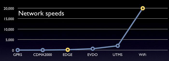
2G Mobile Networks
GSM-GPRS: 50 kbits/sec
CDMA2000: 70 kbits/sec
2.75G Mobile Networks
GSM EDGE: 70-200 kbits/sec
3G Mobile Networks
CDMA2000 EVDO: 180-700 kbits/sec
GSM UTMS: 300-2100 kbits/sec
IP Wireless Hot Spot Networking
WiFi 6500-20000 kbits/sec
No mobile data networks can compare to a WiFi network:
The best case scenario for EVDO is about twice as fast at EDGE. UTMS promises broadband data service, but offers engineering challenges and limited service coverage in the US.
Where In the World is the iPhone's GPS?
A lack of GPS has been another reason frequently cited for booing the iPhone. With its big screen and fancy graphics, it may seem like a huge mistake for Apple for forget to include GPS features, which use radios to locate signals and calculate precise coordinates. Without GPS, the iPhone will have to rely on cell towers to calculate its position, offering a less precise estimate.
Â
However, the Google Maps client Apple wrote for the iPhone offers turn-by-turn driving instructions, complete with satellite maps. That means that it can provide users with an intelligent substitute for GPS that satisfies the majority of users’ needs, without including GPS. That helps the iPhone require far less power. A GPS enabled phone like the Nokia N95 looks really great on paper, but anyone actually using GPS will find the N95’s 4 hours of rated battery life turn into two hours of actual use when GPS is activated.
Â
Users who are pathfinding around the Amazon River will be able to navigate through the forest for 120 minutes with their N95, but the rest of us who just want to use our mobiles for getting around on highways or in unfamiliar cities will probably be better suited to using the iPhone's street-based maps and step by step directions. We'll also save a couple hundred dollars over the ~$750 price tag of the N95, enough to buy a stand alone GPS unit.
Â
Will GPS someday be more battery efficient? Most likely. Until then, GPS is best left to external devices that are big enough to carry a large battery. It would also be possible for Apple to partner with Garmin or Tom Tom in providing a Bluetooth or dock-connector tethered GPS unit for those who might need something like that.
The Wrap Up
The iPhone is an extremely well designed and executed product that pushes the envelope in handheld devices. It's an excellent phone, an exceptional new version of the iPod, and a brilliant web browser, plus a good mobile email machine and general organizer. The iPhone's unique approach to software shoots high above the usability of the software in competing smartphones.
While the iPhone has room for improvement, it is a very impressive achievement and simply embarrasses the industrial design, software, and sync features of other mobiles. Expect the value of the iPhone to continue to increase as Apple delivers software updates as promised in its April financials conference call.
Rating: 5 of 5
Pros:
- Outstanding web browser and iPod features.
- Impressively engineered hardware.
- Excellent overall integration.
- Easy to set up, sync and use.
- Standard iPod dock connector.
Cons:
- Requires a two year contract for mobile service.
- Limited to AT&T and its EDGE mobile data service.
- No audio or video recording features.
- Limited Bluetooth features.
