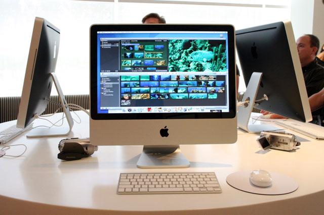
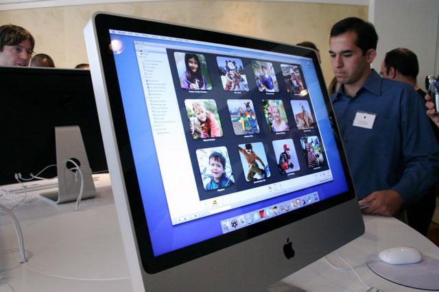
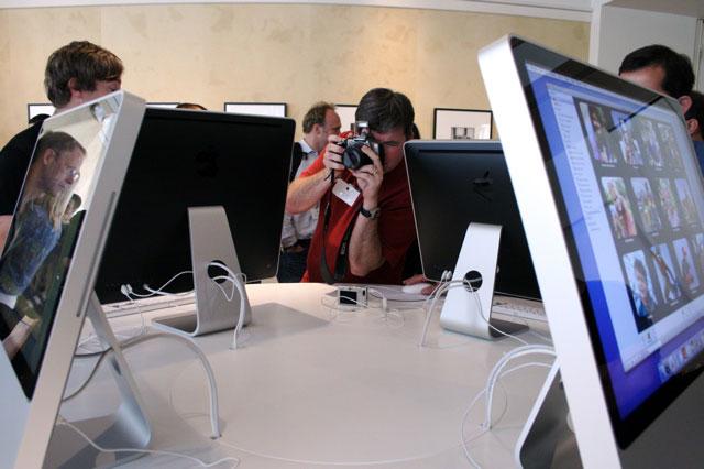
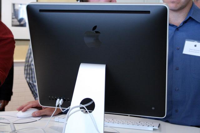
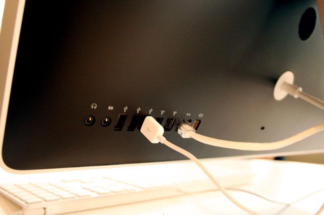
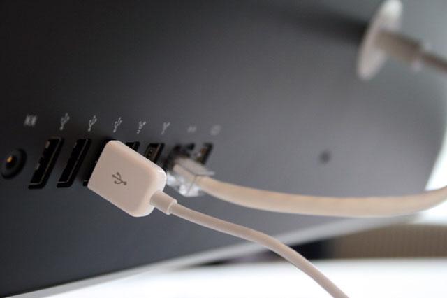
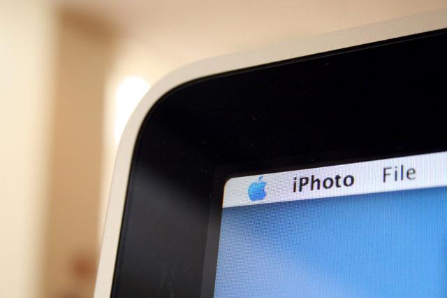
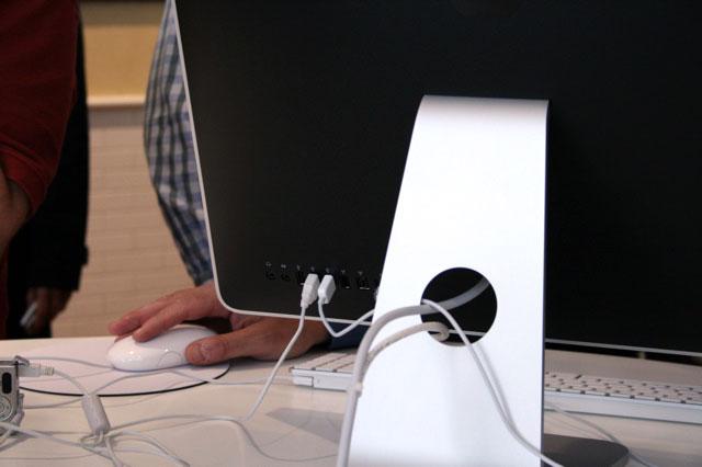
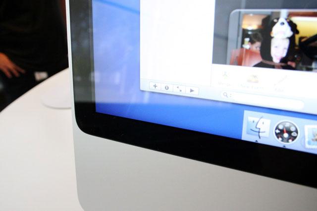
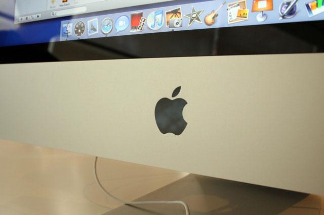
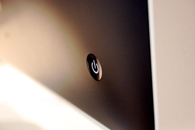
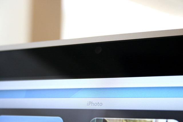
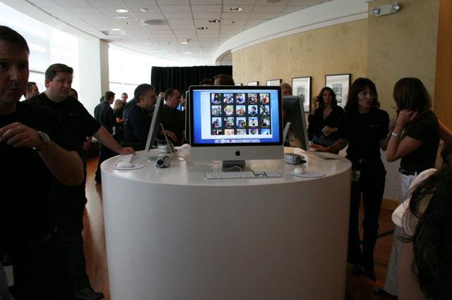
Although branded as an all-new iMac, the new aluminum model is a subtler evolution of the white all-in-one it replaces rather than the overhaul seen with the leap to the iMac G5 in 2004.
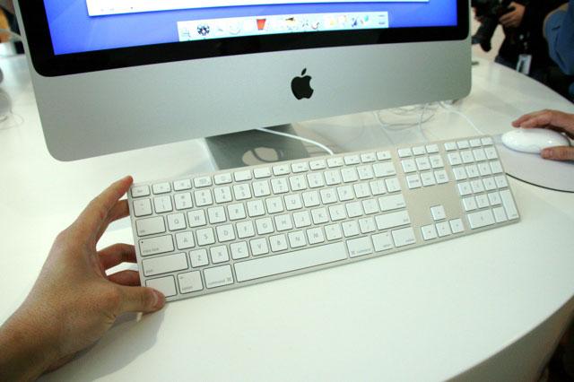
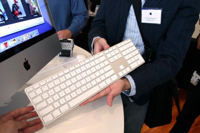
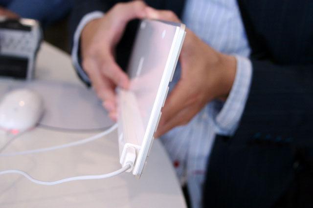
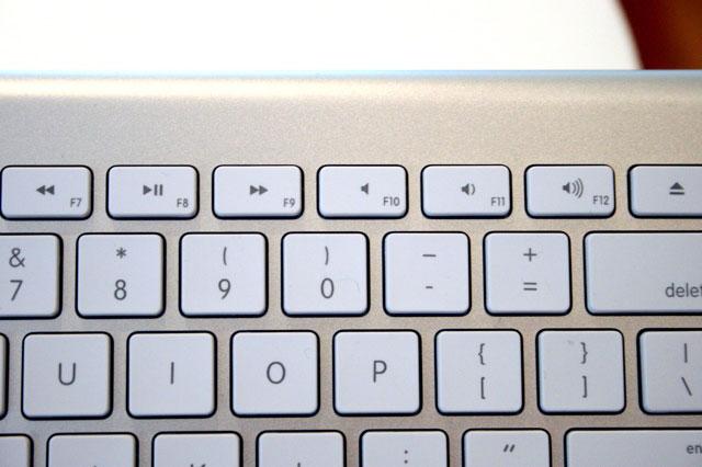
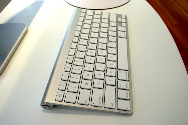
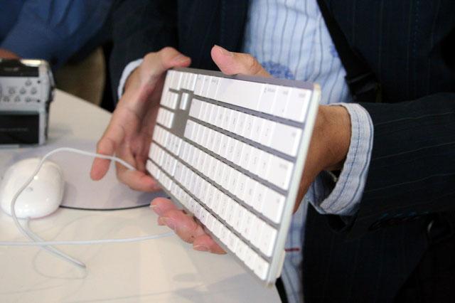
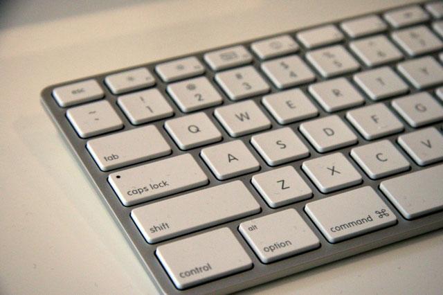
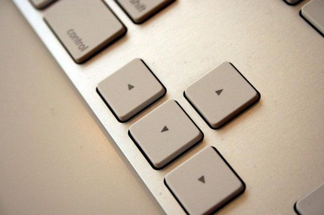
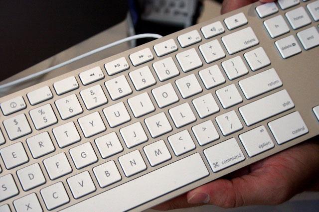
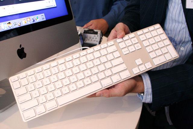
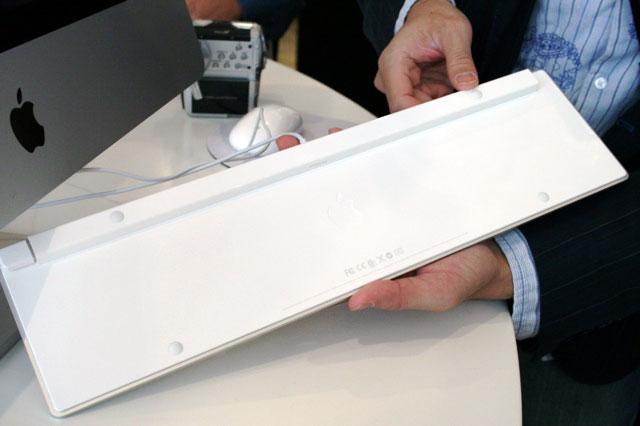
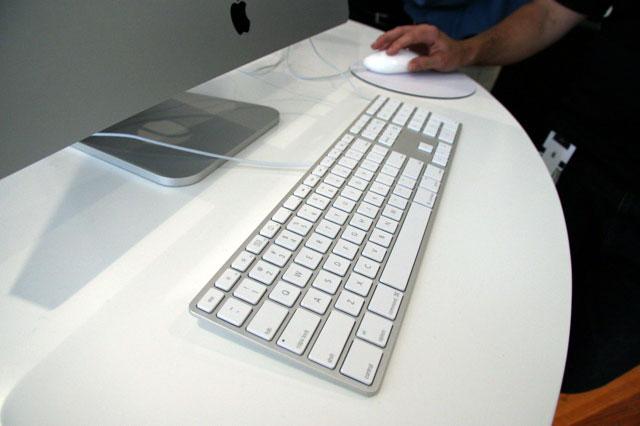
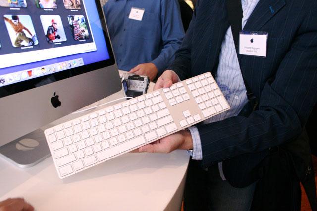
Equally on show at the event is Apple's first major redesign of the company's wired and wireless keyboards. The ultra-thin design, which is available as a stand-alone item from Apple's online store, is also aluminum uses notebook-like keys with a flat surface similar to that of the MacBook.
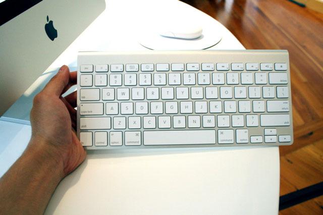
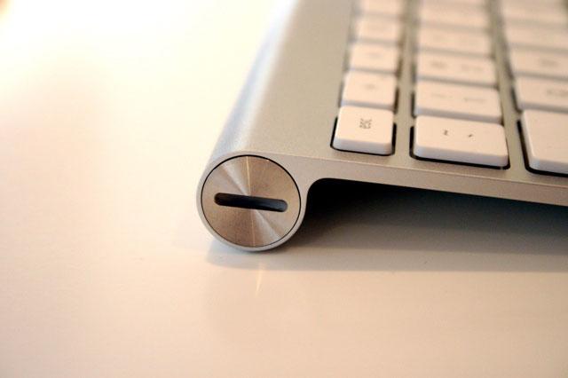
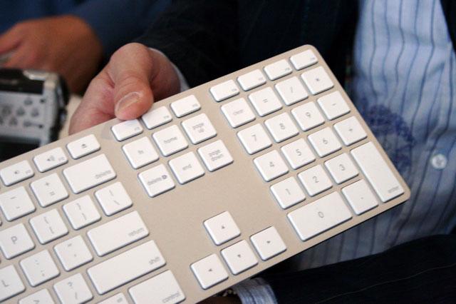
And unlike previous wired and wireless pairings, the physical layouts are different: the Bluetooth-based wireless model abandoning the number pad and extra function keys in favor of a more compact shape for media centers. It also scraps the side USB ports for battery access slots.
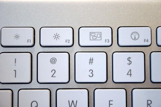
Both versions overlay the traditional F-keys with dedicated media functions such as pausing music and invoking Dashboard or Expose. A Fn key is used to modify the keys back to their traditional roles. Conspicuously, the Apple logo is now removed from both of the Command keys.
 AppleInsider Staff




-m.jpg)



 Christine McKee
 Marko Zivkovic
 Mike Wuerthele

 Amber Neely
 Sponsored Content
 Wesley Hilliard



182 Comments
i do not see photos, or just me?
Teh Sexay!!
Photos were fine here.
I can't believe the wireless keyboard doesn't have a number pad!! That is a deal killer for me.
Also, it's not very Leopard friendly. No icon for Spaces? Maybe a refresh in Oct.?
[ View this article at AppleInsider.com ]
[ Digg this story ]
Feel free to slam me, but that's one crappy looking keyboard. Sorry, two crappy looking keyboards.
And is it just me or does anyone else keep thinking, "Why doesn't the image fill the screen?" every time they see a picture of the new iMac and that big black border around the screen?
Pessimists. Wonderful evolution of the iMac design. Keyboard looks awesome. Hope it types as well as it looks! Don't know why the wireless one lacks a numeric keypad. Not much people use the numeric keypad anyway (redundant. The numeric keypad seems to me like an invention from the past where the computer was mainly used as a fancy calculator. More space on my desktop for papers and stuff!