Sencha develops JavaScript frameworks to enable developers to create apps— including rich multitouch mobile apps for iOS and Android devices— built from web standards. The company is therefore intently interested in how well new products support HTML5 and its related web standards, including advanced CSS3 transforms, SVG, Canvas animations, Web Sockets, embedded multimedia playback, and overall JavaScript performance.
In its developer scorecard of the Galaxy Tab, Sencha examined how well the new Android tablet performs compared to the iPad across a series of benchmarks including Acid3 (basic web standards), Modernizr (HTML5 feature support) SunSpider (JavaScript performance) and some real world testing.
Acid3 vs Android 2.2: where's the modern Webkit browser?
The Galaxy Tab runs a fairly stock version of Android OS 2.2, scoring 93/100 on Acid3, Sencha reports. This compares to a perfect 100/100 score on the iPad as well as RIM's BackBerry Torch, which Sencha also recently profiled.
Android lost points in Acid3 related to a Media Query test, but most of the points were deducted for failing SVG feature checks, as Android doesn't ship with support for the standard.
In its look at the BlackBerry Torch smartphone, Sencha reported that "Webkit based browsers have been shipping with a score of 100/100 for about a year now, so the result here would tell us how recently the BlackBerry team took their branch of Webkit. And the result is: 100/100. The Torch browser is running a modern Webkit browser."
Modernizr HTML5 features
The second test Sencha reviewed, Modernizr, is a JavaScript library written by Faruk Ates and Paul Irish which profiles compliance with a variety of HTML5 features.
While the Galaxy Tab supports a variety of modern HTML5 features, including localStorage, geolocation, CSS3 styles, Canvas, WebSQL, and drag & drop, it lacks support for features that work on the iPad, including CSS3 3D transforms, SVG, and Web Sockets.
Neither the Tab nor iPad support every component of HTML5, with both lacking support for Web Workers, WebGL, inline SVG and IndexedDB.
SunSpider JavaScript performance
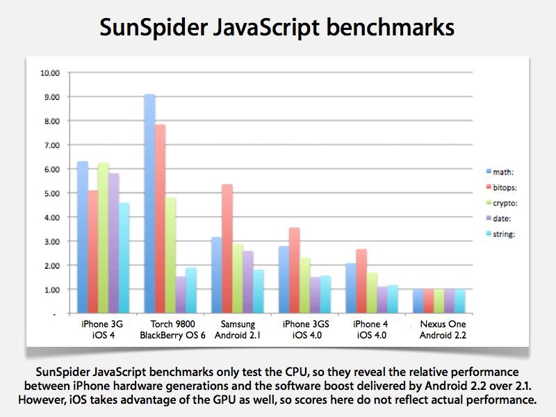
In August, Sencha profiled SunSpider JavaScript scores across three generations of iPhone (3G, 3GS, and 4) running iOS 4.0, along with the BlackBerry Torch 9800 and two versions of Android: a Samsung phone running OS 2.1 and a Nexus One running 2.2 Froyo.
It discovered the Torch offered performance comparable to the iPhone 3GS or Android 2.1, while the Android 2.2 led in performance across the bar, being both good at text processing functions as well as math. In testing the Tab, Sencha reported identical performance, while an iPad running iOS 4.2 reported scores ranging from a few times slower to much slower (in the case of regular expression handling).
Sencha notes, however, that the benchmarks don't tell the whole story because they only test JavaScript performance as it runs on the CPU. "It doesn’t account for the fact that Apple offloads lots of tasks to the GPU for better performance, so a comparison isn’t entirely fair," the company wrote.
The real world web
One real world performance test Sencha created compares the rendering of sample ads created in both Flash and CSS3. Unlike the iPad and other iOS devices, which can only render the web standard CSS versions, Sencha reports that the Galaxy Tab can draw both.
"Sadly the performance of both Flash and CSS3 Ads are sub-par," Sencha said of the Tab's rendering. "Unlike the iPad, the Galaxy Tab does not use GPU acceleration for animation, so CSS3 Animations are quite choppy. What’s more surprising is the sub-par Flash experience. Flash font rendering is pixelated to the point of being unreadable. And when the page is scrolled, the Flash Ads jiggle up and down as the browser tries to re-position Flash content to catch up to the page movement."
A second test, created by Sencha Animator and focusing on advanced CSS3 animations, didn't render correctly on the Galaxy Tab. That was expected because the Modernizr test indicated its browser couldn't handle CSS3 transforms. However, the Tab also had problems loading WebFonts, another HTML5 feature it was expected to support.
Sencha skipped its SVG tests, given that Android doesn't include support at all, and proceeded to test real world applications using Canvas. One example worked, while another didn't. "No dynamic Canvas on the Galaxy," Sencha reported.
Next, in a test of embedded HTML5 web audio and videos, the Galaxy Tab again failed. "Neither [audio nor video] seems to work as embedded content, although it does seem that an HTML5 video will play via the native video player in full-screen view," Sencha wrote.
In a final "Sencha Touch Kitchen Sink" test, the firm observed that while most of of the interface components work on the Galaxy Tab, "the smoothness of both animations and scrolling isn’t as accomplished as the iPad. GPU acceleration for CSS3 transforms is a significant area of catch-up for the Android team."
Oversized phone rather than a real tablet
Apple's chief executive Steve Jobs has openly criticized the current and coming crop of 7 inch tablets (which includes the Galaxy Tab) as not offering enough screen real estate to build real tablet interfaces. It appears Samsung agrees.
"One of the oddest aspects of the Galaxy Tab browser," Sencha reports, "is its CSS pixel to device pixel ratio. When queried in landscape mode, the Galaxy reports a screen.width of 683px and screen.height of 334px. Since the actual device resolution offers 1024×600, it’s giving us a 1.5× ratio of device to CSS pixels. This is a little bit of an odd choice since there shouldn’t be any reason why it can’t offer a 1:1 device-to-CSS-pixel ratio (or even just match the iPhone/Nexus One convention of a 320 pixel device.width — which would give it a 1.875 ratio). This makes the Galaxy slightly bigger than a regular phone screen in CSS pixels, but not really big enough to handle what people want to put in a tablet screen."
The firm concluded, "the practical effect of this decision is that the Galaxy Tab is effectively an 'over-sized phone' for the purposes of web content. For example, an iPad-style side-navigation section just won’t fit on the screen. We think it’s probably best to treat it as a phone with big pixels rather than a true tablet."
One problem with using Android 2.2 for tablets, Sencha explained, was that "when the Android browser gets ready to animate anything — whether it’s a CSS animation or a plain old page scroll — it shifts from high-quality to low-quality display mode. In low-quality mode, it turns off anti-aliasing (presumably on the theory that since things are moving, you won’t notice the quality degradation.) This would be less noticeable on a smaller device. But on the 7″ Galaxy Tab, the resulting pixelation is striking, particularly since it switches to low-quality mode as soon as it detects a touch start event (but before anything moves)."
"We’re still waiting for the first awesome Android tablet," the report observed.
 Daniel Eran Dilger




-m.jpg)



 Christine McKee
 Andrew Orr
 Andrew O'Hara
 William Gallagher


 Mike Wuerthele

 Bon Adamson
 Marko Zivkovic


-m.jpg)

136 Comments
The problem with these articles is Daniel Eran Dilger in previous articles has twisted the truth and written blatantly one sided articles attacking anything not by Apple so often I now automatically assume the opposite. It is like the boy who cried wolf.
Now I'm not planning on replacing my iPad with the Tab (or any of the honeycomb tablets coming next year), but if the Galaxy tab warrants a "html5 is not as good as the iPad" story, I immediately assume that overall the Tab must actually be pretty good and a legitimate competitor to the iPad or Daniel Eran Dilger wouldn't have bothered writing this piece.
Google's current Android for tablets is some really miserable crap, that's for sure. Of course, the also-rans like Samsung went ahead and released it anyway, looking like complete retards in the process. Sometimes it seems like the divisions of these companies that compete directly with Apple (or that were conceived for the explicit purpose thereof) are failing deliberately! Then again, when you whore out your OS to anyone that can slam together a box, what can you really expect?
Competing with Apple on quality, elegance, and innovation is nearly always a losing battle, even at the best of times. By comparison, most products feel awkward and substandard.
Google's OS/software offerings lack polish. A lot of them feel like slipshod betas with horribly unintuitive UIs. Lots to work on of they want Chrome to be an exemplar of superior User Experience. Then again, they could use their current approach and just flood the market with a lot of mediocre tech that likes to mimic Apple products. THAT strategy seems to be working, although it's ridiculously lame.
The problem with these articles is Daniel Eran Dilger in previous articles has twisted the truth and written blatantly one sided articles attacking anything not by Apple so often I now automatically assume the opposite. It is like the boy who cried wolf.
Now I'm not planning on replacing my iPad with the Tab (or any of the honeycomb tablets coming next year), but if the Galaxy tab warrants a "html5 is not as good as the iPad" story, I immediately assume that overall the Tab must actually be pretty good and a legitimate competitor to the iPad or Daniel Eran Dilger wouldn't have bothered writing this piece.
The problem with Orlando's comments is that he never makes a valid point, and instead chooses to simply make personal attacks that avoid any facts.
So when Orlando comments on a Dan article, I can ignore his comments as worthless trolling.
Especially when this article is pretty much just summarizing the findings of Sencha, which are linked in the article for independent reading, and doesn't inject the kind of "truth twisting" that trolls like Orlando are dashing to add to the comments.
The problem with these articles is Daniel Eran Dilger in previous articles has twisted the truth and written blatantly one sided articles attacking anything not by Apple so often I now automatically assume the opposite. It is like the boy who cried wolf.
Then I suggest that you simply stop reading anything with Dan's byline. Then you wouldn't get your tighty-whiteys all tied in knots.
Move along, there's nothing to see here, keep moving please...
I wish there was video of these test/comparison.