Understanding why Apple is expected to increase the next iPad's resolution beyond that of its existing high end notebooks requires a look at how screen resolutions and pixel densities have impacted the history of desktop computing, and why the company's iOS devices stand out as different.
Using higher resolution to increase display area
As screen resolutions have increased with the pace of technology, computers have historically used that new resolution to show more desktop real estate, packing in more sophisticated toolbars and drawing more windows on the screen, each providing a potentially larger, full sized view of the documents they contain.
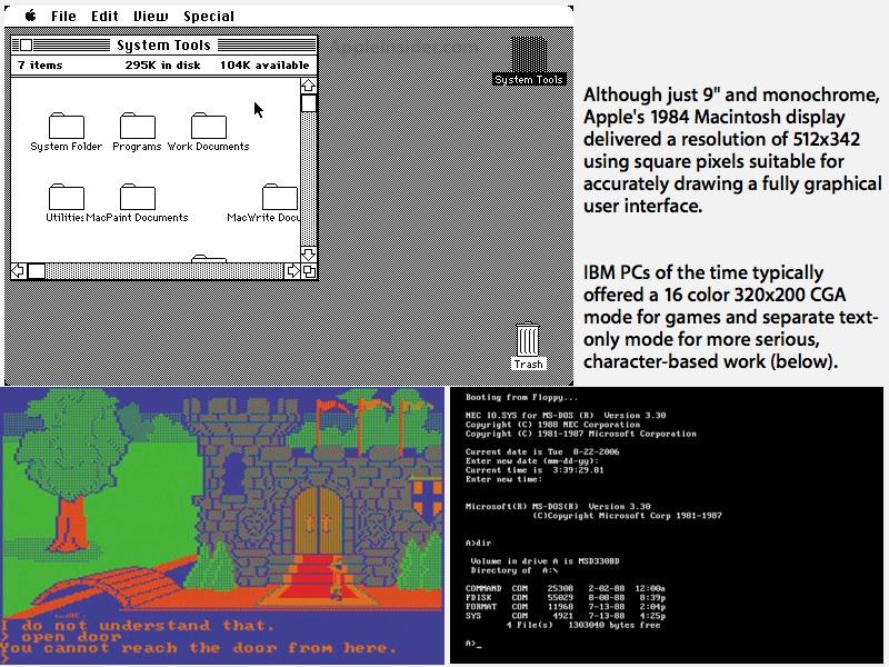
When Apple released the original Macintosh in 1984, it delivered a resolution of 512x342 on a 9 inch monochrome screen just slightly smaller than today's iPad. The Mac's resolution was significantly higher than the 320x200 CGA resolution common on IBM PCs of the day, but also delivered another unique feature: square pixels.
While the rest of the PC industry was aiming at delivering color graphics for games and separate text-only modes for business apps like word processing, Apple delivered a high resolution black and white display with square pixels because this allowed the Mac to deliver a sharp, accurate screen capable of supporting a consistent, mouse-based user interface of windows and pull down menus, with easily readable text in any font face or size.
Other graphical desktop operating systems, including the Amiga, Atari ST and Apple's IIGS, used non-square pixels, which enabled them to use cheaper TV-like displays but gave their desktop a stretch appearances and distorted the relationship between documents on screen and in print. PCs began to adopt VGA as a square pixel standard only in the late 80s and early 90s.
Apple's crisp graphical user interface has continued across the last three decades, incrementally taking advantage of new display resolution technology to simply expand the Mac, and later Windows, desktop. Screen sizes have grown too, moving users from the original Mac's 9 inch screen to the 15 to 17 inch displays that became common in the 90s and the 20 to 30 inch displays that desktop systems now commonly use. Even notebooks that sport 17 inch displays are not uncommon today.
When higher resolution becomes a problem
Display sizes are now at the point where they can't dramatically grow without simply becoming unwieldily. The mainstream market for notebooks isn't growing much larger than 15 inches, and instead users are trending toward smaller devices, with netbooks once enjoying a brief surge in popularity, followed by Apple's own introduction of the MacBook Air, which offers the company's smallest notebook screen ever.
The new 11 inch MacBook Air delivers a similar pixel count (1366x768) as Apple's previous 13 inch notebooks, while the 13 inch Air uses the same 1440x900 resolution of the 15 inch MacBook Pros. In turn, the 15 inch Pro now offers a 1680x1050 high resolution option that was, until 2008, the native resolution of the 17 inch model.
As screen sizes incrementally bump up their pixel densities, the most obvious difference to users is that icons, menu bars, window controls and text in the user interface all grow smaller. While that allows for larger documents to be viewed within a smaller screen, it will eventually run into the problem of the user interface being too small to see, let alone easily target with a shrinking pointer that eventually becomes lost in a vast sea of pixels.
Rethinking resolution
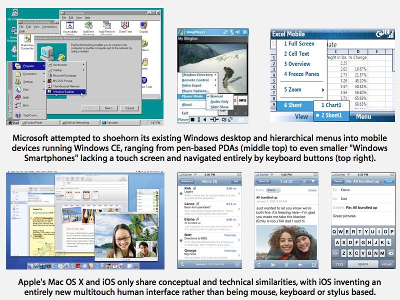
As computer screen resolutions grow higher on both large and small screens, far smaller screens on handheld devices are exploding in popularity due to their handheld mobility. When the iPhone was introduced in 2007, the most similar smartphone, LG's Prada, offered a 400x200 screen resolution. Microsoft's Windows Mobile had attempted to scale down the PC desktop to fit within resolutions ranging from the Motorola Q's 320x240 "Windows Smartphone" to more PDA-like "Pocket PC" devices with 640x480 resolutions.
The Palm Treo 700 offered a 320x320 screen, opting for a simpler user interface rather than trying to replicate the desktop as Microsoft had with Windows CE. Both continued to use a similar stylus-based input system, which duplicated the role of the mouse in selecting text and targeting buttons and other user interface elements.
Apple's newly rethought user interface for the iPhone offered a different take on small display resolutions. The company abandoned its own concept of a desktop with windows, driven by a mouse pointer (or similarly pixel-accurate stylus), and instead focused the user interface on the much less accurate but far more natural direct touch of users' fingers.
Instead of small window controls and scroll bars, the iOS used large buttons and flickable scrolling lists of items (often arranged in columns of options reminiscent of NeXT's column view file browser, albeit showing one column per screen view at a time) in order to make the most natural use of its 3.5 inch, 480x320 display.
Unlike the Mac desktop, which defined an inch as being 72 pixels and simply grew to consume the increased area offered by higher resolution monitors as they became available, the iPhone's user interface was designed to be resolution independent, defining the whole screen as a fixed number of pixels in an abstract sense.
When Apple introduced iPhone 4 and its 960x640 Retina Display, it didn't display more of the interface at once; it simply sharpened the existing interface to the point where individual pixels became invisible.
On page 2 of 3: Focusing on interface resolution, not screen resolution.
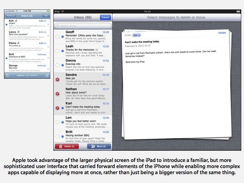
At the same time, when Apple introduced the iPad and its 9.7 inch, 1024x768 screen, it did not simply deliver a bigger version of the existing iPhone interface. Instead, it created a distinct user interface that took advantage of its physically larger screen real estate, displaying the iPhone's familiar column view across multiple columns in its Mail and Settings apps, for example.
Apple did allow existing iPhone apps to run unmodified on the iPad, using pixel doubling to fill out most of the iPad's screen. However, while a transitional convenience, iPad users have clearly expressed a preference to seek out apps optimized to take full advantage of its larger display size rather than being content with existing iPhone apps blown up to fill the screen.
With iPad's enhanced user interface optimized to fit its 9.7 inch display, Apple's chief executive Steve Jobs warned that it would be impractical to scale down the iPad experience to fit into the 7 inch displays being favored by competitors, unless those small tablets were also packaged with files to whittle down users' fingers, he quipped.
Just as the Mac desktop's user interface elements shrink toward being invisible at higher pixel densities, the iPad's touch targets would grow unusably small were the display to simply scale down physically at the same pixel resolution.
Samsung's 7 inch Galaxy Tab offers a 1024x600 resolution similar to the iPad's, but introduces problems with trying to scale or stretch existing Android apps to fit that resolution.
While some apps are customized to take advantage of its larger (than a smartphone) screen, web developer Sencha complained that the Galaxy Tab oddly offered a tweener device pixel ratio that effectively made it "slightly bigger than a regular phone screen in CSS pixels, but not really big enough to handle what people want to put in a tablet screen."
More pixels, same interface
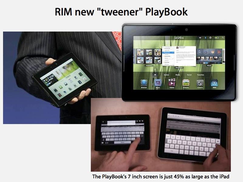
While Apple's competitors are planning to roll out devices that offer comparable display features to last year's iPad, ranging from the Motorola Xoom's 10.1 inch screen at 1280x800 to RIM's PlayBook with a 7 inch display and a 1024x600 resolution (similar to the Galaxy Tab), Apple is reportedly planning to double the iPad's resolution, just as it did with iPhone 4.
This would result in a very high 2048x1536 resolution on the next iPad, higher than the company's largest 17 inch MacBook Pro and in the ballpark of its 27 inch, 2560x1440 LED Cinema Display, which the company promotes as "supersize" and "huge," with an "astonishing" resolution.
What could such a high resolution possibly be used to do? Some observers are wondering what the benefit might be, including John Biggs of TechCrunch, who called the idea of such a pixel jump a "pipe dream," while referencing a blog entry by Jack Deneut pointing out that there's simply no video format with content currently available to fill all those pixels.
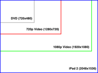
Deneut drew a diagram showing that DVD video would fill just a corner of the screen at its native resolution, while 720p video (from, say, iTunes) would fill just a quarter of the screen. Even 1080p video, which takes up tremendous gigabytes of storage space, would only fill most of the screen at full resolution. "Most people don't expect pixel-doubling when watching HD video," he wrote.
iPad is not just a video player
In reality, video playback is simply not very demanding in terms of resolution, with consumer televisions having now settled on 720p and 1080p resolutions all the way from 27 inch sets to huge 60 inch and larger televisions. All of these sets also scale standard HDTV resolutions up or down to fit their native display resolutions, typically 1360x768 or 1920x1080.
However, the iPad isn't primarily targeted at playing back video. Unlike most other tablet devices, it wasn't given an HDTV aspect ratio of 1280x720, instead using a 1024x768 resolution more closely suited to general computing applications.
Additionally, anyone with a large monitor is capable of scaling HD video up to play full screen, which is why everything from YouTube to Netflix to QuickTime to Flash Player has a "full screen" playback button, regardless of the size or display resolution of the user's monitor.
Apple's 30" Cinema Display, for example, has a 2560x1600 resolution but has no problem playing back full screen 1080p HD video. It doesn't need native resolution video to make movies look spectacular, and users can't really discern a higher resolution than 1080p (or really, 720p) when watching a screen from a typical viewing distance. Video is clearly not a big reason for needing extremely high resolution displays, and certainly not on a relatively small mobile device like iPad.
On page 3 of 3: When displays go Retina, Leveraging resolution independence.
If iPad 2 has no reason to dramatically increase its pixel density just for HD video playback, and is not designed to expand its apparent desktop size as PCs historically have, what good is a fantastically high resolution?
The answer is apparent in iPhone 4, which leapfrogged other smartphone-sized devices in terms of display quality while being completely compatible with all existing iOS software, unlike the Galaxy Tab.
Other Android smartphones have increased both their resolution (although not as much) and their physical screen size (which actually decreases the pixel density at the same resolution, making the display look slightly more pixelated).
While some users prefer a bigger phone, the Retina Display of the iPhone is more than a specification bump; it pushes the display from looking like a computer screen into being photorealistic on the level of very high quality print magazines.
A similar Retina Display on iPad 2 would propel Apple well ahead of competitors who are just now preparing to launch Android 3.0 tablets with larger than 7 inch screens, similar to how iPhone 4 shut down the lead Android smartphones had threatened to take early last year.
While part of iPhone 4's disruption of the Android deployment at Verizon was clearly related to iOS 4's shattering of previous limitations that Android didn't have, including multitasking features such as background audio playback, it was the hardware of iPhone 4 that got the most attention in product reviews, ranging from its industry leading HD video and still rear camera to its front facing FaceTime camera to its solid construction and, of course, its spectacular screen.
Rather than wondering what users might do with a high resolution iPad, it's useful to note what Apple might not do were it not to draw marked distinction between its iPad and the coming contenders from HP, RIM, and the Android licensees. It appears that Apple may not be able to extend its lead without dropping a bombshell on the nascent tablet business.
Skating to where the puck will be, but staying on the rink
Instead of attempting to maintain parity with competitors, Apple needs to anticipate practical, valuable features before customers (and competitors) even realize they exist. The SGX543 graphics processing cores that iPad 2 is expected to use have existed since 2009, but they haven't been put into use because the components needed to deliver an iPad Retina Display resolution haven't been affordable.
Apple's economies of scale, currently being driven by millions of iPad sales, could enable the company to bet on the new technology and roll it out well before it is cost effective for other makers. Apple was already ahead of other manufacturers in being able to deliver a full sized 9.7 inch tablet starting at $499, but it could only do that by banking on being able to sell millions of iPads in its first year.
That, in turn, was only possible if Apple invested lots of time and effort into making the iPad platform attractive to existing iOS developers. By making iOS apps relatively easy to optimize for iPad while retaining a familiarity in ease of use for existing iOS users, Apple fostered the growth of a huge library of iPad-specific apps, something that hasn't occurred for Android tablets.
In contrast, Google is preparing Android 3.0 Honeycomb (as presented below) to exclusively serve a new crop of tablets with an entirely new 3D user interface that offers little familiarity to existing Android smartphone users.
RIM is similarly preparing a completely new operating system to power its 7 inch PlayBook tablet, which offers little in common with its BlackBerry OS 6 smartphones.
Other makers, such as Asus, are planning to use Windows 7 to hit the high end of the tablet market while using the mutually incompatible Android to target enhanced netbooks with more limited features.
Leveraging resolution independence
Apple faces certain issues in further increasing the resolution of its desktop and notebook Macs. If it doubled the resolution of its MacBook line, for example, window controls and the menu bar would become nearly invisible. The company has been developing resolution independence into Mac OS X, but this requires existing third party apps to draw everything on the screen in a way the operating system can scale to the preference of the user.
Mac OS X icons and the Dock have always scaled smoothly, and since Mac OS X Tiger there has been a hidden option to scale up window controls and menu bars to cope with increasingly higher screen resolutions. However, third party Mac apps may be created in Carbon, Java, Flash, or some other custom API that doesn't scale consistanly, resulting in unsightly jaggies or misplaced screen elements that look bad. The overall display of text needs to be scaled as well, to prevent characters from shrinking into microprint as the resolution grid packs more and more pixels into the screen.
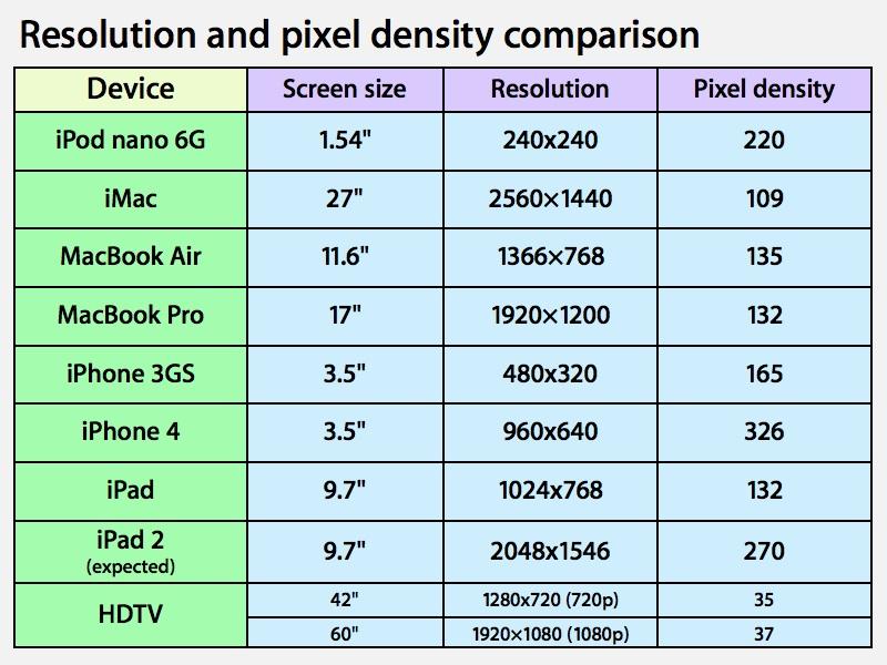
The payoff for increasingly higher desktop screen resolutions is also limited. Users are already facing content overload as they peer into the display resolution of a 30 inch Cinema Display. Mobile devices are slightly different however. The iPad's existing pixel density is 132ppi, compared to iMacs hovering around 100ppi and MacBooks ranging from 110 to 135ppi (on the new 11 inch MacBook Air). At reading distance, the iPad's pixels are discernible; most people position their notebooks significantly further away, making individual pixels less obvious.
Prior to iPhone 4 (boasting 326ppi), Apple's highest screen density appeared on iPod nano models, ranging from 200 to 260ppi. In contrast, a 42 inch 720p HDTV offers just 35ppi, while a 60 inch 1080p set delivers 37ppi. The value of pixel density, clearly, relates to how close you're viewing a display. High resolution is actually rather unnecessary for impressive HD video when viewed across the living room, but is essential to deliver a sharp display on a mobile device held at the reading distance of a book.
Having already created a user interface that works well on a 9.7 inch display, Apple is now free to dramatically boost the iPad's resolution independently of its screen size, in order to deliver a very realistic depiction of photos, ebooks, documents, videos, and dynamic content that users navigate via touch while holding the display at distance where pixel density is readily noticeable.
So rather than needing super high resolution video content, the expected iPad 2 can present existing iPad apps (ranging from Netfllix to NPR) at full fidelity while allowing optimized apps to draw images, text and other content with razor sharp detail at a pixel density where individual dots begin to vanish from view, exactly like iPhone 4.
And because Apple has designed the iPad user interface from the ground up to be resolution independent, doubling the resolution doesn't have the same drawbacks involved with boosting pixel density on desktop or notebook systems. With a resolution nearing the retina's detail threshold, iPad 2 can deliver a user interface capable of exceptional quality, without demanding higher quality video sources than currently exist.
At the same time, photographers and anyone else who deals with detailed images, ranging from X-rays and MRI images to detailed PDF renderings and 3D architectural models, will benefit from the resolution boost because it will simply be there to use. Even users with basic needs for iWork productivity apps, browsing the web, and playing puzzle games will benefit from razor sharp rendering of text (that iOS is capable of doing automatically) and enhancements third party developers make to their custom graphic assets (which are easy to add to existing apps).
The resolution independent design of iOS will also allow Apple to potentially sell both new iPad 2 models with a very high resolution as well as the existing iPad at a low price tier, without causing fragmentation issues for developers or users. The same apps can run seamlessly on both, supplying normal or double resolution graphic assets as needed to take full advantage of the new screens while still working normally on existing models.
Of course, Apple hasn't yet revealed its hand on iPad 2 yet. But if 2011 follows the developments of 2010, as internal and external evidence suggests it will, it shouldn't come as a surprise to see Apple flexing its resolution independent muscle to differentiate its tablet offerings.
 Daniel Eran Dilger

-xl-m.jpg)

-m.jpg)

 William Gallagher
 Amber Neely
 Andrew Orr


 Christine McKee
 Chip Loder





198 Comments
They need to go ahead and tack on WebM support if it's possible at all.
They need to go ahead and tack on WebM support if it's possible at all.
Would that be in software (resulting in a battery draining way to watch YouTube), or by adding new hardware acceleration for WebM that doesn't yet exist, something that would make 70 million iOS devices and 150 million iPods just that much more obsolete?
And once we have established WebM as the way to play web videos, what happens once the MPEG LA forces Google to license its patent portfolio and the whole WebM thing goes away just like Wave, Google Answers, Google Video DRM, GOOG-411, Writely, Dodgeball, Buzz, Jaiku, Orkut, Knol and the Nexus One.
Then what?
The answer relates to resolution independence.
If only...
They need to go ahead and tack on WebM support if it's possible at all.
Not gonna happen. Whatever patents there might be for WebM are 100% Google owned. Meaning the ones that aren't already infringing on MPEG-LA patents.
Regardless, it'd be financial suicide for another company to buy into WebM until the patent wars against it have shaken out, b/c Google refuses to indemnify other WebM users (corporations and individuals) when it's found to be infringing. Funny behavior for a technology that claims to be "open"...
They need to go ahead and tack on WebM support if it's possible at all.
This has been a sad news day. Thanks for the laugh.
I don't think anyone thought of a 2048x1536 screen resolution as a bad idea, just with the assumed added cost it wouldn't be worth it.
If Apple can manage to quadruple the pixels and everything that goes along with it whilst keeping the same low iPad price then they should definitely go for it.