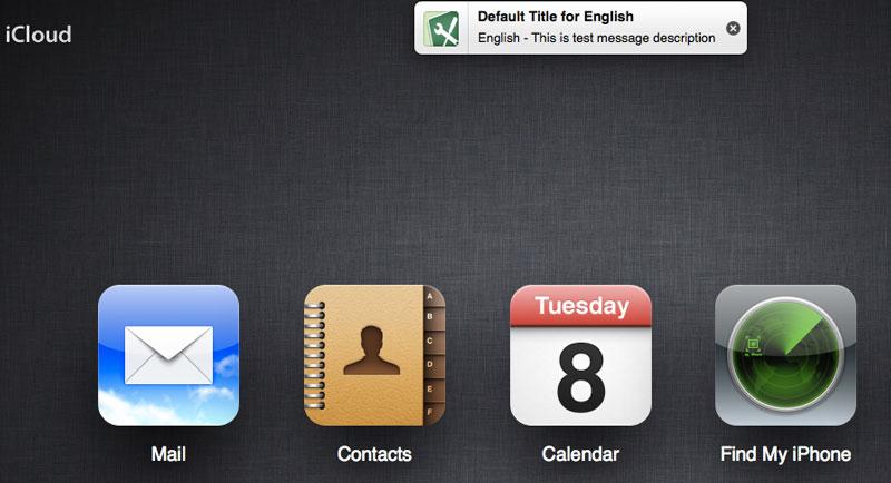
Users who visited the iCloud.com website could find an iOS-style notification at the top of their browser. It featured placeholder text for both a title and a message.
"Default Title for English," the title read, followed by "English - This is test message description."
To the right of the notification was an 'X,' allowing users to close the message from their browser. The test message could not be selected and it did not link anywhere.
The early reveal shows that Apple is planning to bring banner alerts to iCloud.com, a feature that first debuted last year on the iPhone and iPad with the release of iOS 5. The banner alerts replaced the previous, more intrusive alert notifications that must be responded to in order to return the device to normal use.
Regular alerts and banner alerts both remain as selectable options by users in iOS 5, as part of Apple's new Notification Center. Notification Center will also be coming to the Mac this summer with the release of OS X 10.8 Mountain Lion.
In Mountain Lion, Notification Center will be accessible by choosing a circle button on the top right of the screen. With a gesture of two fingers sliding from the edge, the Notification Center can be pulled from the right of the screen.
That's slightly different from iOS devices like the iPhone and iPad, where the Notification Center is pulled down from the top of the screen with a simple finger swipe.
Tuesday's reveal at iCloud.com did not give any indication that a unified Notification Center will be coming to the website. But it did indicate that Apple is actively working on bringing banner-style notification alerts to the free cloud-based service.
 AppleInsider Staff


 Charles Martin
 Christine McKee
 Wesley Hilliard
 Malcolm Owen
 Andrew Orr
 William Gallagher
 Sponsored Content


25 Comments
this really isn't much of a reveal given that they already told us about Notification Center for Mountain Lion. It seems a logical step that they would be syncing notifications via iCloud so such banners would exist.
That it is so logical and they already clued us in would be why they weren't super duper careful to keep this a secret during testing.
So this'd be for when you're away from your Mac, like the rest of iCloud.com.
In addition to this I'd love to see iCloud.com get an additional app for iMessage.. and that if you read a message there it'll clear the notifications on all other iOS/Mac devices that it has been delivered to.
If I migrate to iCloud Apple will probably change it again so I will still have my stuff spread across two Apple IDs which can't be merged, a .Mac address which is the official name of one of my IDs however the email for it is .me and every time I try to access it on the web it redirects me to the migrate to iCloud page and never allows me to see my mail. Apple is just botched this whole user account madness by combining all manner of services on their end into iTunes. What a mess.
I'd also like to see an iTunes web app, and perhaps a Settings one where you can remotely control iOS and Mac settings.
Although, I would like to see better security on iCloud.com. Perhaps passcode locking each app?