In a surprisingly fast turnaround for the U.S. Patent and Trademark Office, Apple won U.S. Patent No. 8,223,134 for "Portable electronic device, method, and graphical user interface for displaying electronic lists and documents " a little over four months after the property was initially filed for in March.
The '134 patent covers both vertical and horizontal scroll bars seen when moving through a digitally represented list like a music playlist or message thread. Also covered is any type of "digital document" or image that cannot be fully displayed on a portable device's small screen.
In its filing summary, Apple notes that the patent was created in response to the limited screen real estate users have to work with on today's mobile devices. To save precious pixels the patent's inventors, including iOS chief Scott Forstall, envisioned a disappearing contextual scroll bar on the right and bottom edges of a display that allows mobile users to keep track of where they are in a given list or image.
From the background:
As portable electronic devices become more compact, and the number of functions performed by a given device increase, it has become a significant challenge to design a user interface that allows users to easily interact with a multifunction device. This challenge is particular significant for handheld portable devices, which have much smaller screens than desktop or laptop computers.
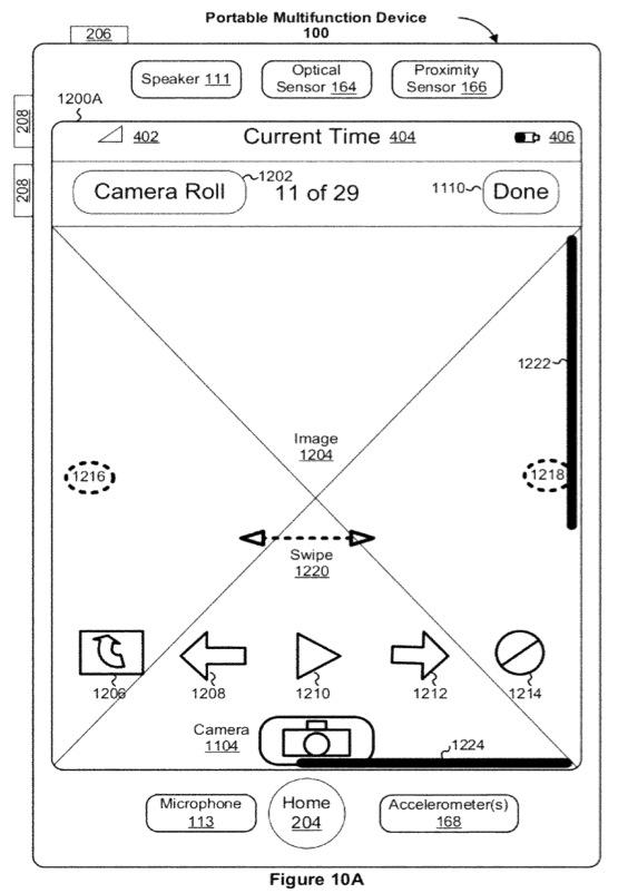
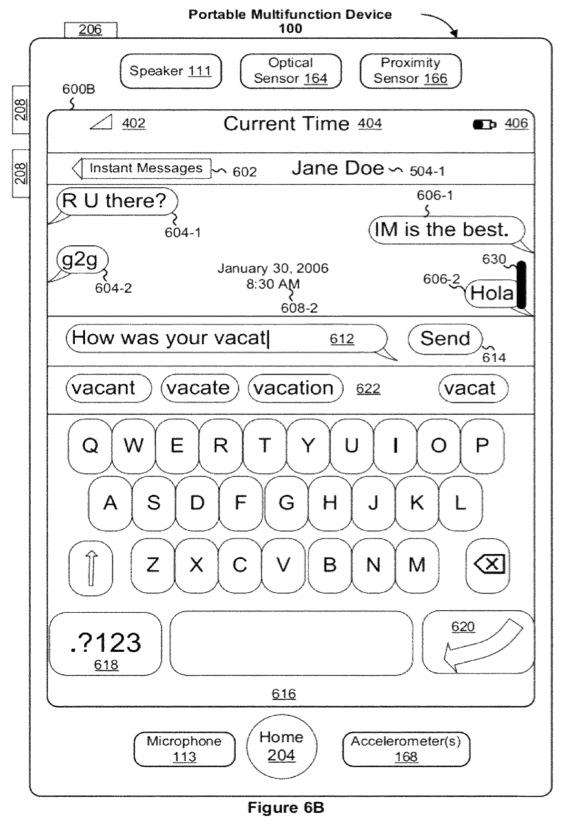
Apple's disappearing scroll bar patent illustration. | Source: USPTO
According to the patent the scroll bars will appear when an object like a finger comes in contact with a multitouch screen, when a list is first displayed as well as other instances where navigation is needed. The bars slowly fade when they are no longer needed based on time set by the mobile OS leaving the screen free of distracting UI elements.
Adding to the functionality is dynamic contextual resizing based on how long a list or how large an image is being displayed. For example, if a list contained only three items, the vertical scroll bar would likely fill the entire right edge of the display while a list with 100 items would prompt the bar to shrink.
Apple has recently adopted the iOS-style scroll bar in its most recent desktop applications with mixed results, though the real issue could be the Android mobile OS which uses an identical UI element. Just as the iPhone maker has successfully leveraged previous graphics patents against Google's OS it may do the same with Tuesday's granted property.
 Mikey Campbell







-m.jpg)






 Christine McKee
 Amber Neely
 Andrew Orr

 Sponsored Content

 William Gallagher








73 Comments
This could really put the hammer down on Android (not to mention Windows Phone and Surface).
Umm I'm an Apple fan and all but really???
You mean there's absolutely no prior art to this? I had J2ME apps that I built that did this.
Umm I'm an Apple fan and all but really???
You mean there's absolutely no prior art to this? I had J2ME apps that I built that did this.
Patents never lie.
Umm I'm an Apple fan and all but really???
You mean there's absolutely no prior art to this? I had J2ME apps that I built that did this.
These were my thoughts initially. But then I remembered that it really doesn't matter if they hold the patent, it's if they go after anyone over it. And if Apple didn't get it, someone else would have.
I guess we just have to wait and see what they do with it.
I believe the patent rule is now first to file, not first to use. Perhaps an ip expert can clarify.