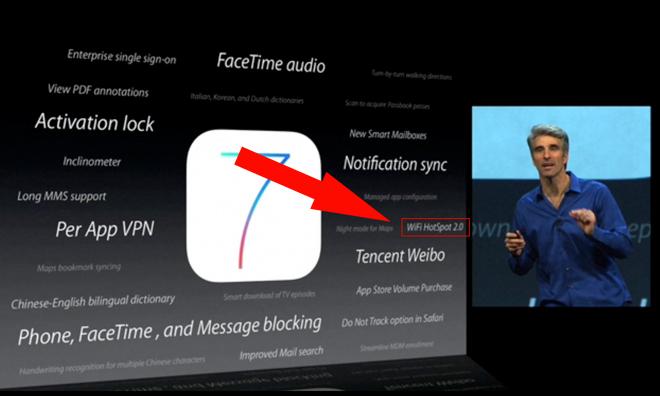
While not mentioned during Apple's WWDC keynote, iOS 7 will support Hotspot 2.0, a relatively new Wi-Fi technology that allows compatible devices to seamlessly connect to compatible hotspots without user interaction.
The new feature is based on the Wi-Fi Alliance's Passpoint project, which looks to automate connections to certified hotspots quickly and securely. This means iOS device users will one day no longer have to search for, select, and manually connect to certain access points.
Passpoint technology is aimed in part at cellular carriers, which offer Wi-Fi hotspots throughout a coverage area as a way to offload data burden. By using a cellular device's SIM card, or other unique identifier, Hotspot 2.0 devices are able to access these Wi-Fi networks without having to constantly input credentials.
In order for the tech to work, both ends must support the protocol, meaning smartphone OEMs, manufacturers of Wi-Fi gateways, and service providers have to be a part the program. So far, the technology is not widespread, at least not to the point where it would be impactful to an iPhone user.
However, as Ars Technica noted on Tuesday, trials are currently underway with participation from 30 operators. Consumer deployments are scheduled for release later this year, possibly in time for the expected rollout of Apple's next-generation iPhone.
 AppleInsider Staff

 Oliver Haslam
 Thomas Sibilly
 Marko Zivkovic
 Wesley Hilliard

 Malcolm Owen
 Andrew Orr


-m.jpg)



36 Comments
It would be nice just to have the iOS 7 but noooo.... We have wait for apple to release there new phone first what a bunch BS
Never mind all that. I'm running the iOS 7 beta now. I can't friggin stand it. The design seems all over the place. iOS seems to have lost its *well contrasted*, punchy beauty. It looks drab and lifeless. Maybe it'll grow on me. But my first impression..... Ive should have been kept way from software.
... so I was in this cafe the other day and this onion head jerk comes in and starts listening to foreign soccer with the volume turned up!
Never mind all that.
I'm running the iOS 7 beta now.
I can't friggin stand it. The design seems all over the place. iOS seems to have lost its *well contrasted*, punchy beauty. It looks drab and lifeless.
Maybe it'll grow on me. But my first impression..... Ive should have been kept way from software.
I don't like it either. I hope it'll grow on me. It's like Apple listened to tech presses too much. I'm all for a new look but I don't understand why everything must be flat. Can't icon be 3D? Can't notification be 3D? OSX icons are 3D and nobody accused it of being skeumo...
I hope OSX won't go this route.
It just looks stupid and thoughtless. The folders, the 2D blobs that they are, look *completely* out of place. The zoom effect on the folders is slow and totally unnecessary, compared to the nifty downward-slide we had before. It all looks like a disjointed Franken-OS. The design doesn't flow.