Affiliate Disclosure
If you buy through our links, we may get a commission. Read our ethics policy.

Leaker wars escalate, Jon Prosser shows alleged iOS 19 redesign

iOS 19 concept shared by Jon Prosser. Image source: FPT


Last updated

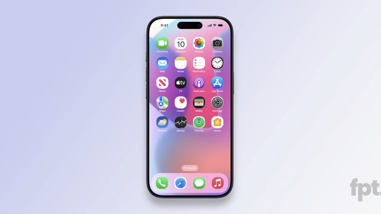
Jon Prosser has refined his iOS 19 leak concepts with more-rounded squircle icons, reflective elements, and more that bring it closer to Apple Vision Pro's visionOS.

Apple operating systems rarely leak, if ever, but leaker Jon Prosser claims he has access to a recent build of iOS 19. A previous leak showed glassy elements Mark Gurman called outdated or inaccurate, but Prosser is back with a few more redesign tweaks to show off.

According to a video shared by Jon Prosser on Front Page Tech, the new leaked UI is from a more recent build. Of course, everything shown is an artist's render and not actual screenshots to protect the source.

First, there's actually not much new to discuss here. He confirmed our suspicions that the glassy edges reflect light based on device tilt, showed a new TabView UI, and more pill shapes across the system that are reminiscent of Apple Vision Pro's operating system visionOS.

The biggest part of the leak here is the Home Screen app icons. Prosser shows a more-rounded squircle that's still not quite a circle.

If these icon shapes look familiar, it is because some Android skins have this icon shape. Round app icons are also an Android thing, so it seems odd that Apple would abandon its classic squircle.

Apps with tabs will get more animations and floating bars Prosser dubbed TabView. These mimic floating UI elements already present in iOS, but have more lively animations like the Dynamic Island.

Prosser also showed off a new search UI in iMessage that wasn't in the original iOS 19 leak video. It is simply a floating pill-shaped button that sits at the bottom of the app.

The Settings app was also shown with more tweaks and a longer, skinnier toggle switch.

It isn't clear if these new tidbits will cross the threshold of "significant" by Mark Gurman's definition. Instead of writing a new social media post, he just reposted what he said before, calling the "images floating around" not "representative."

The new leak may have shown possible new icon shapes, but it really wasn't much in addition to what was shown before. It likely means Prosser will continue to push back against Gurman and attempt to find something more significant to share.

Whatever the case, all will be revealed during WWDC 2025 on June 9.

Watch the Latest from AppleInsider TV

21 Comments

mattinoz 10 Years · 2599 comments

I feel like his insider sources just got fired. 

bestkeptsecret 14 Years · 4316 comments

I do not like the look of these "squircle" icons. I prefer the icons to be either round, or square with subtler rounded edges, like they are now.

Then again, we'll know for sure in June.

2 Likes · 1 Dislike
Vision1 5 Years · 10 comments

It’s funny how many say that circle icons are an android thing, but icons on the Apple Watch have them from the start 

2 Likes · 2 Dislikes
9secondkox2 9 Years · 3373 comments

While iOS 7 was a major move forward in terms of modern ui and UX, this update just seems pointless. Look more like the headset ui? Why? No point. The headset ui just looks like the watch, but with frosted windowing. And it makes sense there. The phone doesn’t need windowing or greater elements. Whatever those icon shapes are-they are genuinely ugly. Looks like a beginner homemade android mod. 

I’m not opposed to change at all. Actually was kinda excited about it. But then I remembered this is a different design team. Reminiscent of whoever thought white bezels and plopping the power supply on the floor was a good idea in the new baby iMac. 

I understand Prosser is just showing renders trying to reproduce what his team saw. But st the same time, I hope it’s not anywhere near that style. Msjor backward step if that’s the case. 

But I don’t believe apple would head back into skeuomorphism (with the fake glass buttons) or degrade into amateur style design. I’m sure it will combine the best parts of each is and make it consistent across the board. 

2 Likes · 0 Dislikes
apple4thewin 4 Years · 429 comments

I turned on an iPhone 5c the other day and instantly nostalgia hit, and I remembered that the gyroscope on the phone can let you also see the background move. With that being said, it feels off because of how outdated the UI is, especially being used to iOS 17 and 18. (The iPhone 5c’s last update is in iOS 10.)

1 Like · 0 Dislikes