While Apple updated every first-party app for iOS 7, one of the most heavily modified is Calendar, which sheds the silver and blue skin seen in iOS 6 for a grayscale theme almost devoid of color.
With the new Calendar app, Apple is going for a spartan, almost bleached look with an all white background, subtle gray borders and lines, and text that is either a shade of black or bold red.
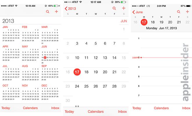
The design is eye-pleasing, though users familiar with previous version of iOS may find the change a bit jarring. The main full month view shows a Sunday through Saturday layout, with weeks demarcated by thin gray lines. Also in gray are the weekend dates.
Instead of "press-able" buttons for dates, Calendar in iOS 7 drop almost all shadow effects for simple black and red dots. A red dot on a date denotes the current day, while a black dot shows that a date has been selected and is ready to edit.
It appears that Apple has taken a step back in its design, however, as the month view no longer shows the small tick on dates with scheduled events. Also gone is the brief day-by-day view that appears below the month calendar in iOS 6.
In addition, the "add new event" dialogue can no longer be triggered with a long press. The only way to create an event is to drill down into day view, or click the plus symbol at the top right. Unless users want to check what day an upcoming date falls on, this particular page has been greatly handicapped.
Backing out from the month layout takes users to a full-year view, with the red "today" dot standing out against a background of incredibly small numbers.
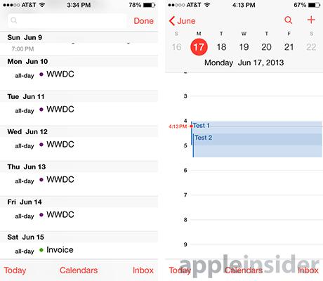
List view has been integrated into Calendar search (left), while overlapping events show up as tiered overlays.
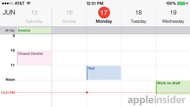
Moving into day and week view, things become a lot more usable. Days of the week are displayed at the top of the screen with their corresponding dates, as well as the current day and date, set against a light gray backdrop. This allows users to tap to select other days rather than swipe
Below the date header is a take on the iOS 6 day view, with hours and a moving red line for the current time.
The user interface for day view remains largely unchanged, and is more of a graphical, rather than functional, overhaul. Unlike iOS 6, however, events that coincide are not set off in their own boxes, but are instead overlaid one atop the other in a tiered fashion.
Event creation is largely the same as it is in iOS 6, with the same data fields presented in the new iOS 7 color scheme.
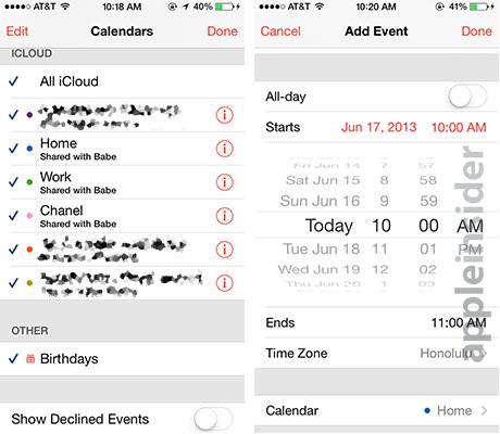
With iOS 7 beta, Apple has moved the "List" view to be included with the Calendar search utility, which can be found by clicking on the magnifying glass at the top of any in-app page except when in landscape mode.
Flipping the iPhone into landscape, iOS 7 throws up a five-day view which is, again, mostly a re-skinned version of the iOS 6 Calendar. Days and times are browsable by scrolling horizontally and vertically. Adding events requires the tap and hold method as no menu buttons are available.
Overall, the look of Calendar has changed more than its feature set. The layout is clean and uncluttered, but the removal of the month view's event notations and easy event creation could be a deal breaker for some.