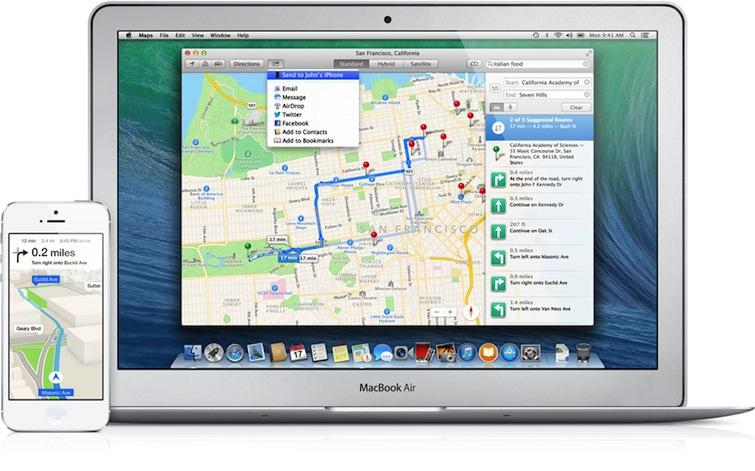
Google would like Apple's iOS Maps to go away, but the latest builds of iOS 7 show that Cupertino is working to deliver significant new improvements to its mapping app while also adding deep integration of Maps throughout iOS and with Macs running OS X Mavericks.
Full Screen Maps
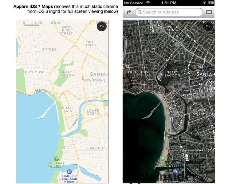
One new feature in Apple Maps, noted by AppleInsider reader Vesko Kateliev, is its full screen mode, which erases all of the user interface chrome to present the largest possible view.
While similar to Safari's full screen view (which hides the URL bar and search fields as users scroll down), iOS 7 Maps takes full screen literally full screen, making even the top status bar disappear. Note too that when scaling the map, a distance legend briefly appears (top left of image on right, below), then vanishes.
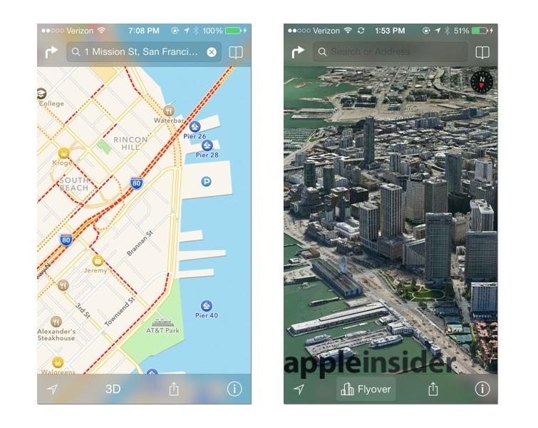
The revamped iOS 7 Maps app already expands the apparent field of view by making use of translucency in its search bar and new lower toolbar in both Standard and Satellite or Flyover modes (below).
In either mode however, a purposeful touch of the map makes the UI go away entirely. Pinching or dragging a finger across the screen doesn't hide or show the UI chrome; you have to touch the map to take it full screen, and it says full screen until you deliberately tap the map again.
Full screen mode works with standard, satellite or hybrid maps in either 2D or 3D, allowing you to peruse maps using all the pixels you have.
More brilliant chrome
Apple has also enhanced the chrome itself. Across the top, the Directions button works the same as previously, offering driving, walking or transit routes (which continues to make use of helper apps, as it does in iOS 6).
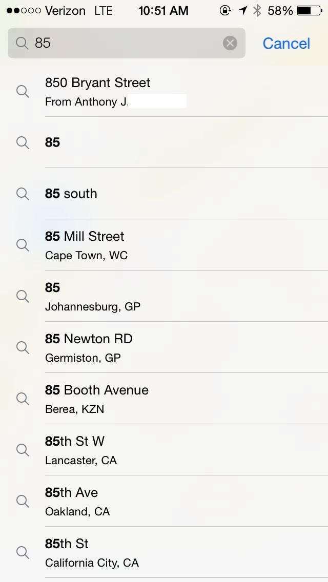
The Search field also works as expected, although Apple now auto-suggests locations it has highlighted in recent emails or messages (below) via Apple Data Detectors. Bookmarks is unchanged, except for gaining the new iOS 7 appearance.
At the bottom of the screen, rather than just presenting Location and 3D/Flyover buttons and hiding other options behind a dogeared corner, Maps now presents a toolbar with four buttons: Location, 3D/Flyover, Sharing, and an Info button that brings up an options sheet.
Location & Compass
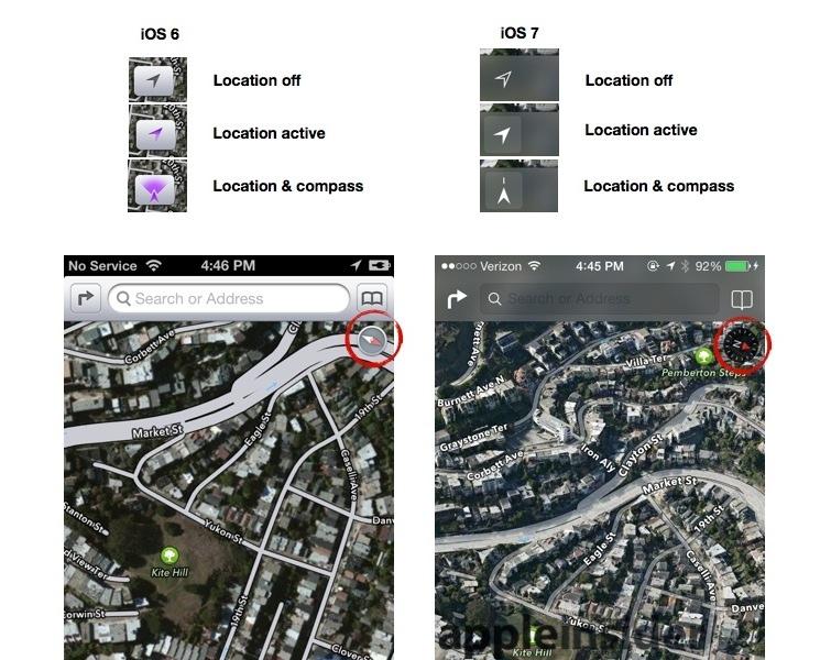
Each of these has changed slightly. For example, the Location button loses its former purple tint when activated; it now just turns solid to indicate your current location, and points upward to show you're in compass mode.
While in compass mode, Maps also now presents a compass indicator with an N for north, rather than the more abstract double arrow with a red end pointing north. As previously, touching the compass sets the map orientation to North and it disappears.
3D/Flyover
The 3D/Flyover button also works the same as it does in iOS 6, entering a 3D perspective view of the map when touched in either Standard or Satellite/Hybrid mode.
You can also enter 3D mode with a two fingered, vertical drag gesture, but providing the button makes it easier and more evident how to jump into this mode, if you're not aware of the necessary gesture to invoke it.
However, in iOS 7 it now pops up a "Flyover" text label when you are in satellite mode and at a zoom level and in a region where you can enter Flyover (above), making the feature more obvious and prominent. Flyover looks particularly cool in Full Screen mode.
Sharing & Bookmarking
A prominent new Sharing button brings up the standard iOS 7 share sheet, with options to share a location via AirDrop, Messages, Mail, Twitter or Facebook or to add a Bookmark.
Emailing a location involves sending a maps.apple.com URL with its coordinates, something that opens in Apple's Maps on iOS or OS X Mavericks, or for web-based users, resolves to a Google Maps URL they can look up.
An emailed location also attaches a "loc.vcf" vCard file, which is a small, standard structured file that includes the same coordinates, sort of like a contact record that only supplies a GPS location.
If you've looked up Directions to a location, iOS 7 Maps also offers to share the directions to a nearby friend via AirDrop.
Previously, you could only share a location in iOS 6 Maps by selecting a pin, opening its info page, clicking on share location to open another sheet, and then selecting one of the sharing options.
Location Information
Replacing the whimsical dogeared corner of previous incarnations of the Maps apps, Apple now uses an information button to pop up options for switching between Standard, Hybrid and Satellite views or to Drop a Pin, Print Map via AirPrint, Report a Problem and Show/Hide traffic.
If you select a pin representing a location known to Yelp, you get the same information presented in iOS 6, including business contact info, Yelp reviews and photos; hours of operation; delivery, reservations and kid-friendly notes; and options to create a contact, bookmark or report problems.
New in iOS 7, apart from a clearer presentation, is a default link to transit directions and a the "popular apps nearby" feature, which links to location-relevant apps. This is particularly helpful in places where the establishment has a custom app, or there are site-specific apps in common use, for example, the Uber car service in San Francisco.
Directions preferences, options
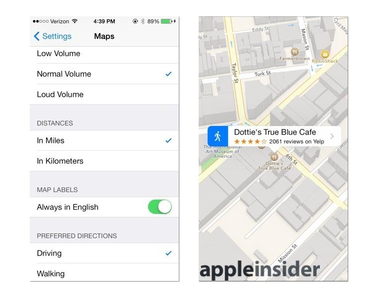
Maps includes a new preference in Settings for "Preferred Directions," letting you choose the default between Driving or Walking. If you pick the latter, locations you select will get the walking man icon rather than the car for one touch walking directions.
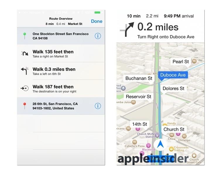
Once you enter directions mode, the same Route Overview button (now in the lower toolbar next to the Sharing button) presents you with step by step directions, albeit with more precise directional icons rather than the more cartoony, "road sign" style arrows of iOS 6.
The same, simpler direction panels are presented along your route in place of the former green roadsigns with highway style skeuomorphism. While giving directions, Maps also now presents the estimated trip duration, remaining distance and arrival time at the top of the display as well as on the Lock Screen, so you don't have to do the math in your head.
Another nice improvement in directions is that you can now zoom out further and pan around more while in GPS directions mode; iOS 6 locked the presentation into a very constrained view that often made it hard to see where the next turn would be.
In iOS 7, you can interact with the map via pinching to see around corners and spy out the landscape ahead, then pop back into "you are here" mode where you are centered in the map and and north is up. This still prevents you from navigating out to a "lost" zoom location where you have to manually zoom back into your current location.
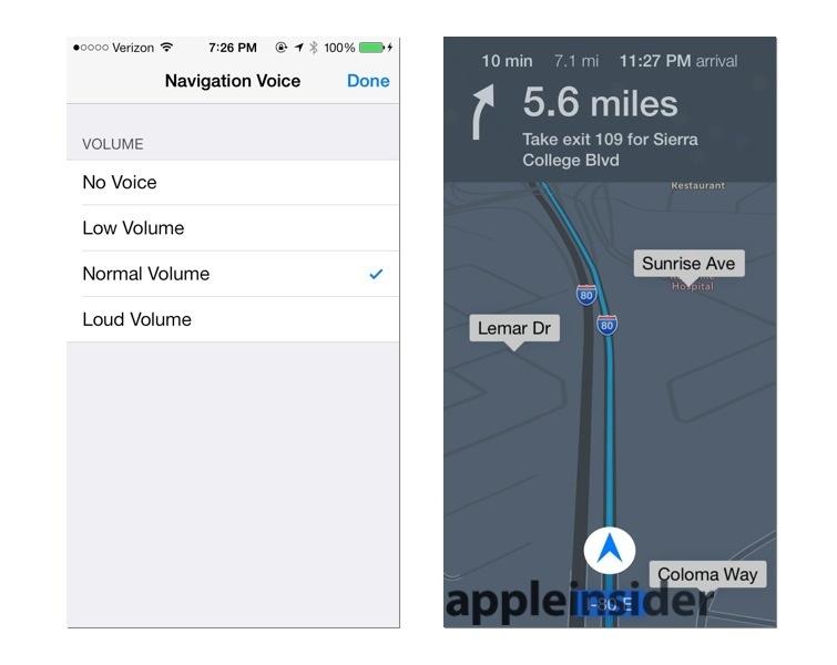
You can also control the volume of Siri voice controls right within the app. While the main Siri volume preference is in Settings, a new volume button lets you change the relative volume of Siri's voice feedback independently of the system volume, so it doesn't shout too loud over your background music, for example.
There's also a new Night Mode that automatically activates when you're driving in the dark. It presents a darker grey background rather than a bright white map, similar to many auto navigation systems.
System integration
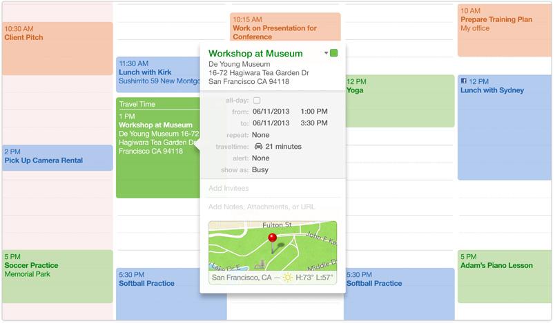
Rather than just replacing Google Maps with its own service, Apple is using its new mapping services throughout iOS 7 and OS X Mavericks to provide map previews of locations in apps like Mail, Contacts and Calendar, drawing upon traffic information to calculate travel time to an appointment, for example.
Lastly, iOS 7 Maps also features new integration with OS X Mavericks, allowing users to send locations and directions to their iOS 7 device via a push notification. Apple's new Maps app for Macs also feature expanded error reporting tools to leverage crowdsourcing in order to improve its mapping service, search results, location information and directions
 Daniel Eran Dilger








-m.jpg)




 Malcolm Owen

 Charles Martin

 William Gallagher
 Stephen Silver

 Christine McKee
 Amber Neely



81 Comments
love the transparency of the chrome over vector maps. A bit gray/muddy over the flyover and sat views. Either way ios7 is looking really nice
It sounds like Apple Maps is really shaping up to be a really good tool!
That's all well and good, but the interface Maps has (on iOS) is already impressive. The problem is the search facility is awful. It's taken me to places that don't exist so many times that I only use Google Maps now.
In terms of the version for the Mac, having just started using a new beta of Google Maps in a browser, Apple have a fight on their hands here. The new Google Maps is very impressive.
[quote name="dugbug" url="/t/158467/ios-7-maps-go-full-screen-navigation-gets-night-mode-new-siri-options#post_2361102"]love the transparency of the chrome over vector maps. A bit gray/muddy over the flyover and sat views. Either way ios7 is looking really nice[/quote] Agreed. I think it's shaping up to be something really nice. There was a great article in the Next Web about how iOS 7 is designed for future customers. http://thenextweb.com/apple/2013/07/10/ios-7-is-designed-for-apples-next-billion-customers/
Sounds good, but they will still be almost useless to those of use without cars or those of us that live in cities outside of the USA. Maps needs transit information, bike route information, and proper walking directions to be useful to anyone who doesn't drive a car. It has none of these at the moment and based on this review is not adding them to the product this year either. It's great to have the new default walking setting, because doing the route, changing it to walking instead of the current default to cars, and then having to re-route a second time gets old really fast. Unfortunately, the "walking" directions are not really walking directions at all, but merely car directions with a longer time frame noted in the "how long ail it take" part. For instance in most non-american cities, cars are actively slowed down and "calmed" by means of blockades and "no through" routes. An intersection of two streets is often turned into two "L" turns so that cars can only turn one way, but people can easily walk through this same intersection. Apple maps ail route you blocks out of your way on walking directions because it takes intersections like this and assumes that if a car can't get through, then a person can't either. Also, in most non US cities, there are extensive bike routes where cars are not allowed, but Apple maps makes no mention of these at all. Transit routes also aren't marked at all in my city despite it being the third largest metropolitan area in Canada. Rapid transit stations are noted but are literally several blocks from where they actually are. The boundaries of parks are still off by blocks, despite being reported multiple times. It's just a dog's breakfast of bad information that isn't updated frequently enough. I have dozens of friends who have regularly submitted corrections and updates to Apple maps since day one, myself included and have yet to see a single one of these actually make it to the map. This is a very large, urban metropolitan area in North America. I pity someone who lives in some more far flung place. They either shouldn't have taken on maps at all, or they should do it right. Google has thousands of employees around the world who's only task is to update this information. I would be surprised if Apple's maps team is even as large as the app store submission team and we know how small that group is don't we?