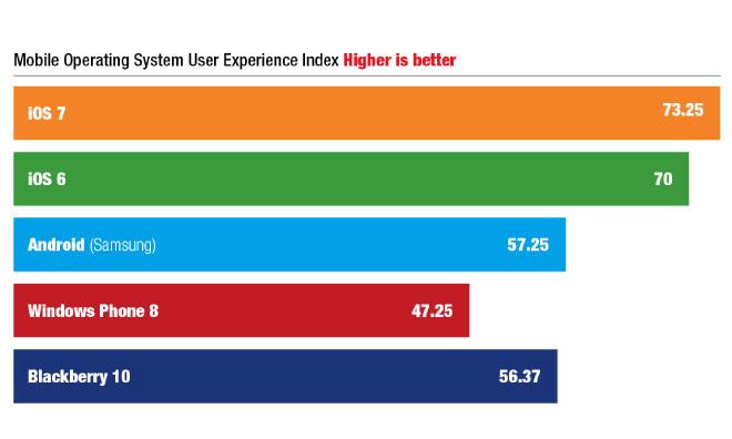
Following the public release of iOS 7, Apple's newest operating system is thrown into the fire against its strongest competitors in a battery of user experience tests, and coming out on top against Samsung's customized Android build and Microsoft's Windows Phone.
The study, conducted by technology consultants Pfeiffer Consulting, was designed to gather and compare quantitative user experience data from users of Apple's iOS 6 and newly released iOS 7, Microsoft's Windows Phone 8, Samsung's variant of Android, and BlackBerry's Blackberry 10.
According to Pfeiffer, the test methodology attempts to eliminate as many subjective variables — like brand loyalty or perception — as possible, looking only at objective "aspects that have a direct impact on the day-to-day user experience of an average, non-technical user." Pfeiffer hones in on four key points: the operating system's cognitive load, efficiency and integration, options for customization, and user experience friction.
Cognitive load is a psychological concept that refers, generally, to the number of distinct pieces of information a person must remember and process at once — for example, a typical 7-digit U.S. telephone number has a cognitive load of 7. To calculate each operating system's cognitive load, Pfeiffer's researchers counted the number of pre-installed applications and user interaction elements in a factory operating system installation.
iOS 7 was bested only by its older sibling in the cognitive load rankings, a difference that Pfeiffer attributes to the addition of Control Center to iOS 7.
Samsung's Android variant came in far behind Apple, Microsoft, and Blackberry's offerings with a cognitive load score more than four times that of iOS 7. Android has long been derided for its user interface complexity, though it is not clear how this metric would have been affected if Google's implementation, rather than Samsung's, had been measured.
To measure efficiency and integration, the group "analyzed access to key settings, integration with notifications, multitasking, and camera access, among others." iOS 7 and Android shared the top spot in this area, with researchers praising Apple's revamped and "well-implemented" app switching model alongside Android's "mature but slightly overwhelming" options like customizable notifications and shortcuts.
Samsung's Android took first place the customization rankings with its "dizzying" array of options, while iOS 7 trailed but still handily outperformed relative newcomers Blackberry 10 and Window Phone 8. Microsoft's belated answer to the iPhone was dinged for its lack of support for home screen background images or folders for app organization.
Apple's entries dominated the user experience friction (UXF) mark, which Pfeiffer explains "occurs whenever a device does not do what you expect it to do - or lacks a key feature that should be available." Control Center again caused iOS 7 to lag behind iOS 6 — the study found that the feature is "clearly useful," but has "the annoying habit of accidentally popping up" when it is not needed — though both operating systems still scored around 50 percent better than Samsung's Android, their closest competitor.
Overall, the study found iOS 7 to be the most user friendly of the major operating systems, saying that "Apple has achieved its goal to move iOS into the modern smartphone era. Despite some controversial design aspects, iOS 7 is pleasant and more fluid to use than other mobile operating systems." iOS 6, Blackberry 10, Samsung's Android variant, and Windows Phone 8 rounded out the rankings.
